How to Choose the Perfect Branding Colors (+ Examples)
Learn all you need to know for choosing the right colors for your brand
 October 5, 2023
 9 minute reading
Your color palette is a vital part of your brand’s identity, so designing your logo entails much more than selecting your favorite shades. Each color has a different meaning that conveys an array of emotions and concepts and has the ability to influence behavior and decision-making.
With a broad spectrum of colors to choose from, selecting your brand color palette might sound like a daunting task.
This guide walks you through the difference between a number of colors and discusses how to choose the right color for your brand.
Why brand colors are important
When we talk about branding, one of the first things that pops into most people’s minds is a logo. And while a logo is crucial, there’s something equally important that doesn’t get as much limelight: brand colors.
Imagine you’re walking down the soda aisle at the grocery store, with bottles of various different colors staring back at you.
What do you immediately recognize? It’s that red box with the white script across it. That’s right, Coca-Cola red! You spot it a mile away. That’s the power of brand colors.
Here’s the lowdown:
Instant recognition: Just like in the Coca-Cola example, certain colors help your brand be recognized instantly. It’s like your brand’s secret superhero costume. Every time people see your colors and fonts, they know who’s behind the mask: it’s your brand, standing out in the crowd!
Emotional connection: Do you know colors make you feel things? It’s true! Reds get your blood pumping and make you feel excitement. Blues might make you feel calm and trusting. Choosing the right colors helps your brand create an emotional connection with your audience.
Consistency and unity: When all of your materials—like your website, business cards, and advertisements—use the same colors, it creates a feeling of unity. This consistency makes your brand feel more trustworthy and professional.
Setting you apart from competitors: Lastly, your brand colors help you stand out from your competitors. If all the other brands are using blues and grays, choosing a bold yellow or vibrant green makes your brand unique.
Remember, picking your brand colors isn’t just about choosing your favorite colors. It’s about considering what these colors say about your brand.
So when you’re ready to paint the town (or at least your logo) with your brand’s colors, think about what you want your colors to tell the world.
How to choose the best color for your brand and logo
Research shows that people make a subconscious judgment about a product within just 90 seconds of looking at it, with up to 90% of their assessment being based on color alone. What’s more, color can increase brand recognition by 80%.
If you want to encourage a strong emotional connection with your customers, your brand colors provide a shortcut straight to your target audience’s hearts.
1. Know how many colors to have in your color scheme
When you first start considering colors, you may wonder how many you need to define your brand. In examining some of the world’s most popular brand color schemes, it’s evident that many highly effective palettes contain three key elements:
Base color: This is your primary brand color. Therefore, it should reflect your most important brand personality trait while appealing to your target audience. You can play around with different shades and tints, from dark to soft and pastel, to find the best fit.
Accent color: The second-most important brand color, after the base color. Not only should it convey another trait of your brand, but it also needs to pair well with your base color and appeal to your audience.
Neutral color: Refers to a color that doesn’t demand attention but ties your color palette together in an understated way. Think of colors you’d typically use in the background, such as shades of white, beige, or gray.
Even monochromatic color schemes require different shades for different purposes. If you want to play around with different ideas, you can use AI art prompts to see how they work.
Say you want to create a logo for a clothing brand. You can prompt DALL-E to generate some ideas. You can play around different colors and shades, and even ask for variations of a logo you like.

Let's take a look at Dunkin' Donuts' brand color palette to see how to create an effective brand color scheme.
The brand's base color is a zesty orange, conveying joy, enthusiasm, and fun. The accent color is bold magenta, which is playful and stimulating.
Let’s take a look at Dunkin’ Donuts’ brand color palette to see how to create an effective brand color scheme.
The brand’s base color is a zesty orange, conveying joy, enthusiasm, and fun. The accent color is bold magenta, which is playful and stimulating.
Together, these colors represent the brand’s colorful sprinkled donuts and fun-loving personality. Its primary neutral color is chocolate brown, which complements the two louder shades and conveys the brand’s sweet and down-to-earth visual identity.
2. Use the color wheel to find colors that match
On your journey to creating a brand color palette, you’re likely to come across numerous terms relating to color theory and design. One essential concept to understand is the color wheel, which is a visual representation of the relationships between primary colors and other shades.
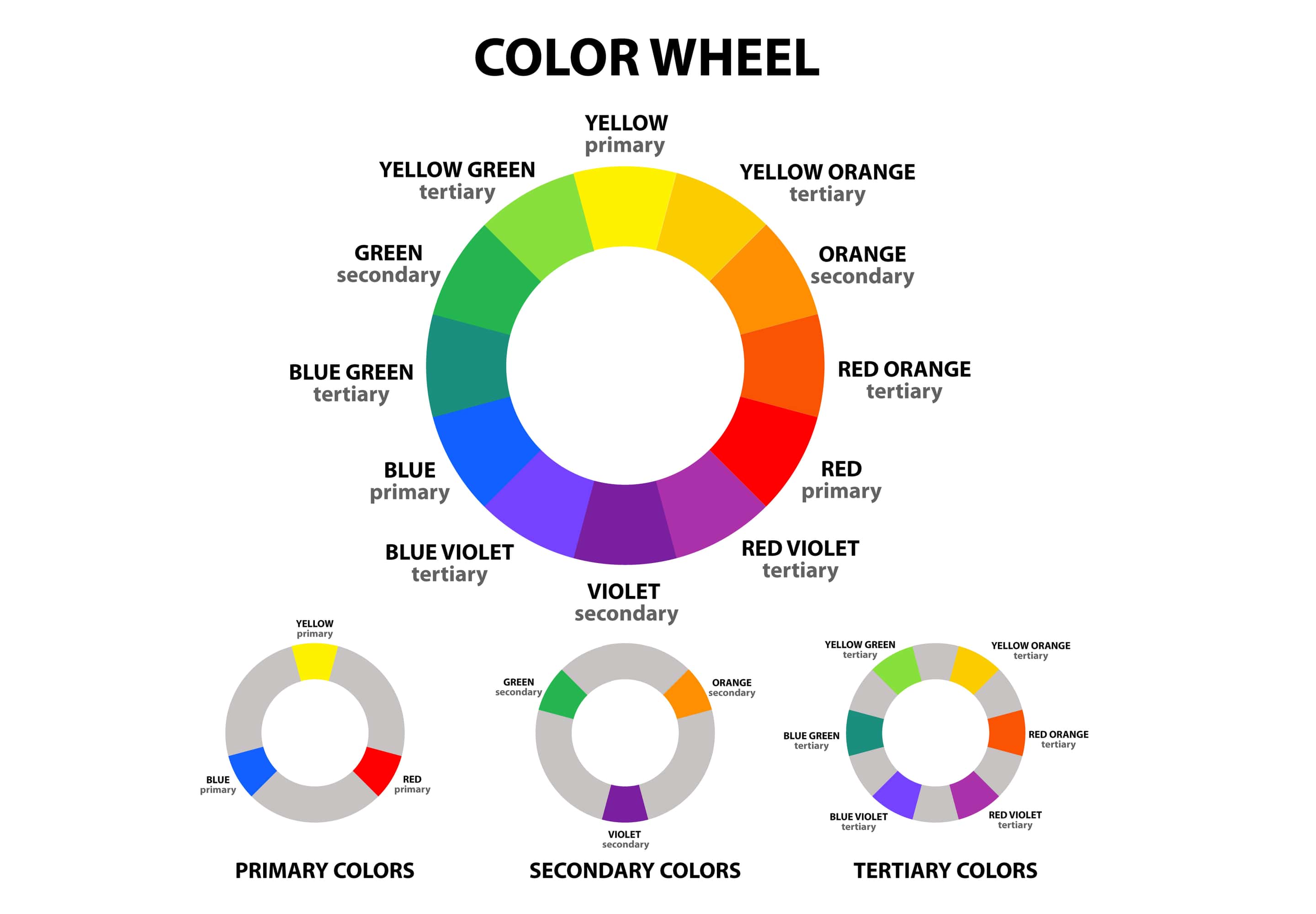
The color wheel’s foundations can be traced back to 1666, when English physicist and mathematician Isaac Newton discovered that clear white light was composed of seven visible colors—otherwise known as the colors of the rainbow. Fundamental aspects of the color wheel include:
The primary colors, red, blue, and yellow. These colors cannot be mixed from other colors.
Secondary colors, including green, orange, and purple. These colors are created when primary colors are mixed together.
Tertiary colors, made by mixing primary and secondary colors together, such as aqua or violet.
The color wheel can also be split down the middle to represent the two distinct color temperatures:
Cool colors, which include blues, greens, and purples. These are associated with cooler seasons, including winter and spring, as well as feelings of calm and serenity.
Warm colors, which include reds, oranges, and yellows. These are associated with warmer seasons, including summer and fall, as well as feelings of energy, action, and vitality.
Looking at the color wheel, we can also determine three key color schemes:
Complementary colors refer to two colors that are opposite one another.
Analogous colors refer to three colors that sit directly next to each other.
Triadic colors refer to three colors that are evenly spaced around the color wheel.
How does this information help you select colors for your brand style guide? An intelligent way to put this knowledge to work is to think about brands you know.

Best Buy is an excellent example of a brand that uses a complementary color scheme. The dynamic blue and yellow are opposites on the color wheel and work together to make Best Buy’s logo stand out.
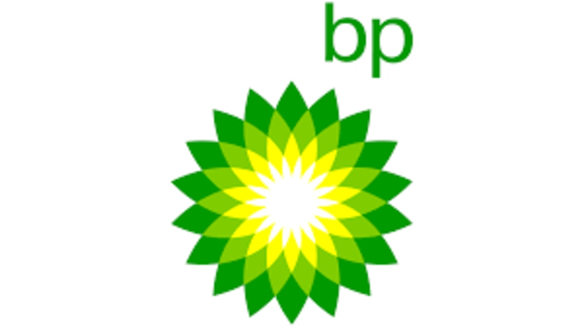
With its green-and-yellow sun-shaped logo, oil and gas company BP is a prime example of how to make an analogous color scheme work for a corporate brand. The colors convey both energy and nature to give viewers quick insight into BP’s core purpose.
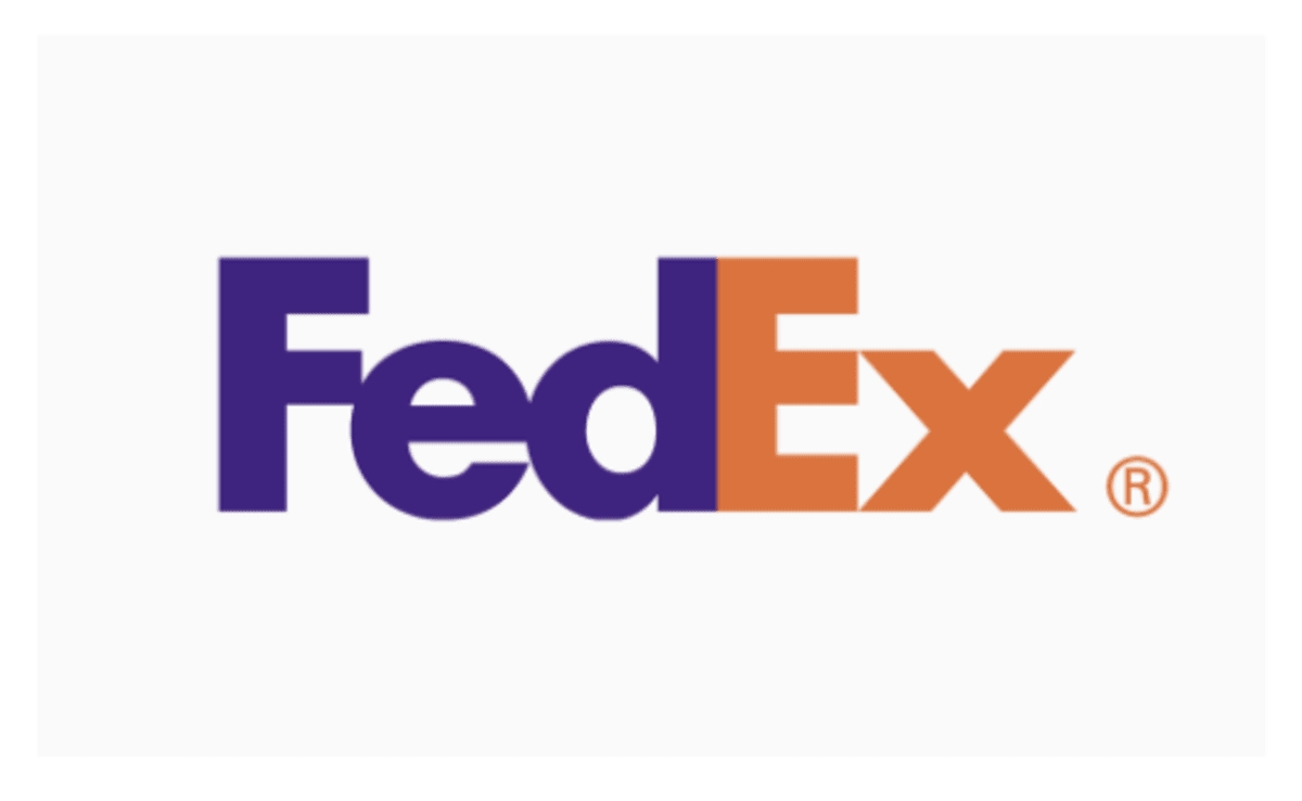
What about a triadic color scheme? FedEx uses purple and orange, two colors evenly spaced on the color wheel, for its primary logo. The quirky purple is a departure from the staid brown of its chief competitor, UPS, and the orange conveys energy and momentum.
Want to bring together your color scheme and fonts? Work with a professional typographer on Fiverr to turn your idea into a reality.
3. Understand the link between brand personality and color palette
Equipped with some fundamental insights into color theory, you’re ready to start thinking about the colors for your brand.
According to insights published in the Journal of Consumer Research, people prefer brands that “fit” well into their lives, and favorite brands often become part of people’s identities. Color is one tool that marketers can use to convey their brand’s core message and purpose.
To truly narrow down your palette, you should begin by paying close attention to who you are as a brand and the personality you convey to your target audiences.
A company with a fun brand personality, for example, might choose a vibrant and energetic color palette such as pink and yellow. A more serious and mature brand personality, on the other hand, should be represented with colors like dark blue and gray.
The infographic below shows the main colors and what they mean.
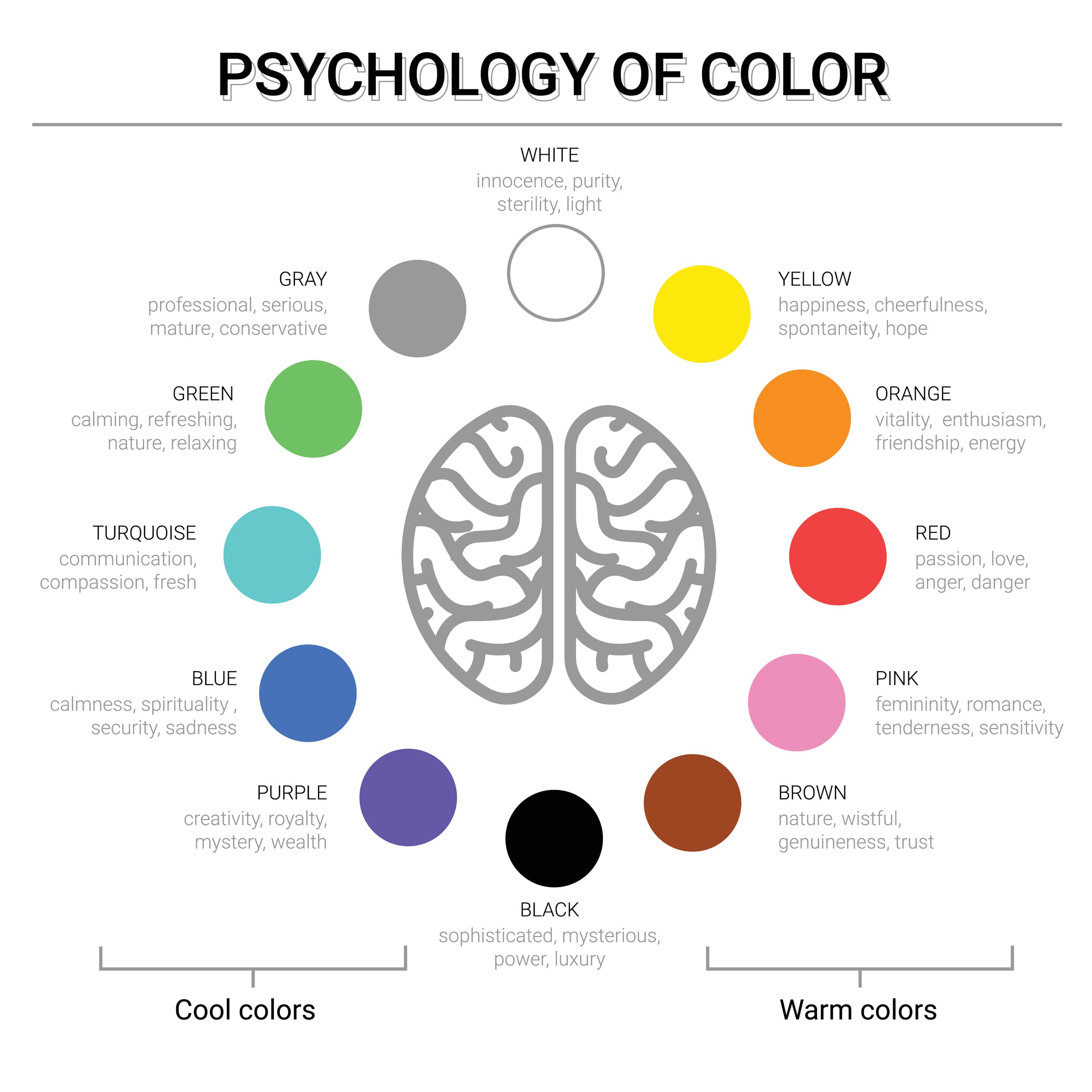
For more details on psychology of color, you can read our color meanings guide but knowing common color associations can jumpstart your color selection process:
Red: action, strength, energy, and passion
Orange: emotion, youth, optimism, and enthusiasm
Yellow: happiness, optimism, positivity, and intellect
Green: harmony, safety, growth, and health
Blue: security, trust, loyalty, and responsibility
Purple: spirituality, mystery, royalty, and imagination
Pink: compassion, love, femininity, and playfulness
Black: protection, power, elegance, and sophistication
White: cleanliness, purity, innocence, and perfection
Gray: compromise, neutrality, control, and practicality
Brown: reliability, stability, honesty, and comfort
Gold: success, triumph, luxury, and abundance
Silver: femininity, fluidity, sensitivity, and mystery
Keep culture in mind when choosing colors
Culture also plays a significant role in color associations and preferences. White is associated with joy and purity in Western countries, yet it’s associated with death in many Asian countries, for example. Do your research beforehand to ensure your brand colors don’t have negative connotations in countries where your target audience is based.
4. Discover the best brand colors based on your industry
Did you know certain colors are more suited to specific industries due to the relevant messages and emotions they convey? Understanding your industry is an essential step in choosing your brand colors.
Red
Red is a common color choice in the food, technology, automotive, and agricultural industries. Some famous examples of brands that utilize the color red in their logo design and brand palette include Kellogg’s, Nintendo, and Ferrari.
Orange
Orange is a popular brand color among companies in both the technology and health care sectors. Brands including Firefox, Amazon, and GSK Consumer Healthcare are just three examples of companies within these fields that use orange as a brand color.
Yellow
Yellow is a common color selection for brands specializing in energy, food, or household goods. McDonald’s, IKEA, and Shell are three brands that famously use yellow in their color palette.
Green
Green is a prevalent brand color within the energy, finance, food, household, and technology industries. BP, Starbucks, and Android are three famous brands that include green in their color palette.
Blue
Blue is one of the most prevalent colors within brand color schemes, particularly those within fields relating to energy, finance, airlines, technology, health care, and agriculture. Twitter, NASA, and Oral B are three such examples.
Purple
Purple is popular within the finance, technology, and health care sectors. Three examples of companies using purple within their brand colors are Yahoo!, New York University, and Starlight Children’s Foundation.
Pink
Pink is a popular color within the technology, beauty, health, toys, and food-related industries. Taco Bell, Barbie, and Victoria’s Secret are just three brands that use pink.
Black
You’ll often see companies in the fashion, technology, and automotive space utilizing black in their brand colors. Examples include Apple, Nike, Sony, and Mercedes.
White
Although it’s a neutral color, white can also serve as a dominant brand color, particularly among fashion and health care brands. Adidas, Chanel, and GE Healthcare are three examples.
Gray
Gray is a common brand color in the automotive, technology, petrochemical, and interior design industries. Companies including Wikipedia, Honda, and Nissan use gray within their color palette.
Brown
When it comes to the color brown, you’ll most often find it used for brands in the fashion, automotive/transport, and agricultural industries. Louis Vuitton, UPS, and Cotton are three examples.
Gold
Gold is a popular brand color for companies in fields such as fashion, gourmet food, entertainment, and automotive. Guess and Lindt all use gold within their color palette.
Silver
Silver is a versatile brand color typically featured within fields relating to the internet, technology, watchmaking, electronics, news media, and video games. Disney, Bvlgari, and Star Wars are three brands that may come to mind.
5. Know your brand color codes
Since color is such an important part of your branding, you'll want to ensure your chosen palette remains consistent across desktop, mobile, and print. The way you do this is by knowing each of your brand colors in their relevant color codes: PMS, CMYK, RGB, and HEX.
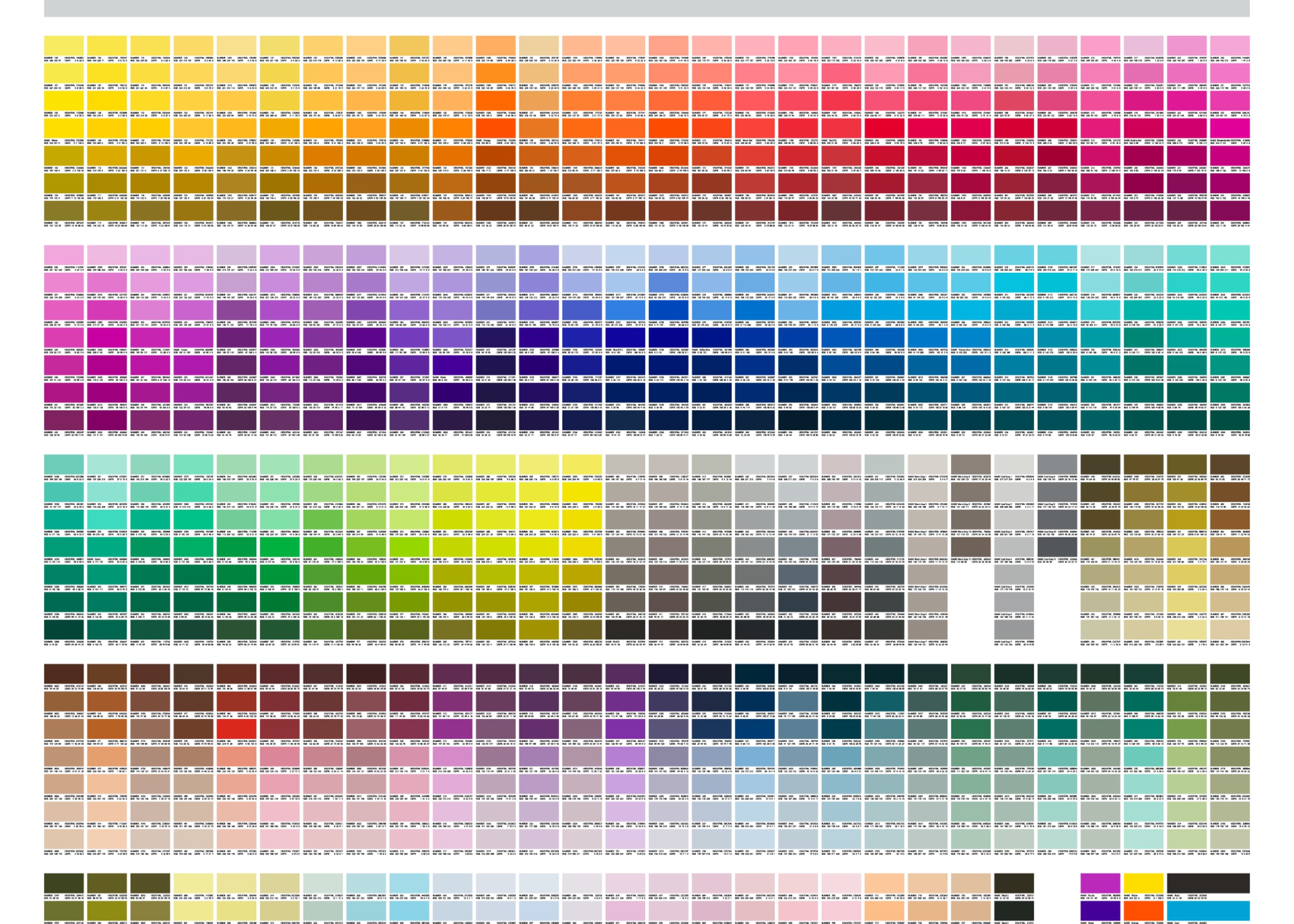
PMS (Pantone® Matching System): patented, standardized color inks manufactured by the Pantone Corporation
CMYK: a printing technique that uses a mixture of small transparent dots in four ink colors: cyan, magenta, yellow, and black
RGB: a method of displaying colors on-screen using red, green, and blue color combinations. RGB is exclusive to digital applications
HEX (hexadecimal color): a six-digit number and letter combination determined by the proportions of red, green, and blue (RGB)
Brand colors in print
Digital and print mediums represent color very differently from one another. When printing your brand colors, such as for a brochure or magazine ad, you will represent colors using PMS or CMYK color types.
Brand colors used digitally
When displaying your brand colors digitally, such as on desktop or mobile, you’ll use RGB (red, green, blue) or HEX (hexadecimal color) color types.
Explore top brand color palette resources
Your journey to selecting the perfect brand colors isn’t complete without getting to know several helpful, easy-to-use tools. We recommend the following resources to further assist you with choosing the best brand colors:
Pantone Connect can determine your brand colors in HEX, HTML, RGB, or CMYK formats for you.
Fiverr’s Logo Maker utilizes AI technology to create logo designs in colors and styles that best fit your brand.
The Sessions College Color Calculator lets you choose a base color and then generates color harmonies based on geometric relationships on the color wheel.
Basic Principles of Color Theory from the University of Missouri discusses basic principles of color theory for use in both art and graphic design.
6. Use your brand colors in your designs
Now that you’ve got your brand colors, it’s time to include them in your designs. You can add them to different areas of your business like:
Logo
Website
Product packaging
Social media
Digital and print ads
Physical stores
Email marketing
Your brand colors will become part of everything in your business. They’ll help you stand out and build a memorable brand image. Remember to use your colors across all your platforms.
Create attention-grabbing colors your for brand
Now that you know how to choose the right brand colors, you’re ready to finalize your palette and put it to successful use within your business.
Your business color palette allows you to communicate what your brand is about while cultivating a strong emotional connection with your customers. Since most brand purchasing decisions rely on emotions, there’s no denying the significance color plays in the success of your brand.
As the saying goes, “First impressions count.” The first thing a consumer will see relating to your business is your brand colors—often in the form of your logo.
If you’re looking to complement your brand color scheme with the perfect logo, check out Fiverr’s innovative Logo Maker. Simply answer a few questions about your business and style preferences. Then, let our powerful artificial intelligence (AI) technology create logo designs that best fit your brand.
Create a custom logo for your brand with Fiverr Logo Maker or hire a freelance logo designer expert.
Brand colors FAQ
What colors are best for branding?
There’s no one-size-fits-all answer to the best colors for branding because it all depends on the message you want to send to your audience. For instance, blue often communicates trust and professionalism, red is used to show excitement and energy, while green is great for health and environmental themes.
What colors mean for branding?
The colors used in branding have a powerful impact, as they carry certain meanings and emotions. For example, yellow can suggest happiness and positivity, purple is associated with creativity and luxury, and black may indicate sophistication or exclusivity.
What is color psychology for branding?
Color psychology in branding is the study of how colors affect our perceptions and behaviors. It’s an important factor in branding because different colors can provoke different feelings and reactions from people. For instance, a fast food chain might use red to stimulate appetite and create a sense of urgency.
What colors are not appropriate for branding?
No color is outright inappropriate for branding, but some colors may not work well depending on the context and the audience. For example, neon colors might be too loud for a law firm aiming for a conservative image, and using too much black could give a negative or gloomy impression if not balanced properly.
Related Guides


Melanie Clarke is a freelance writer based in Sydney, Australia. She has obtained university degrees in both creative arts and journalism and possesses over a decade of experience in creating educational online content. She is particularly passionate about helping small business owners learn about the intricacies of graphic design and branding.
