The 7 Types of Color Schemes (+ How to Use Them)
Learn how to choose the best color combinations for your brand
 April 10, 2022
 8 minute reading
The colors you choose to represent your organization are intrinsically linked to your business’s visual identity. They have the power to determine if a brand rises to the top or blends into a sea of competitors.
Colors have different meanings that convey an array of emotions and concepts and have the ability to increase brand recognition, while also influencing the thoughts, feelings, and behaviors of your audience. With a wide range of colors to choose from, determining which colors pair perfectly with one another to successfully represent your brand can be challenging.
In this article, we’ll walk you through the different types of color combinations and how to choose the right color palette for your brand.
What is a color scheme?
A color scheme is a systematic way of using colors that complement and enhance each other in a harmonious manner. It’s essentially a color palette that is used to create a pleasing or meaningful visual effect in graphic design.
A brand's color scheme shapes its identity, drives customer engagement, and influences consumer perception. Colors instantly evoke feelings and associations, whether it's the vibrant red and white of Coca-Cola or the soothing blue of Facebook.
But you don’t choose a color scheme randomly. It's guided by color theory, which explores how colors interact, can be combined, and impact human emotion and perception.
Color theory fundamentals
At the core of color theory lie the primary, secondary, and tertiary colors:
Primary colors: Red, blue, and yellow are primary colors. These are the basic colors that can't be made by mixing other colors together.
Secondary colors: When primary colors are mixed together, they produce secondary colors. The secondary colors are green (blue + yellow), orange (red + yellow), and purple (red + blue).
Tertiary colors: Tertiary colors are created when a primary color is mixed with a secondary color adjacent to it on the color wheel. Examples include red-orange, yellow-green, and blue-violet.
By pairing different colors together, you can create an endless list of brand color choices. For example, choosing complementary colors (colors directly opposite each other on the color wheel) can create a striking and dynamic look, while choosing an analogous color scheme results in harmonious and cohesive visual interest.
7 types of color schemes for creatives
With color harmony, there are seven major strategies for relating colors to one another. Each approach connects colors on the color wheel via a spatial connection.
Let’s examine each in more detail.
Complementary Colors
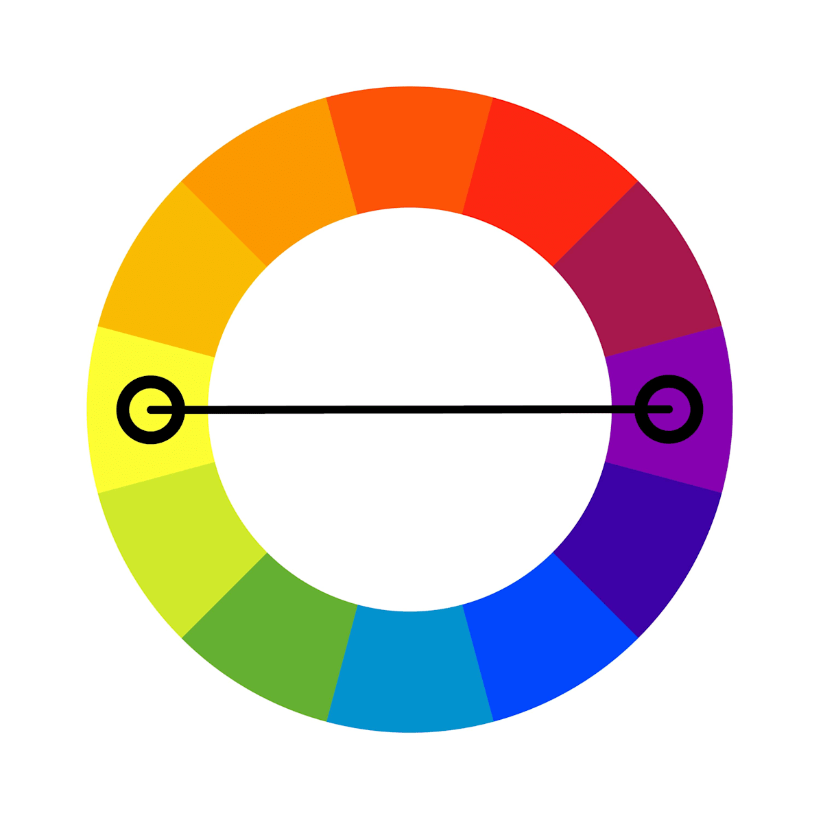
On a color wheel, complementary colors are those that are opposite each other. We can visualize it as drawing a straight line from one color on the wheel to another. Green and red, for example, are complementary colors because they are directly across from each other on the color wheel.
The complementary color scheme creates the most contrast in terms of color.
As a result, you should be mindful when using complementary colors in your brand's logo and color scheme. According to design principles, it's better to utilize a primary color for the majority of your design and a second complementary color for accents.
Well-known brands that use a complementary color palette include Mountain Dew, Best Buy, and Ahrefs.
Split Complementary Colors
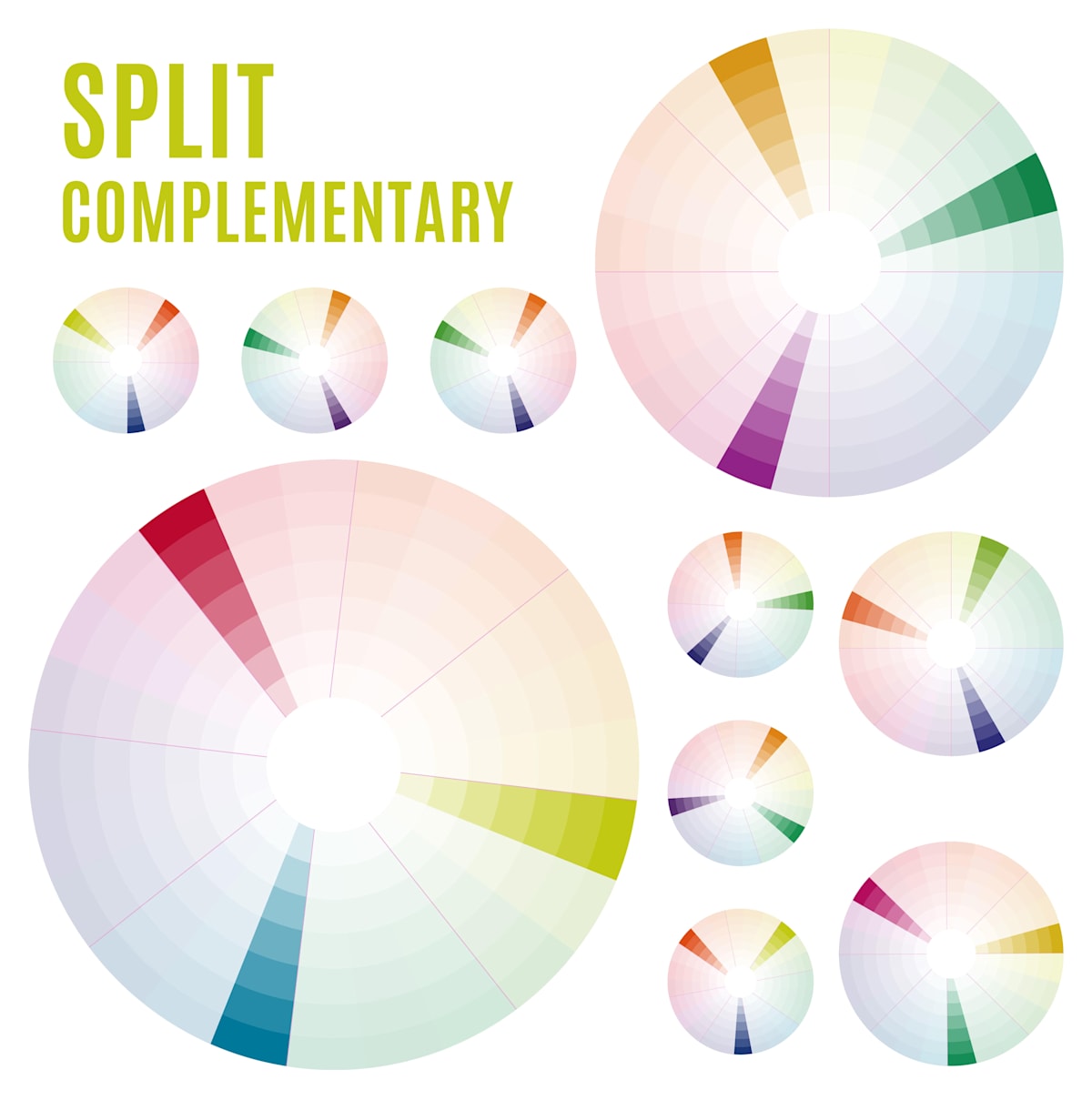
A split complementary scheme consists of one prominent color and the two colors adjacent to the complementary color. This results in a more diversified color palette than a complementary color scheme while maintaining the benefits of contrasting colors.
The split complementary color scheme can be hard to balance since the colors used all create contrast — similar to the complementary scheme.
Also, you should know that the split complementary color model has both positive and negative aspects. The upside is that you can use any two colors in the scheme and achieve great contrast.
However, the drawback is that it might be difficult to establish the proper balance between the colors. As a result, you may need to experiment with this a little more to achieve the ideal balance of contrast.
Brands such as Fanta and Mozilla utilize split complementary colors.
Analogous Colors
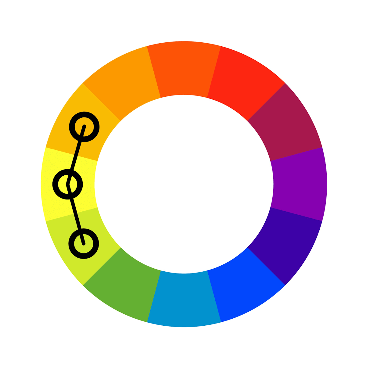
Analogous colors are colors that are next to each other on a color wheel. Let's use green as an example. Blue-green is to the left of green. Yellow-green is located to the right of green. As a result, blue-green, green, and yellow-green are considered analogous colors.
No single color demands our attention. Instead, our eyes can seamlessly follow each hue as it changes to the next.
If you wish to utilize a five-color scheme instead of only three, you may add two more colors located next to the two outer colors.
This color scheme works well for generating warm colors (red, orange, and yellow) or cool colors (purple, blue, and green) palettes.
Analogous color combinations can be seen in the brand colors of PayPal, Mastercard, and BP, for example.
Triadic Colors
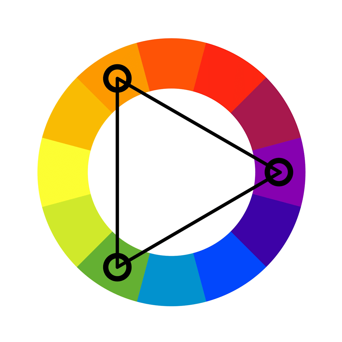
The triadic color scheme is illustrated by a triangle rotating through the color wheel. If we start with green again as an example, we can draw a line that moves away from it at an approximately 90-degree angle. This would link green with violet. Then we'd draw a straight line from violet to the opposite side. This would link violet with orange.
Then we may draw a straight line from orange back to our starting point at green. This would result in the formation of a triangle within the color wheel.
Triadic schemes can be useful for creating high contrast between each hue in a design, but they can also appear overwhelming if all of your colors are selected on the same point in a line around the color wheel.
When considering a triadic color combo for your brand colors, consider choosing one base hue and using the others as accent colors, or simply downplay the other two hues by selecting softer tints of the same colors.
Burger King, Tide, and Toy Story are all examples of brands using a triadic color scheme.
Tetradic Colors (Rectangle)
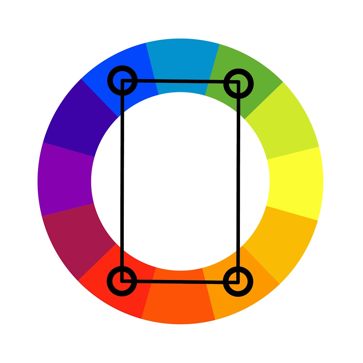
A tetradic color scheme is similar to a triadic color system. The key difference is that we're forming a rectangle on the color wheel, instead of a triangle. Using the example of green again, we can draw a straight line to orange. Then, on the other side of the wheel, we'd like a line of identical length. Then we'd connect the two with shorter lines.
This would connect green and orange on one of the longer lines. The longer line on the opposite side would link red and blue. The smaller lines would alternate between blue and green, and red and orange.
The biggest difference between this color combination and previous ones is the sheer number of colors to contend with. Four color selections give your brand color palette a much wider range of hues and tints to contemplate.
It's recommended to choose one of the four colors to be the main color in your design. Balance is also required to guarantee that the emotional impact of the color selections is consistent.
Tetradic color combinations can be seen in brands such as Google, eBay, Slack, and Microsoft.
Square colors
A square color scheme is quite similar to a tetradic scheme. We simply connect colors on the color wheel using a square shape instead of a rectangle. Going back to the color green, for example, a square color scheme using this color would also involve the colors green, red, blue-violet, and yellow-orange.
It’s recommended to implement a square color scheme in the same manner as a tetradic scheme. This involves selecting one of the four colors to serve as the foundation for the remainder of the color scheme. It's also a good idea to achieve a balance in the representation of warm and cool colors. Accenting warm over cool or cool over warm allows you to tailor the emotional resonance of your brand's palette with your target audience.
Inside Out, Visme, and sprinklr are just three examples of brands using a square color palette in their logos.
Monochromatic Colors
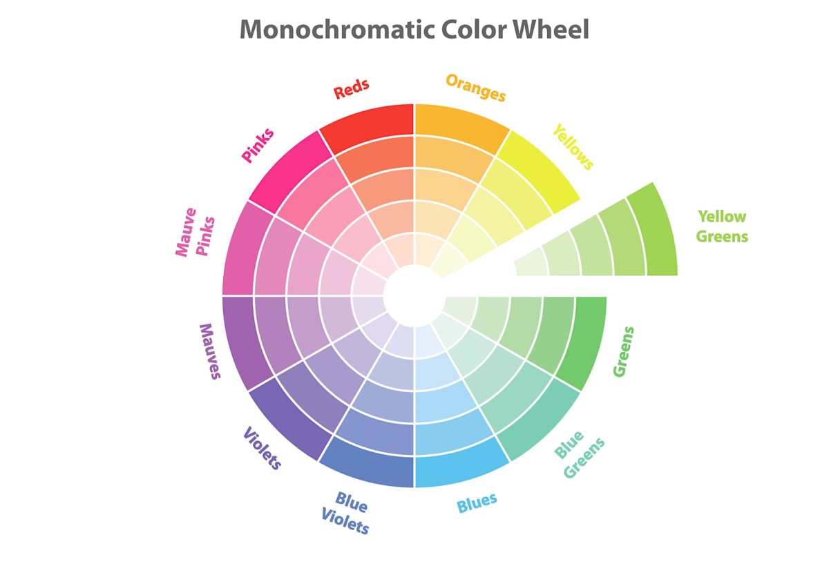
A monochromatic color scheme, unlike the other color combinations, begins and ends with a single color. Monochromatic color schemes utilize color with varied tints and shades to create a cohesive look and feel.
Despite the absence of color contrast, monochromatic color combinations typically appear clean and polished. It also lets you easily adjust the darkness and brightness of your colors.
Monochromatic color combinations can be seen in the branding of Sprout Social, Spotify, and Hello Fresh.
How to choose a color scheme for your brand
Now that you’ve learned the seven different formulas for a successful color palette, it’s time to decide which color combination is right for your brand.
Determine your personality
It’s crucial to understand color theory and the color meanings in business. This includes the ways certain colors evoke an emotional response, as people associate certain colors with specific thoughts and feelings.
Start by using color psychology to determine the primary and secondary personality traits or messages you want to convey to your audience about your brand. For example, if you sell makeup aimed at young women, you might settle on the color light pink (representing femininity, romance, and youth) as your dominant color.
Find color inspiration
Although a brand’s color scheme should be very relevant to what it is and what it does, color trends can still inspire a particular shade of a color and help its branding to remain modern.
When it comes to trending color combinations, brands can look to the Pantone Color of the Year to see what shades are most influential in our current era. For example, in 2022, Pantone nominated PANTONE 18-1750, or Viva Magenta, as Color of the Year, because the shade’s eye-catching presence invokes the forces of nature and helps build personal inner strength.
Work out your color combinations
Then, simply work out additional and potential color combinations using the seven color scheme formulas. A complementary color scheme, for example, results in pink and green, whereas an analogous combination results in pink and red or pink and violet.
Don’t be afraid to take your time experimenting and visualizing colors next to one another to get this right. Color palette generator apps like Adobe Color and Canva help you map out each different palette so you can compare and contrast them.
You can also work with AI tools to play around with different color combinations. Use an AI art prompt in a tool like DALLE to generate a logo based on your color schemes. You don’t need to use the logo it gives you, but you can see how the colors will look in real life.
Decide on your color palette
You can then determine not only which one looks best, but also which one most effectively conveys what your brand is, what it is you do, and who you’re targeting—in relation to color theory.
Finalizing your band color palette
Now that you've learned how to select the ideal combination of colors for your brand style, you're ready to finalize your palette and successfully use it in all elements of your business—beginning with your logo design.
Thankfully, designing the perfect logo that adheres to your unique brand color scheme doesn’t have to be tricky. Fiverr’s Logo Maker is a helpful tool that uses powerful artificial intelligence (AI) technology to create logo fonts, designs, and colors that best fit your brand—all with a few clicks.
Create a custom logo for your brand with Fiverr Logo Maker or hire a freelance logo designer expert.
Related Guides


Melanie Clarke is a freelance writer based in Sydney, Australia. She has obtained university degrees in both creative arts and journalism and possesses over a decade of experience in creating educational online content. She is particularly passionate about helping small business owners learn about the intricacies of graphic design and branding.
