7 Principles of Design (+ How to Use Them)
Want to level up your design game? Here’s how to apply the principles of design to your next project, and how AI can help.
 June 10, 2023
 12 minute reading
The principles of design are a set of fundamental recommendations designers adhere to create balanced, effective, and visually pleasing designs.
Graphic design serves an important role in the way consumers interact with, perceive, and experience your brand, so it’s vital that you not only understand the practice but also embrace it within your business.
Here’s the thing though: Unless you’re familiar with the principles of design and how to use them correctly, then your graphic design efforts will fall short.
We’ve created this helpful guide to teach you everything you need to know about good design principles and how to use them.
The 7 principles of design (+ examples)

mijalzagier is a freelance logo, packaging and brand designer on Fiverr, with over 14 years of experience in the field. She has a deep passion for her job and consistently delivers beautiful and effective designs.
Connect with seller
1. Emphasis
Emphasis places importance, prominence, or value on specific design elements. It works by making a particular element stand out.
Emphasis draws your eye to a specific focal point, then leads it to the rest of the design. It’s the bold headline on a newspaper, the bright red Sale sign in a store.
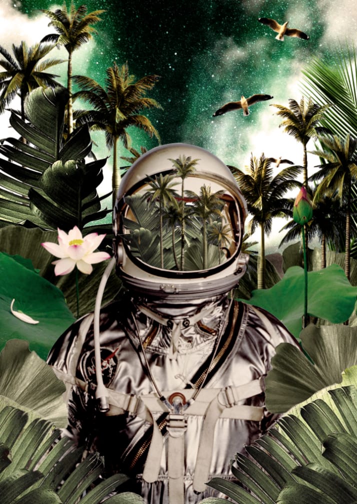
The image below represents great design using emphasis. Notice how your eye attracts first to the center of the helmet, then pushes you to explore different visual elements (the flowers, the birds) throughout the image.
To use emphasis:
Ask yourself, "What is the most vital piece of information your audience needs to know?" This should have the most emphasis placed on it in the design.
Create an outline of the design in your mind, allowing your brain to organize the information in the hierarchical way it sees fit.
Lay out your graphic design to visually convey this order, based on your mental design.
Consider utilizing elements of design, such as placing the information you wish to emphasize the most in the center, making it the largest component of the design, using a bold and eye-catching font, or using an attention-grabbing or contrasting color.
2. Balance and alignment
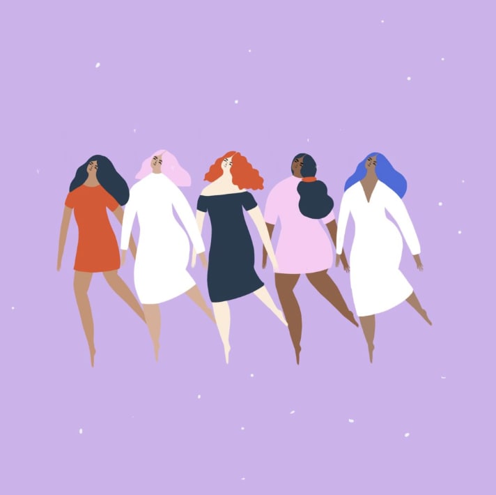
Balance creates a feeling of equilibrium. It’s all about equalizing the visual weight of elements in a design. Think of it like a seesaw; you need to distribute elements to create a sense of stability, like in the image below.
There are two types of balance:
Symmetrical balance, also known as formal balance, is when elements are mirrored on either side of a central line, or around a central point. It’s like a butterfly with its identical wings. This type of balance often brings about feelings of stability, formality, and orderliness.
Asymmetrical balance, also known as informal balance, works by balancing various elements with different visual weights. With asymmetry, the sides are not identical, but the resulting composition is still balanced. Asymmetrical balance tends to create a feeling of modernity, dynamism, and interest.
Here are some tips on using balance and alignment:
Keep in mind that each individual design element placed within your piece carries its own weight, whether it be in the form of size, color, texture, or something else.
To keep your design balanced, you must focus on having an even alignment. In other words, don’t cram all of the design elements in one area, but rather, space them out in a way that is pleasing to the eye.
Utilize symmetry to create a design that features equally weighted design elements that are in alignment with each other.
Alternatively, embrace asymmetrical design by grouping elements with contrasting weights, such as one large piece of text with multiple smaller pieces of text. While it isn’t symmetrical, it still has balance.
3. Contrast
Contrast is one of the basic principles of design that can greatly enhance the impact of your work. It refers to the arrangement of opposing elements (such as colors, shapes, sizes, or textures) to create visual interest or intrigue.
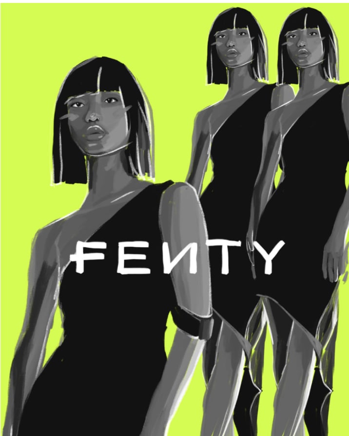
It’s the striking difference between two elements. Think of a smooth circle surrounded by rough squares, a small object next to a large one, a bright background with dark objects, as seen below.
Here’s how to use contrast in the design process:
Contrast allows a design element to “jump off the page” and is best used for parts of the design you wish to remain memorable.
Contrast also creates a difference between elements, which can give them the space they need to “breathe.”
The background color of your design should vary greatly from the colors of the rest of the elements, as this creates the necessary contrast to ensure the text and graphics are legible.
Contrast is vital to text, as it allows you to signal which pieces of information are the most important to the viewer. This text might be larger, bold, or a different color, for example.
Contrast among the text is most successful when only one or two different, yet complementary, typefaces are used within the design. You might also consider using a single typeface but in two different weights.
4. Repetition
Repetition reinforces some recurring design elements, either by creating a motif or pattern within the design. It creates cohesion and harmony in a design.
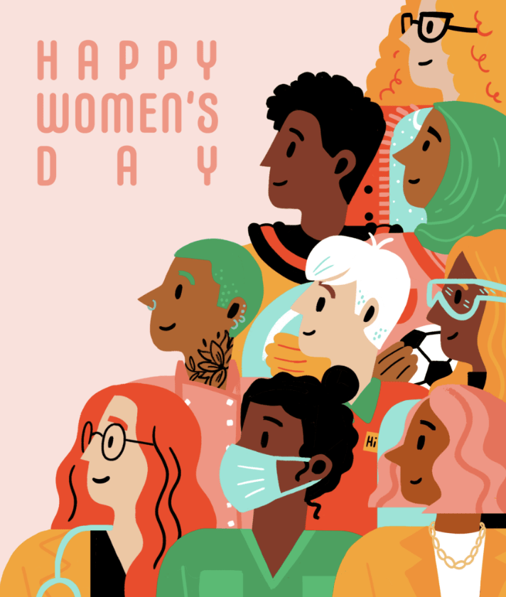
Even though the Happy Women’s Day image has many different colors and elements, the repetition makes it pleasing to the eye.
Here on some tips on using repetition:
Repetition of design elements, such as one or two typefaces or no more than three strong colors, shouldn’t be seen as boring, but rather unifying and strengthening to the overall design.
Random design choices, such as having a single piece of text in a color not seen anywhere else in the design, can seem like an error, as if it is out of place.
Repetition creates a motif, and therefore, puts you in control of the design and what you are conveying to your audience.
The pattern is a great way to incorporate repetition in your design and, currently, beautifully illustrated patterns are on-trend.
Brand identity is another example where repetition in graphic design is necessary. This includes placing your logo on your website, business cards, social media profiles, and more. Additionally, your product packaging design should be repeated across your offering to strengthen your brand identity.
Get designs that make you stand out
5. Proportion
Proportion is about the relationship between the size of one element to another, the space between those elements, or the number of elements used. A well-proportioned design feels right and comfortable to the eye.
As you can see in the work of art below, even though there are many colors and elements, the image is easy to follow. Viewers can perceive a sense of unity through the symmetrical design of the face and the use of colors in different sections.
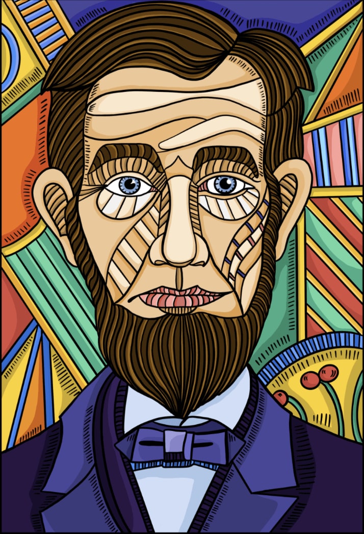
Here’s how to use proportion in your design work:
To get the proportion of your design right, it’s helpful to look at the design in sections, rather than as a whole. Then, determine if each part is balanced on a smaller scale.
When you group smaller yet related elements together, you can give them importance based on their relationship with their surrounding elements. An example would include ticket information on a concert poster, which is often placed inside of a small box at the bottom of the design.
Proportion can be hard to master, as all of the elements of the design must be sized perfectly and set out in a way that is visually pleasing. By mastering principles including contrast, balance, and alignment, however, proportion should naturally be achieved.
6. Movement
Movement is the way your eye travels through the design, guided by lines, shapes, and colors. It’s like a well-choreographed dance, leading the viewer from one point to another seamlessly.
The most important element should lead to the next important one, and so on. The sales image below guides your eye through each section and communicates something different:
There’s a Cyber Monday sale happening.
Here’s your promo code.
Get the sale before it’s over.

To use movement in your next design project:
The positioning of your design elements can create a sense of movement, deliberately guiding the viewer’s eye from one piece of information to the next in the order of importance.
Movement is important in this manner, as it creates the narrative of your design.
To determine if you have successfully utilized movement in your design, glance at it as a whole to determine if your eyes are drawn to a single element, particularly those that are too large, too bold, not in proper alignment, or in a color that doesn’t match the rest of the color palette.
Adjust any element that doesn’t feel right until you finally achieve the level of harmony desired.
7. White space
White space, also known as negative space, is an integral element in design that’s often overlooked. Contrary to its name, white space doesn’t necessarily have to be white; it refers to any unmarked area in a design left free of text or visuals.
White space is like breathing room for the eyes, providing visual rest for the viewer, as you can see in the examples below.
It’s like the silence between the notes in a piece of music, which makes the melody more enjoyable and comprehensible.
Since white space is negative space, it encourages you to look at where you haven’t added elements to the design. In other words, it’s the empty spaces within the design, and is vital for giving your design elements room to breathe.
Use white space to create a visual hierarchy and organize your design successfully. A significant amount of white space around an element tells the viewer it’s important.
White space can also be used to group similar elements together, therefore communicating to the viewer that they’re related.
Finally, white space can be used to create a different image or convey a different message entirely, when used creatively.
Using AI in your visual design
AI has made massive strides in design, offering innovative solutions that are changing the way we create and perceive art.
With AI, you can generate captivating visuals, streamline the design process, and even get assistance with creative prompts.
Here are a few AI art prompt ideas to try:
Brand-related: For instance, “Create an image of a cozy coffee shop with the logo of our brand on the front window.”
Product showcase: For example, “Design an image showcasing our latest range of eco-friendly products in a lush, green environment.”
Event promotion: Such as, “Generate a vibrant, energetic image for our upcoming summer music festival.”
Abstract concepts: Like, “Create an image that visualizes the concept of innovation.”
Seasonal themes: For instance, “Design a warm, festive image for our brand’s holiday season promotions.”
Writing effective AI art prompts requires clear, specific, and detailed instructions. Here are a few tips along with examples:
Be specific: Instead of “Create a business-themed image,” you could say, “Create an image of a modern, bustling office space with diverse employees brainstorming around a table.”
Describe the mood or tone: For example, instead of “Design a holiday-themed image,” say, “Design a cheerful, warm, and festive image of a family opening gifts on Christmas morning.”
Include brand elements: Such as, “Generate an image of a relaxed, comfortable living room setting bathed in the golden, cozy hues of our brand color scheme.”
There are many AI and Midjourney use cases you can leverage for graphic and web design work. If you need extra help on art creation, you can hire an AI prompt engineer through Fiverr.
The bottom line
While learning how to use the principles of design can go a long way in helping you create successful graphics, they should by no means be seen as rules, but rather, as guidelines. After all, some of the most effective and memorable designs have deliberately ignored or broken some of these design principle recommendations.
The trick to manipulating these design principles in a way you see fit is to always ensure the most important information is being communicated in your design, above all else.
You should view the elements of design as many moving parts that are combined to successfully tell a narrative. It’s only once you’re familiar with them and how they work, that you’ll be able to stray from this advice to create your own signature design style.
Explore Fiverr’s professional graphic designers to kick off your next design project.
Principles of design FAQ
What are the 7 principles of design?
There are seven traditional and universal principles of design, which are significant across the industry: emphasis, balance & alignment, contrast, repetition, proportion, movement, and white space.
What is the purpose of principles of design?
The principles of design are important because they create the structure and foundation of a design, helping to communicate messages more effectively, create a professional image, and lead to a better user experience.
What is the principle of balance?
The principle of balance in design refers to the equal distribution of visual weight in a composition. It could be symmetrical, with elements mirrored around a central axis, or asymmetrical, with different elements of varying visual weight achieving a sense of balance.
What are 4 examples of principles of design?
Four examples of design principles include contrast, which uses opposing elements to create visual interest; repetition, which uses recurring elements to create consistency; movement, which guides the viewer’s eye through the design; and proportion, which deals with the size relationship between elements in a design.
Related Guides
")


About author
Michael Keenan Content writer and strategist
Michael is a marketer and entrepreneur living in Guadalajara, Mexico. Through storytelling and data-driven content, his focus is on providing valuable insight and advice on issues that readers care about most.
