How to make your homepage design stand out
A beginner's guide to website homepage design
 May 3, 2021
 8 minute reading
A brand's online presence will influence whether they sink or swim. Your business's homepage is one of your most important assets, as it's responsible for setting a great first impression and converting visitors into leads.
What many business owners don't realize is that unless your homepage follows a strict set of instructions in regards to design and user experience, then it's unlikely it'll ever hit the mark. You've worked so hard to build your brand, so don't let this one hurdle stop you from achieving the success you deserve.
We've created this helpful, in-depth guide to teach you everything you need to know about what makes a successful website homepage design. Keep reading to find out how you, too, can turn your website's welcome page into your best business asset yet.
Website homepage design
What makes a good website homepage design?
The design of your home page is vital, as it’s your chance to provide visitors with the best first impression of who you are and what you do. To be successful, an effective website homepage design should contain the following 10 elements.
1. Communicates "Who I am," "What I do," and/or "What can you (the visitor) do here."
When a visitor lands on your home page, you want them to feel like they’ve arrived at the “right place.” Therefore, it’s important for your home page to provide information about who you are as a company, what you do, and how you and your site can benefit those visiting it.
If a visitor can’t identify this information about you within just seconds of landing on your home page, chances are they'll bounce. This means they'll leave your website without taking further action, such as clicking on links or viewing other pages.
The overall percentage of visitors who do this is tracked by Google Analytics and referred to as your bounce rate. The average website bounce rate falls between 26% and 70%. A higher bounce rate is a red flag that your content isn't targeted to your viewers' wants and needs, causing them to promptly leave.
2. Resonates with your target personas
You don’t want a home page that appeals to everyone. Instead, you’ll benefit from designing a website home page that is narrowly focused on serving your target audience. These are the specific group of consumers who you’ve identified as the best recipients of your products or services.
To do this, eliminate any ‘fluff’ by avoiding corporate jargon and speaking to your target audience in the everyday language they know best.
3. Communicates a compelling value proposition
Your value proposition is the value you promise to provide visitors with if they choose to engage with your home page. You don’t want your target audience to instantly click away from your website to find what they’re looking for on a competitor’s site. Therefore, you’ll want to provide content that satisfies their wants and needs and compels them to stick around.
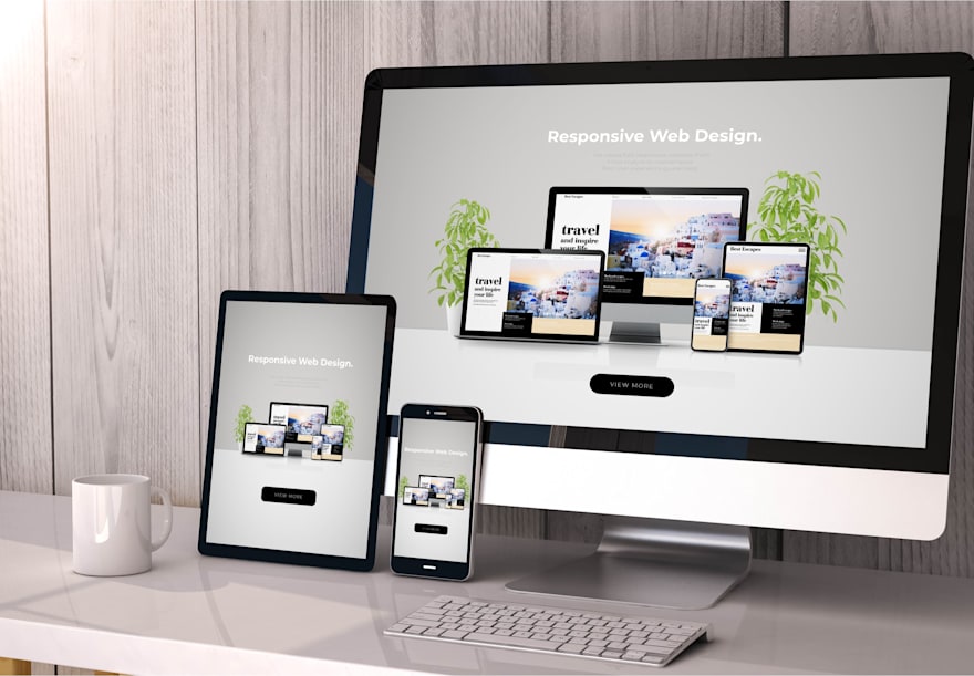
4. The layout is optimized for multiple devices
If you’ve ever found yourself perusing a home page with flash banners, animations, or pop-ups that get in the way of browsing, then you’ll know just how annoying it is to view a website that’s not optimized for different devices.
Keep in mind that mobile accounts for approximately 50% of web traffic worldwide, so it’s vital that your home page is optimized for both desktop and mobile web browsing.
5. Integrates the right calls-to-action (CTAs)
When designing a home page, it’s also crucial for you to think about how you can use calls-to-action to prompt visitors to take the desired next step — whether it’s to ‘Sign up,’ ‘Request a demo,’ ‘Learn more,’ or ‘Buy now,’ for example.
After all, the important role of any home page is to encourage visitors to engage on a deeper level with what you have to offer. A home page shouldn’t act as a simple, informational brochure. Rather, it should be designed as a lead-generating machine that incorporates both primary and secondary CTAs to ensure the visitor doesn’t feel lost or overwhelmed by choice.
6. The layout design is always changing
It’s simply not enough to set up a home page and then let it remain the same for several years to come. The best home pages are constantly evolving and adapting to their target audience’s needs, obstacles, and queries.
Some home pages also utilize A/B testing or dynamic content to ensure their design and content appeal to each individual viewer.
7. Employs great overall design
A well-designed home page doesn’t just look good, but also instills trust within the viewer, communicates your value proposition, and compels visitors to take the next logical step in engaging with your company.
There are several design elements a home page embraces to achieve great overall design, including:
Layout
CTA design and placement
Whitespace
Color
Typography
8. Employs an appealing color palette
Color plays a significant role in the design of a home page, as it can be used to prompt particular thoughts or feelings in your viewer. Designers take elements such as human optical ability, mindset, culture, and more into account to determine the best colors to impact how the viewer behaves. For example, a red CTA button against a white background conveys alertness and immediacy.
A brand’s color palette can also be used on a home page to boost brand recognition and support your brand’s philosophy. Furthermore, color helps us to process and store images more effectively than black and white images, allowing your brand’s home page to be more memorable and authoritative.
9. Uses typography effectively
Using just 1-2 different fonts in your welcome page design helps to maintain consistency, especially if those fonts are part of your brand’s style guide. Additionally, it prevents the page from becoming overwhelming and positively impacts the readability of the website, thus creating a positive user experience.
11. Includes captivating imagery
We’ve all heard the saying “a picture tells a thousand words,” and this is particularly true in homepage design. Imagery can not only visually explain a difficult concept much more easily than text, but also attract and maintain a viewer’s attention. This is because colored visuals increase a person’s desire to read content by 80%. Additionally, the human brain processes visuals 60,000 times faster than text, making imagery a great way to immediately differentiate your product from the competition.
The benefits of a well-designed homepage
Now that you know which elements contribute to a successful homepage design, let’s delve into the benefits a well-designed homepage can have for your brand.
Helps your target audience get to know your business
Remember how we mentioned your homepage should create the best first impression of your brand? Embrace this benefit by ensuring your welcome page provides all of the necessary information for someone to instantly get to know who you are. This includes:
Your values
Your purpose
What you provide
What sets you apart from your competitors
Keep this information succinct, yet effective. If viewers want to learn more, allow them to then click through to the relevant sub-pages.
Improves the user experience on your website
User experience simply refers to how people interact with your product, service, or system. It places emphasis on a user’s opinions on functionality, ease of use, and effectiveness.
One key thing to remember is that when a user lands on your home page, they are there with a clear purpose — whether it’s to learn more about your products or services, read your articles, or accept an offering. You want your home page to flow easily and meet their needs. One of the most effective ways to improve this user experience is through intuitive navigation.
Accrues more conversions
Think about what actions you want visitors to take when they land on your homepage. Is it to sign up for your email newsletter, for example? If you have a prominent and pleasing sign-up form on your page, then it’s likely you’ll have many conversions.
Focus on how you can encourage visitors to take your desired action and move them along in your marketing or sales funnel. Then, design your home page with this key goal in mind to reap the benefits of a highly converting website hub.
Improves brand awareness
Using brand identity elements such as logos, color palettes, and imagery on your homepage further strengthens your brand image and boosts both awareness and recognition for your business.
Additionally, when you feature important website links and calls-to-action, your visitors will instantly attach that usability and the enjoyable experience they have with your brand.
Provides easy navigation throughout the entire website
When a homepage provides just a few well-intentioned choices for the viewer, along with enticing CTAs, it compels them to delve deeper into the website as a whole. This is also why simple and self-explanatory navigation is necessary on your site. Unless a viewer can immediately decide where they want to go and what they have to do on your homepage to navigate there, you risk them bouncing.
Encourages users to share your website with others
Having a well-designed and user-friendly homepage can also reap benefits for your site’s shareability and organic SEO, as visitors will naturally want to share it with others. Not only does this further increase the number of new viewers visiting your website, but also the number of possible conversions your CTAs might have.
How to design a website homepage that works
There are several steps involved in designing an effective homepage layout. We’ve broken each of these down for you to make the process easier.
Step 1. Write strong headlines
The first step to writing a strong headline is to put yourself in your target audience’s shoes.
What would impress them?
What language do they use?
What words would connect with them and compel them to continue browsing your website?
The key to an effective headline is to use powerful words. These are words that are so persuasive, they trigger a psychological or emotional response in the reader. Examples include “powerfully effective” and “world’s best.”
While they might not sound too powerful on their own, when these words are placed in a concise and emotive headline, they’re incredibly efficient.
When using powerful words, focus on appealing to your target consumer’s emotions, conveying credibility and authority, or stating your value proposition.
Step 2. Think and keep it simple
When designing your home page, don’t fall into the trap of thinking that by providing too many options for your viewer, you’ll keep them on your site longer. According to Hick’s Law, the more choices you present your users with, the longer it will take them to reach a decision. This ultimately leads to frustration, causing them to leave your homepage altogether.
Instead, use menu options on your site that your viewers will quickly and easily understand. An intuitive and simple menu might include the following options, for example:
About
Contact
Blog
FAQ
Services
Additionally, avoid having too many conflicting CTAs, as you also want to narrow down these conversion choices for visitors. Your home page should have a single, prominent CTA, while others remain smaller or less obvious.
You want your homepage to be eye-catching and attention-grabbing — but not so cluttered with elements that visitors don’t know where to look.
Step 3. Utilize negative space
Negative space, also known as whitespace, serves numerous vital roles on your welcome page.
Firstly, it leaves ample blank space around images and text, giving them the ‘breathing room’ they need to look visually appealing. Along with the visual appeal, this blank space breaks information up into easily digestible chunks, making it more scannable and improving reading comprehension by 20%.
It also helps to visually direct visitors on how to proceed to the next step, which is conversion. This is because negative space is used to demonstrate the visual hierarchy or importance between elements on your page. Increasing the blank space around the CTA button, for example, places more emphasis on it. Therefore, it makes it stand out among the other elements on the home page.
Step 4. Use a big CTA phrase that makes sense and conveys value
A highly converting home page design is one that is built around the actions you want your visitors to take. Think of it as a roadmap that directs your visitor from their initial landing (Point A) to your desired conversion (Point B).
This is why your CTA button is so important, as it’s the most obvious invitation you can offer to visitors to prompt them on what the next logical step is.
Use a distinctive color that allows it to stand out from the rest of your page’s elements, and ensure it’s large enough to make an impact, yet not so large that it takes up too much of the page.
Along with your CTA button’s design, you’ll also want to pay attention to the call-to-action itself. Write something that’s captivating and too irresistible to pass up. For example, instead of ‘Sign up now,’ try ‘Sign up now to get your free eBook.’
Step 5. Using the right colors can evoke certain emotions
Statistics show the psychology of color plays a large role in the success of your homepage. Not only do 80% of website visitors think color increases brand recognition, but 85% of consumers cite color as a determining factor in their purchases. This is because certain colors encourage specific emotions or thought patterns among audiences.
Yellow, for example, makes us think of sunshine, happiness, and vitality. Red, on the other hand, is often associated with an alert, danger, or passion. It’s also important to note that colors will have different connotations for different demographics.
Colorpsychology.org is a great resource for learning about each color and the emotions they evoke. Think about the purpose your home page serves and how this can be conveyed through your color palette.
Furthermore, you can look to the color wheel to discover which colors look great together. This includes colors that are:
Contrasting (opposite each other on the wheel)
Harmonious (next to each other on the wheel)
This is also an effective way to ensure any colors you select for your home page don’t clash with your brand’s color palette if you’re introducing new colors.
Step 6. Keep your unique selling proposition above the fold
Above the fold refers to the content you see on your home page before scrolling. This is important real estate on a web page, as more than half your visitors will spend the majority of their time in this section.
As a result, your most important information should be featured above the fold, including your unique selling proposition. If you cannot demonstrate the value you have to offer to your visitor immediately, then unfortunately they won’t feel compelled to stick around.
Step 7. Use large and appealing images
By now, you no doubt understand just how important images are on your homepage, so it makes sense to use ones that are both large and visually appealing!
They should also showcase your brand, products, or services in the best light — especially that all-important main image. This is because users spend an average of 5.94 seconds looking at a homepage’s main image, so ensure it makes a great first impression with both its size and quality.
Step 8. Include trust emblems & social proof elements
Another key to keeping visitors sticking around on your website is to ensure your home page showcases how credible, trustworthy, and authoritative your brand is. The best way you can do this is by including trust emblems and social proof elements.
Trust emblems can include:
Security symbols
Customer logos
Award badges
Membership badges
Certification badges
Press mention logos
Social proof elements can include:
Feedback from satisfied customers
Links to client case studies
Client story videos
Step 9. Keep the menu simple
The trick to creating a homepage menu that complements the user’s experience is to make the most critical menu items visible, yet ensure other sub-pages are also easy to find.
You can do this by creating a topic hierarchy within your menu. Main menu items such as About, Contact, Services, or Products, for example, will also include a submenu featuring related and important pages.
Don’t forget to include a search bar in a prominent position on your homepage too, such as in the top corner, to make it even easier for visitors to find what they’re looking for.
Step 10. Make it clear how to get in touch
Your website homepage acts as the central online hub of your business, so visitors should never find it difficult to contact you or your team. Ensure you have a Contact link within your main menu and list contact information within your page’s footer too. Additionally, you might consider adding a chatbot feature so visitors can have their queries answered in real-time — even if no one is available within your workplace.
Step 11. A/B test different homepage layout elements
A/B testing, also known as split testing, is when you test two versions of a single web page, email, or other forms of marketing collateral to compare how they each perform. This allows you to see what choices are more popular among your target audience, therefore influencing your future marketing or design decisions.
Multiple elements of a homepage can benefit from A/B testing. These include:
Headlines and copywriting: Your headline is one of the most important elements of your homepage, as it’s often the first thing a visitor sees. The copywriting throughout the rest of the page is also vital to test, however, as it impacts conversions. Try A/B testing different power words, paragraph lengths, and positions.
CTAs: Even changing just one word in your CTA can impact your conversion rates. Additionally, design elements such as button color, text color, contrast, size, and shape can alter its performance. When split testing your CTA, ensure you’re only testing one change at a time — no matter how slight.
Images: You can also utilize A/B testing to determine which images you should use on your home page to increase conversions. For example, testing suggests if you have a photo of a person pointing at your headline or CTA button, the image will naturally draw the visitor's attention toward the element.
Social Proof: Showcasing reviews and testimonials on your homepage is also important, but the trick is to find out which social proof, along with how it's designed, helps to boost conversions. Consider A/B testing star ratings against testimonials or videos vs. static images with quotes, for example.
Website homepage design examples
Now that you’ve learned all there is to know about homepage design, it’s time to draw inspiration from some of the most effective homepage examples online. This will help you to see a successful website homepage in action, while also determining what will work best for your own brand and audience.
Airbnb
Why it works:
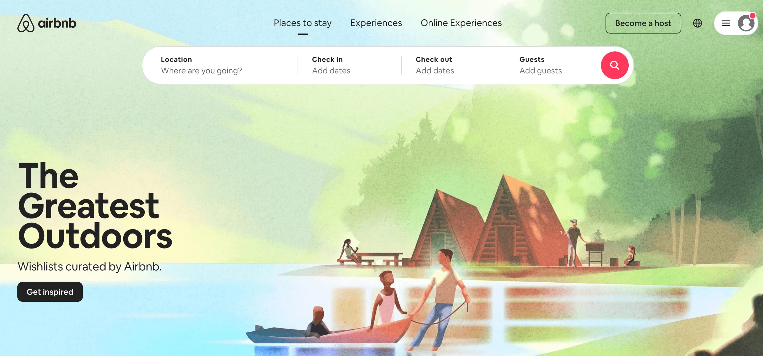
The search form is located prominently above the fold, guiding guests to take the next logical step and search for accommodation. This search form is also intuitive and auto-fills the visitor's last search if they're logged in.
The primary CTA is the Search button, and this uses the color red to stand out among the other elements on the page. The secondary CTA is the “Become a host” link, which is also located above the fold. It blends in with the rest of the page’s color scheme, however, so it doesn’t distract the viewer from the main intended conversion.
The main featured image is large, eye-catching, and on-brand.
Both above and below the fold, you also find suggestions for excursions and getaways to encourage users to spend longer on the site and make additional purchases.
Evernote
Why it works:
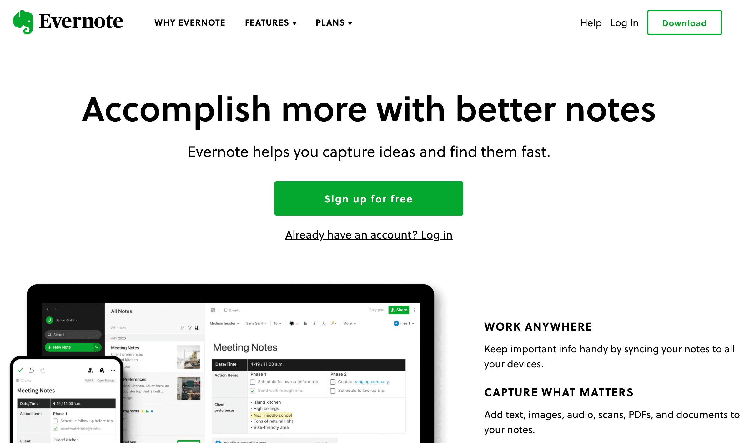
The page starts with a powerful headline, “Accomplish more with better notes,” before quickly summing up what the company does: “Evernote helps you capture ideas and find them fast.”
The prominent, center placement of the CTA button, along with its signature green color, instantly draws the viewer’s eye.
The large feature image showcases the product across both devices.
The page is a great example of effective whitespace, which is not only aesthetically pleasing but also establishes a visual hierarchy and guides our gaze.
A clean and minimal menu at the top of the homepage provides intuitive navigation and doesn’t overwhelm the viewer with clutter.
Below the fold, you can also view social proof in the form of testimonials, as well as trust emblems in the form of well-known client logos.
Ahrefs
Why it works:
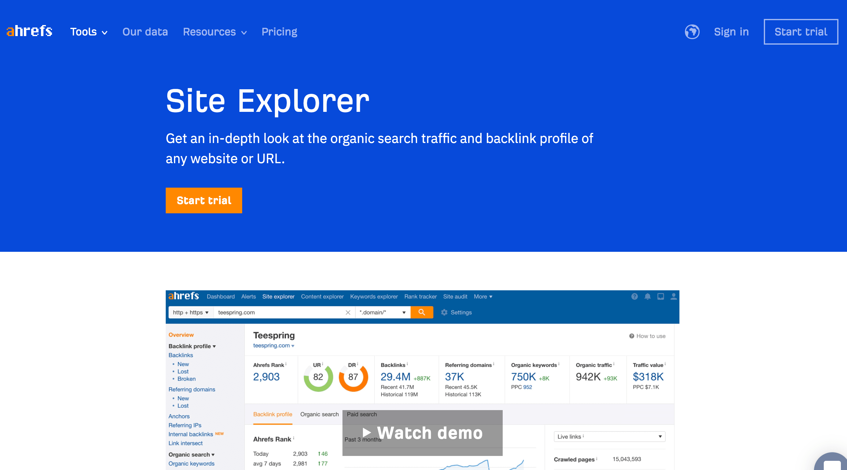
The color palette takes advantage of contrasting, yet complementary colors, including blue, white, and orange.
The primary CTA button is located above the fold and its bright orange color is immediately eye-catching. Additionally, the copy on the CTA button is effective, stating that users can “start a 7-day trial for $7.”
Though the main headline is lengthier than most home pages, it appeals to the company’s target audience by addressing their wants and needs.
Above the fold, you can find social proof in the “number of trials started in the last 7 days,” as well as trust emblems with the included client logos.
Below the fold, a prominent and large demo video showcases the product and its value proposition.
Slack
Why it works:
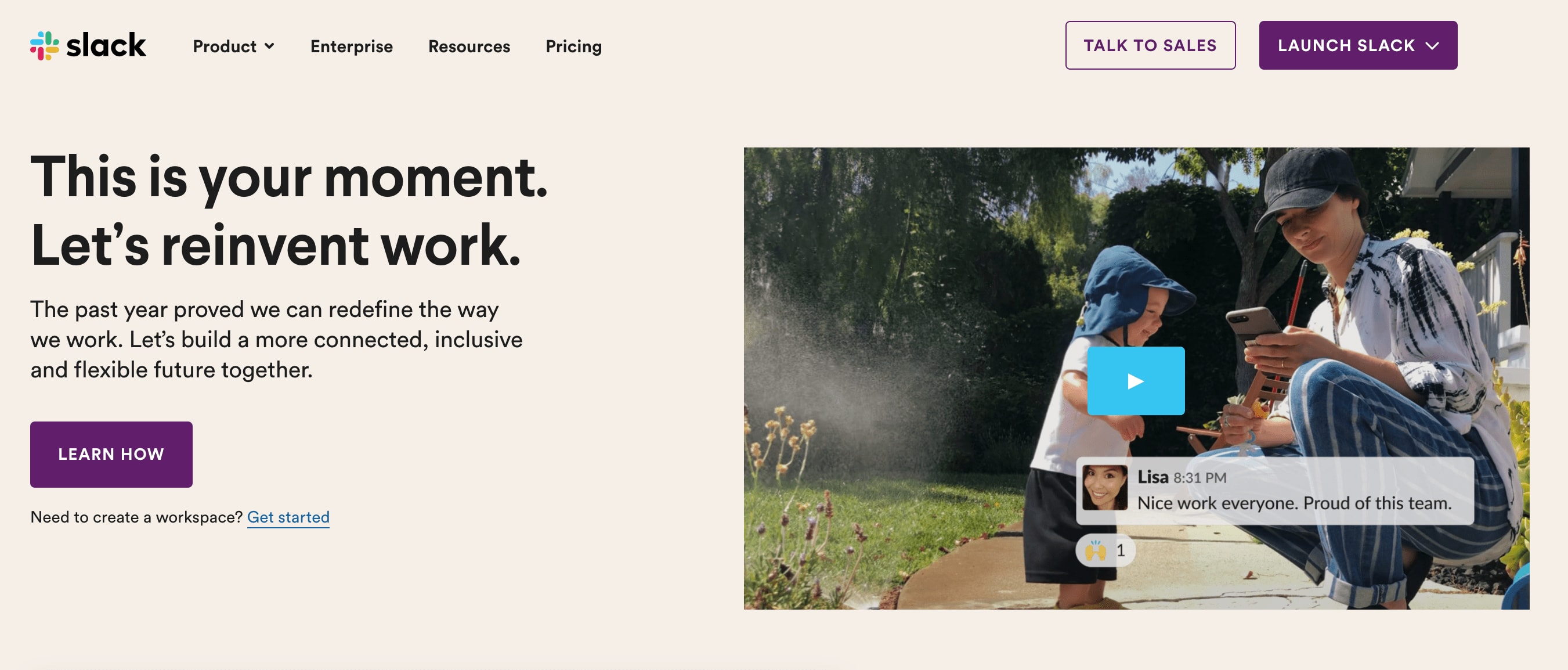
Its main headline, “Slack makes it downright pleasant to work together,” not only communicates how the product benefits users but is also a great example of using specific language to appeal to their target audience.
Above the fold, we can see three CTA buttons, yet they still don’t compete with one another. “Try for free” is the main action the home page wants a visitor to take, while the secondary CTA, “Talk to sales,” is less prominent.
Animated graphics catch our attention and guide our eyes, yet they are subtle enough not to overwhelm or annoy the viewer.
Below the fold, the company showcases statistics and on-brand graphics to establish its trustworthiness.
Large and eye-catching imagery on the right-hand side of the home page demonstrates the product and showcases its value proposition.
How to determine if your homepage design is working or not
While A/B testing is a great way to determine how you can boost your home page’s effectiveness so our website heat maps.
Heat maps use colors on a scale to give an at-a-glance understanding of how users interact with a webpage, including what they click on, scroll through, or disregard. In other words, they help you see the most popular (hot) and unpopular (cold) elements of a webpage, ranging from red through to blue.
There are four different types of heat maps, including:
Scroll maps: which show you how many visitors scroll down to any point on the webpage
Click and touch maps: which show the elements that have been clicked and tapped the most
Move maps: which track where desktop users move their mouse as they navigate the webpage
Desktop and mobile heatmaps: these track the performance of your website on different devices and allow you to compare the results
Using heatmaps, you can determine if visitors are:
Engaging with your most important content or not
Finding and using vital links, such as your CTA, opt-in, buttons, or menu items
Spending too much time interacting with unimportant or non-clickable elements
Experiencing difficulties viewing your home page across different devices
The information you gain from a heat map provides you with the irrefutable data you need to make more informed decisions about A/B testing, technical updates, or the design of your homepage.
Conclusion
Your business's website homepage is one of your most important assets, as it's responsible for setting a great first impression and converting visitors into all-important leads.
Remember, it all starts with understanding the elements that make a good website homepage design, as well as the benefits this provides. Additionally, tracking if visitors like your layout can be extremely beneficial for any adjustments moving forward.
Finally, getting your homepage design just right can be tricky, but armed with the helpful, step-by-step information in this complete guide, you're now well on your way to welcome page success.

