Landing Page Optimization: How to Increase Traffic and Conversions in 2024
The best landing pages have all the right elements. Check out this guide to learn what your landing pages are missing and how to optimize them for conversions.
 November 18, 2023
 13 minute reading
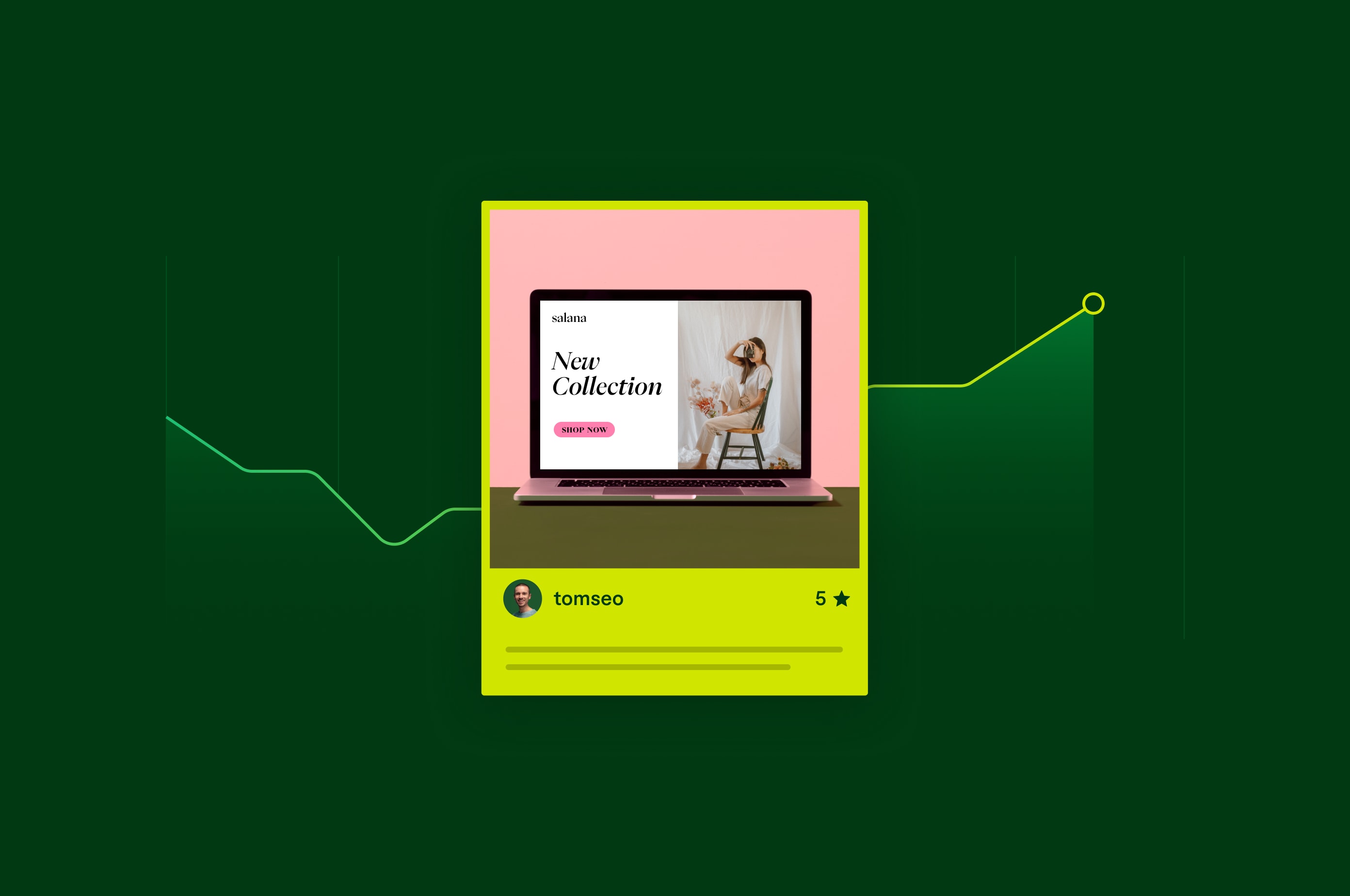
Landing page optimization can mean the difference between a wasted ad budget and a profitable marketing campaign.
But designing effective landing pages is a multi-disciplinary skill that can be challenging for small businesses to carry out efficiently. Landing page optimization requires knowledge of:
Web design
Web development
Graphic design
Search engine optimization (SEO)
Typography
Copywriting
Web analytics
And various sub-fields of the above that can get pretty niche
Fortunately, the basics of landing page optimization will always remain the same. If you can get a grip on these, you'll be well on your way to creating higher-converting landing pages.
What is a landing page?
A landing page is a goal-specific web page designed for maximum conversions. Landing pages are typically low-distraction, highly focused web pages people land on after clicking a link in an email or ad. Landing pages serve a single purpose—to convert website visitors into leads and customers.
What is landing page optimization?
Landing page optimization is the action of improving a landing page’s conversion rate. Conversion optimization refers to the percentage of people who take a desired action on your landing page, such as purchasing a product or signing up for a newsletter. Landing page optimization requires design, writing, testing, and development skills.
If you need help in any of these areas, you can hire Fiverr freelancers to do the work for you.
Tips for increasing traffic and conversions
Place important info above the fold
The fold is the bottom of your screen. Everything "above the fold" refers to the elements users see without scrolling.
Landing pages must include the most important elements above the fold. Secondary info needs to go below the fold.
For example, having your value proposition and call to action (CTA) above the fold ensures visitors know immediately that they’re in the right place and how to take the next step if they’re interested.
Make it focused and to-the-point
High-converting landing pages should be focused annd include the most valuable information. That doesn't mean you must remove everything except the CTA button. But it does mean that the landing page design should have minimal distractions and minimal white space.
In a 2017 study, Google discovered that the more elements a page used, the less likely a conversion became.
Have a specific action in mind that you want the user to take, then design your page to guide the user toward this action. If you’re trying to persuade your target audience to sign up for a webinar, everything on the page should be focused on achieving that goal. Some landing page optimization best practices include:
Large call to action button
Removing menus
Forcing links to open in a new tab instead of navigating away form the current tab
Having exit popups
Including form fields that capture contact information such as phone number
Using contrasting colors
Using design lines to guide attention to the CTA
Additional elements on the page are okay so long as they aren't distracting.
If you struggle with this step, consider hiring a professional designer to help you.

Hyper-focused landing page by travel company Kensington Tours.
Hyper-focused landing page by travel company Kensington Tours.
Mark Pybus, CEO of Creative CX, tells Fiverr about a recent experiment where the landing page wasn’t focused enough:
"[The customer had] a lead generation form where the landing page included lots of texts and multiple CTAs," says Pybus. "Qualitative and quantitative research showed visitors hesitating, abandoning, or spending more time researching before signing up. Our experiments helped identify that a simplified message with a single value proposition, single CTA, and some social proof helped to increase form completion by over 30%."
Ensure message consistency
A good landing page’s message should match the message of the medium that brought the user to that landing page. That medium could be an email, a QR code at an event, or an ad. Use templates if you struggle with consistent language and cater them toward different buyer personas.
If you advertise "10 Top Tips for Baking Pies," but the landing page is about baking cakes, you’ll decrease your conversion rate optimization (CRO).
A bounce is when a user leaves your site without taking any further action.
Make it compelling
"UX Writing" (short for User Experience writing) refers to the landing page copy that helps users understand where they are, how to find what they need, and what they should do next. UX writers work closely with designers to create a landing page that’s focused, compelling, and incites the user to take action.
The specific CTA you choose for your landing page, such as "Try it today" or "Learn more," can profoundly affect how many conversions your landing page achieves.
Part of the UX Writing skill set is communicating your product's compelling benefits without losing the reader.
Here’s an example landing page from Shopify:

Shopify landing page
Shopify landing page
It boasts a simple message of being a global commerce platform, which may entice folks who want to open a store to sell worldwide. There are also visuals of what appears to be Shopify sellers and their dashboards showing an increase in sales (social proof).
Then those who want to learn more can check out the two minute video (short and sweet).
If you struggle with designing a compelling landing page, you can find UX Writing experts on Fiverr to help.
Be convincing
Use social proof to convince visitors of your product's benefits.
Social Proof refers to user reviews and recommendations from past customers. High ratings, gloating testimonials, and impactful case studies about your product can work wonders to increase your conversion level.

Delphi Watersports in Aruba shows off its incredibly positive reviews on its home page as social proof.
Delphi Watersports in Aruba shows off its incredibly positive reviews on its home page as social proof.
If you don't have social proof, you may need to beef up your online marketing efforts to make your product more widely known. Check out our guide for ideas on B2B content marketing strategies.
You could also hire a social media influencer to build brand recognition and drive social interaction for your post. Or create an engaging social media campaign to get people talking about your brand.
Handle page loading speed
Slow loading times are a conversion killer for landing pages. A study by Google revealed that "The probability of bounce rate increases 32% as page load time goes from 1 second to 3 seconds."
Site speed is especially one of the biggest pain points when users visit your website using a mobile data connection. And nearly 60% of all web traffic comes from mobile phones in 2023, according to data from StatCounter. Countless studies show users leave a website that loads too slowly. Many users visit a website from their mobile phones, and their connection speeds might be poor.
Some things you can do to optimize a landing page’s speed include:
Compressing images
Hosting on a faster web server
Combining style files and code (javascript) files
Compressing style and code (javascript) files
Delaying loading non-essential style and code (javascript) files
Sound too technical or time-consuming? Consider hiring a Fiverr web development expert on Fiverr to help.
Make sure it's responsive (device-agnostic)
Finally, landing pages must be optimized across devices. This means taking into account different:
Web browsers, such as Chrome, Safari, Firefox, and Opera
Screen sizes, such as tablets, desktops, phones, and the variations within those categories, including landscape and portrait views
Mobile phone users will see an entirely different layout than a desktop visitor. The UX Writing on a mobile device may also differ because of space considerations.
Wrike, a project management software, did an excellent job designing its responsive landing page.
Here’s the desktop version of its landing page:

Wrike desktop landing page.
Wrike desktop landing page.
And then the mobile version:

And then the mobile version:
The call-to-action button remains prominent in the mobile version, including in this tablet layout:

Wrike tablet version landing page.
Wrike tablet version landing page.
The tablet version even has extra space to display the logos of companies they've worked with (aka social proof).
Do A/B testing
A/B testing, or split testing, is when you build two variants of a landing page and change one thing about it, such as a headline, call to action copy, or CTA button color. You then analyze google analytics and conversion metrics to see which version works best and switch to the one that helps you meet your conversion goals.
For A/B testing to work, you must serve the page to many users, not just a handful. This gives you more insight into user behavior. Lots of data will give you better insight. It’s also critical to continuously test your landing page to improve results.
"Be sure to test, test, and test some more to ensure your optimization efforts are paying off," says Kevin McGrew, CEO and Chief Strategist of Everzocial, a full-service digital marketing agency. "And don't overlook lesser-known tools like Hotjar, Fresh Marketer, and Unbounce—they can be game-changers for taking your landing pages to the next level."
Provide a USP (Unique selling point)
Your landing page should clearly communicate your unique selling point. Shopify defines a USP as "the one thing that makes your business better than the competition."
Given two products, what would make a customer choose yours? A strong USP.
You should show your USP as a large heading on your landing page. Stripe puts its USP in a huge heading on its home page: "Payments infrastructure for the internet."
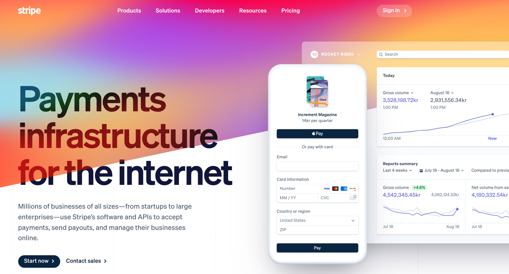
Stripe landing page
Stripe landing page
Zapier's USP is its ability to automate virtually anything. They show this on their landing page by scrolling through the different automations they offer. After a few seconds, it becomes clear that Zapier has a unique service:

Zapier "Automate your possibilities" USP
Zapier "Automate your possibilities" USP
A few challenges exist when coming up with the wording for a USP:
You don't have a USP
You have one but haven't worded it yet
You've worded it, but it's too lengthy
If you don't have a USP, you need to rethink your business. The USP is what will make your potential customers choose you instead of your competitors.
Sometimes, small companies have a USP but haven't figured out how to express it. Or, when they do give it expression, it's too long and wouldn't work on a landing page.
Hiring a UX writer might help you figure out this vital aspect of your landing page.
Use the right hero image
A hero image is a visually prominent image placed above the fold of a webpage that does two things: capture visitors’ attention and convey your brand’s personality.
So, a hero image shouldn't be a random stock photo to make the page "pretty." It needs to serve a purpose that directly aligns with the message of the page.
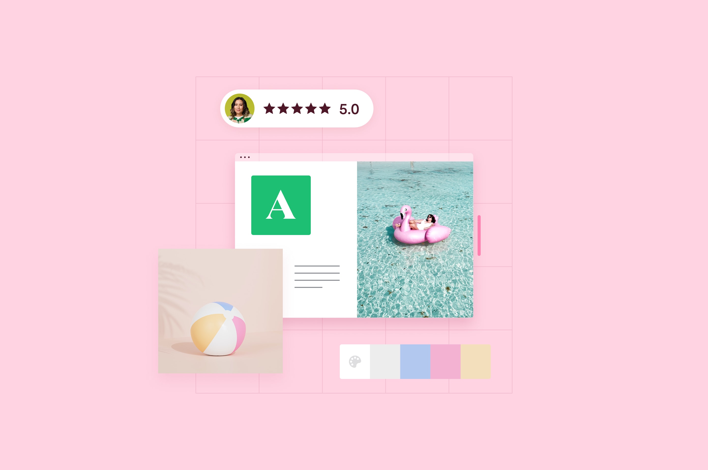
The CIB (Culinary Institute of Barcelona) landing page has a hero image that communicates it caters to cooks, or wannabe chefs:
Culinary Institute of Barcelona landing page.
Culinary Institute of Barcelona landing page.
The call to action (CTA) on this page needs work. "Contact" doesn't entice the user to take an action. Better options might be:
Learn to be a chef today
Apply to be a chef
Even "Schedule a call" would be better.
The music learning website Yousician goes a step further than using a hero image: It embeds a compelling video on the landing page. This is technically challenging to do well, so you may want to consider hiring a web design expert to help with this step.

Yousician landing page
Yousician landing page
Clear CTA (Call-to-Action)
The call to action or CTA is what you want the user to do on your website. It's the action that counts as a "conversion" for the landing page.
The goal of landing page optimization is to improve conversion rates. One way to do this is to use persuasive language. It should also stand out from the rest of the landing page elements, like in this Hotjar example:
Hotjar landing page
Hotjar landing page
Hotjar packs a powerful message into just a few words on its landing page. Their use of "Start free with email" entices you with "free" and tells you that you can get started with just email—no lengthy forms or credit card details needed. This is much better than just using "Start free trial."

IBM Cost of a Data Breach Report 2022 landing page
IBM Cost of a Data Breach Report 2022 landing page
IBM has two CTAs on its 2022 Cost of a Data Breach Report landing page. The first one—"Download the report"—isn't very exciting. But it might serve this particular market which is mostly interested in getting the data it landed here for.
The second CTA, "Detect and respond to threats faster," incorporates certain wording tweaks that pique interest and entice the target audience to learn more. That button leads to one of IBM's security products, with a form for the user to request a demo.
Landing page optimization tools
McGrew of Everzocial recommends the following landing page builder and testing tools when optimizing a landing page:
Mouseflow: Offers heatmaps, visitor recordings, and feedback polls. The free plan lets you store up to 100 recordings and heatmaps.
Optimizely: Has a free plan for A/B testing and optimization for up to 1,000 monthly visitors.
Clicktale: Provides heatmaps, visitor recordings, and user feedback. Their free plan lets you store up to 100 sessions per month.
Carrd: Contains a landing page builder that lets you set up three landing pages with basic features. For more options and features, consider hiring landing page experts on Fiverr to create an optimized landing page for you.
Leadpages: They offer a landing page builder with A/B testing and lead capture forms, with a free trial available.
Hire a Fiverr expert to help with your landing page optimization
Attracting the right people to your ecommerce website is key to improving conversions, whether that’s through organic search or pay-per-click (PPC) ads. But your efforts are meaningless if your landing page fails to convert visitors into buyers.
We get it, you’re busy running a business and don’t have time to A/B test landing pages. And that’s why we recommend working with freelance Fiverr experts in web design, UX Writing, and landing page optimization.
Ready to improve your landing page conversion rates?
Sign up to Fiverr today.
Related Guides


About Author
R. Paulo Delgado Tech & Business Writer
R. Paulo Delgado is a tech and business freelance writer with nearly 17 years of software development experience under his belt, including WordPress programming. He is also a crypto journalist for Moneyweb, and proudly a member of Fiverr's Pro Seller program — hand-vetted professionals, verified by Fiverr for quality and service.
