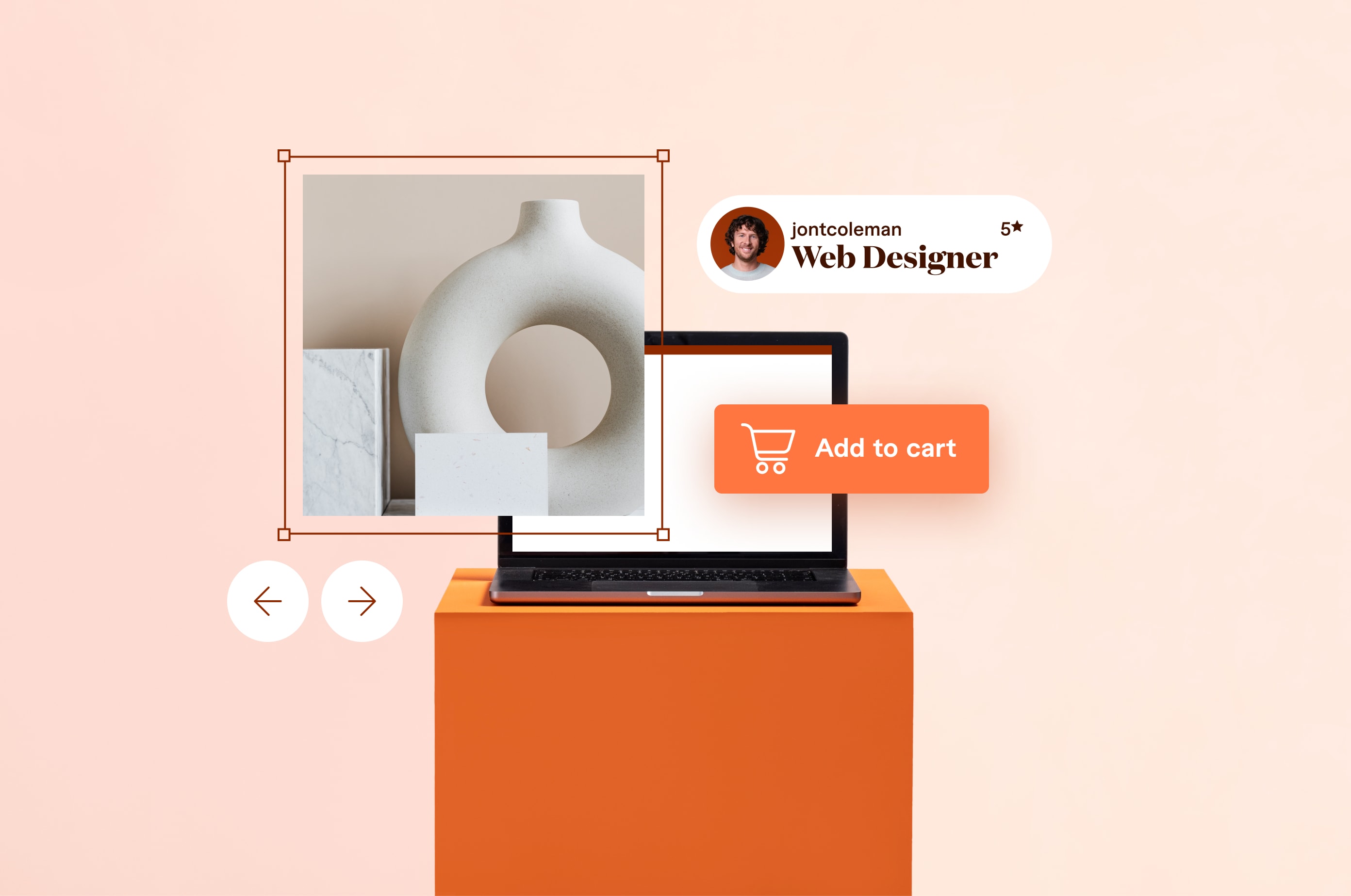
10 Stunning Ecommerce Website Examples to Inspire Your 2024 Design
The best way to learn is by example. We dissect 10 beautiful ecommerce sites and tell you how you can do the same.
 August 21, 2023
 15 minute reading
It’s become easier than ever to create an ecommerce website yourself. But that only makes your competition even tougher.
To truly compete, you first need a profitable ecommerce idea, and then you need to make your website stand out.
Regardless of current ecommerce trends, every successful ecommerce website has certain things in common. This article looks at 10 stunning ecommerce website examples and how they were created. Then we dive into the specific skills and technologies you need to create a similar website.
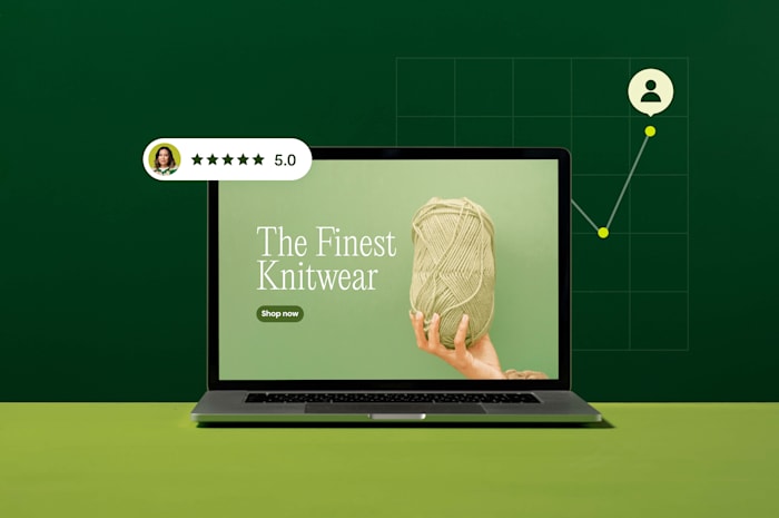
Learning from ecommerce website examples
Sometimes, learning by looking at examples is easier than reading long instructive posts. That’s why we compiled this list of 10 stunning ecommerce website examples to learn from.
In each example, we’ll look at the specific challenges that particular ecommerce store overcame and how you can implement similar functionality on your website.
10 stunning ecommerce website examples
1. Mabel & Moss
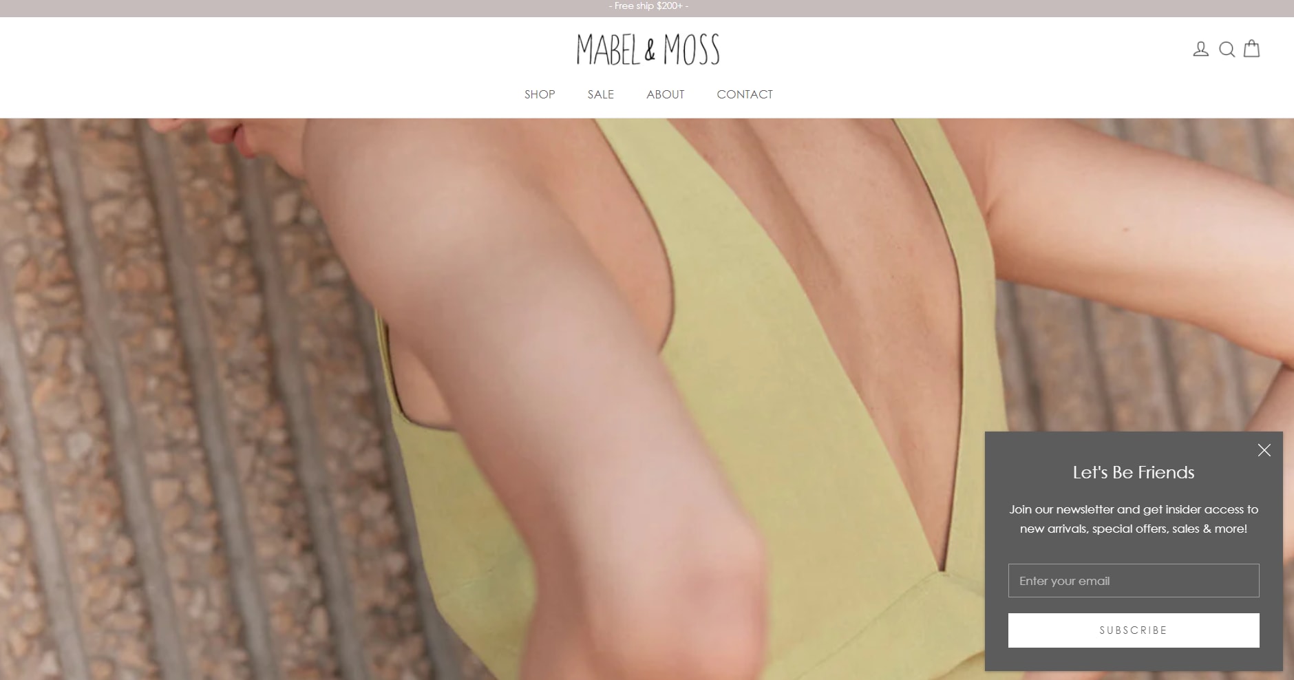
Mabel & Moss
Mabel and Moss provides a curated collection of women’s clothing from new and independent labels. Everything about the site exudes elegance. It uses a minimalist design style and top-quality photographs.
The site also uses gentle animations that give it a dynamic feel, such as the easy zoom-out animation of the hero image on the homepage.
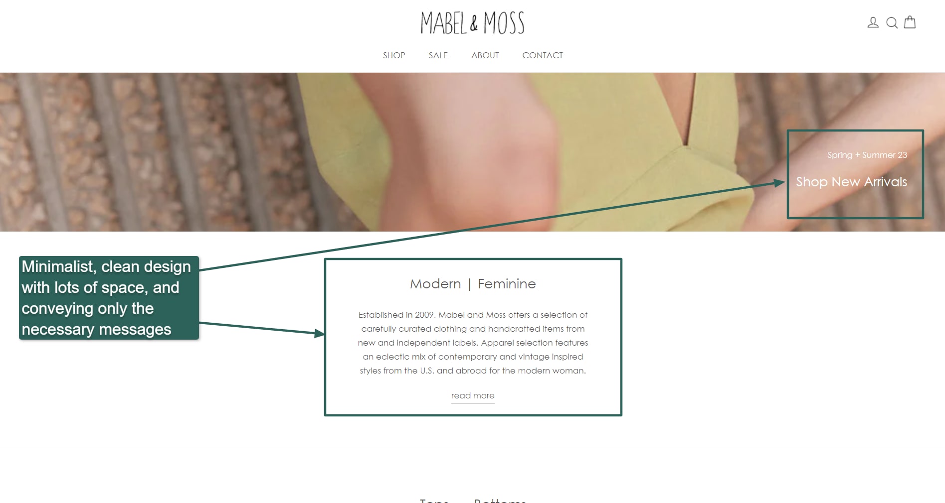
Minimalist design
One problem with many ecommerce sites is they often feel cluttered as companies try to cram as many products as possible onto a single page. Mabel & Moss’s use of white space gives the site’s products room to breathe and makes for a far more comfortable browsing experience.
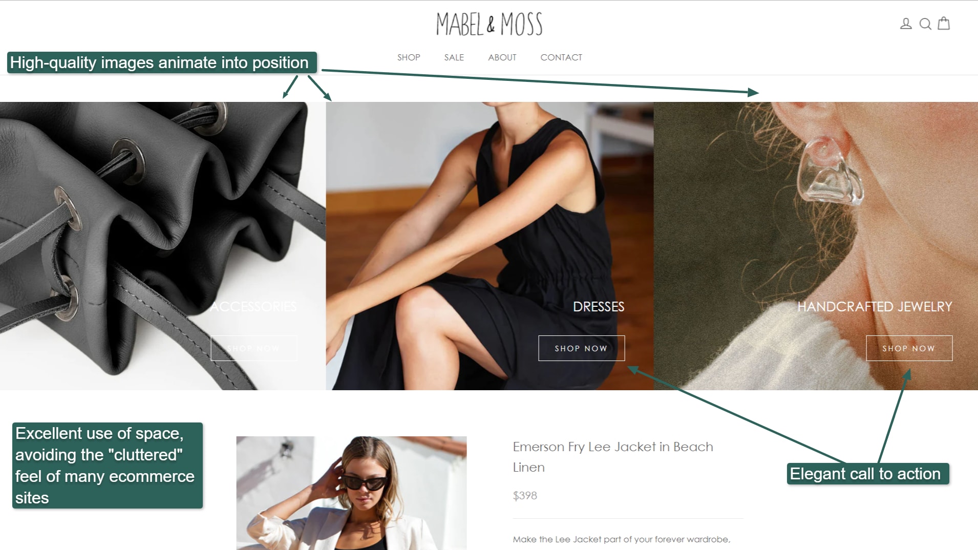
Light animations and top-quality photography throughout the site.
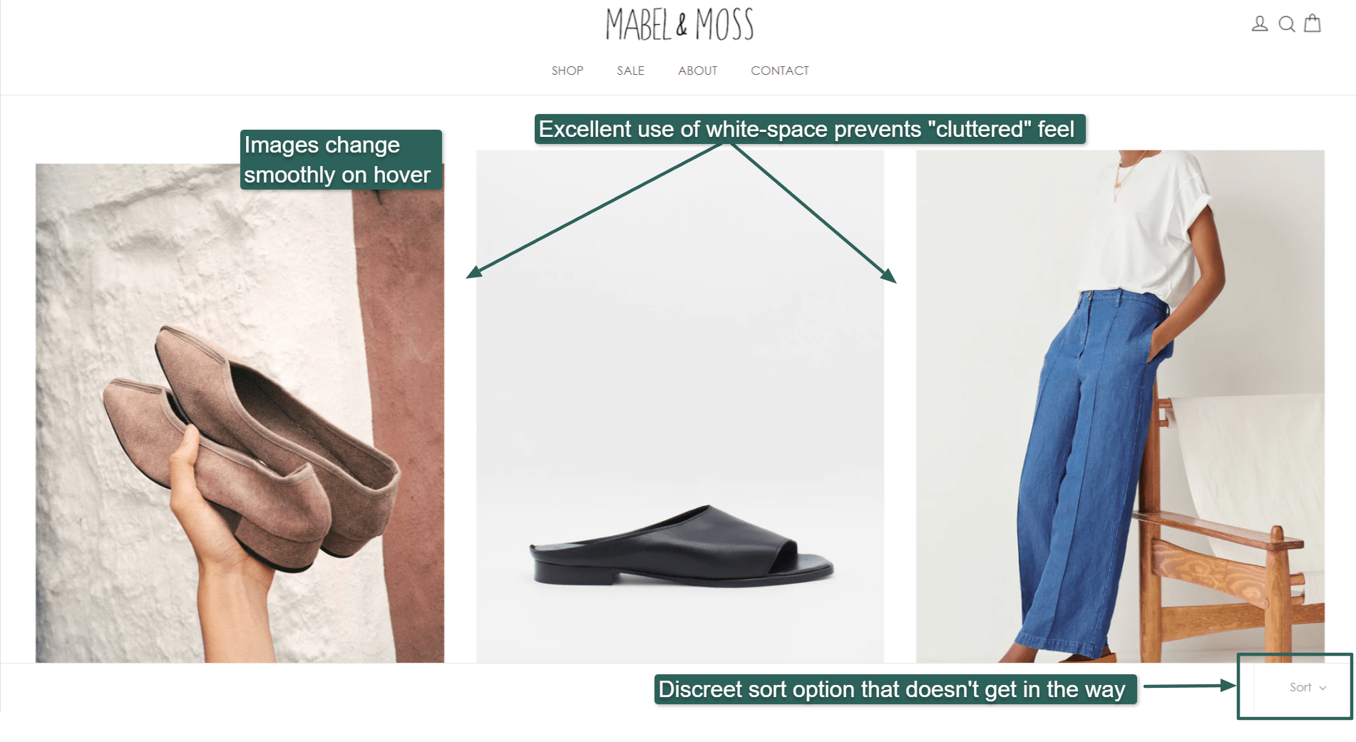
White space throughout the site gives products room to breathe.
When you hover over products, the images change, which adds some dynamism to the site, as opposed to the staid “grocery store shelf” that many ecommerce stores suffer from.
Platform: Shopify
How to do the same:
Mabel & Moss’s site runs on Shopify, so that’s probably the easiest way to emulate all the elements that make this site unique. You can buy Shopify design services on Fiverr to help you if needed.
But you can also emulate aspects of the site without using Shopify. You can hire a professional web designer to help you design a minimalist, elegant site, and Fiverr’s experienced photographer freelancers can help you take exquisite photos for your site.
2. Tannen’s Magic Shop
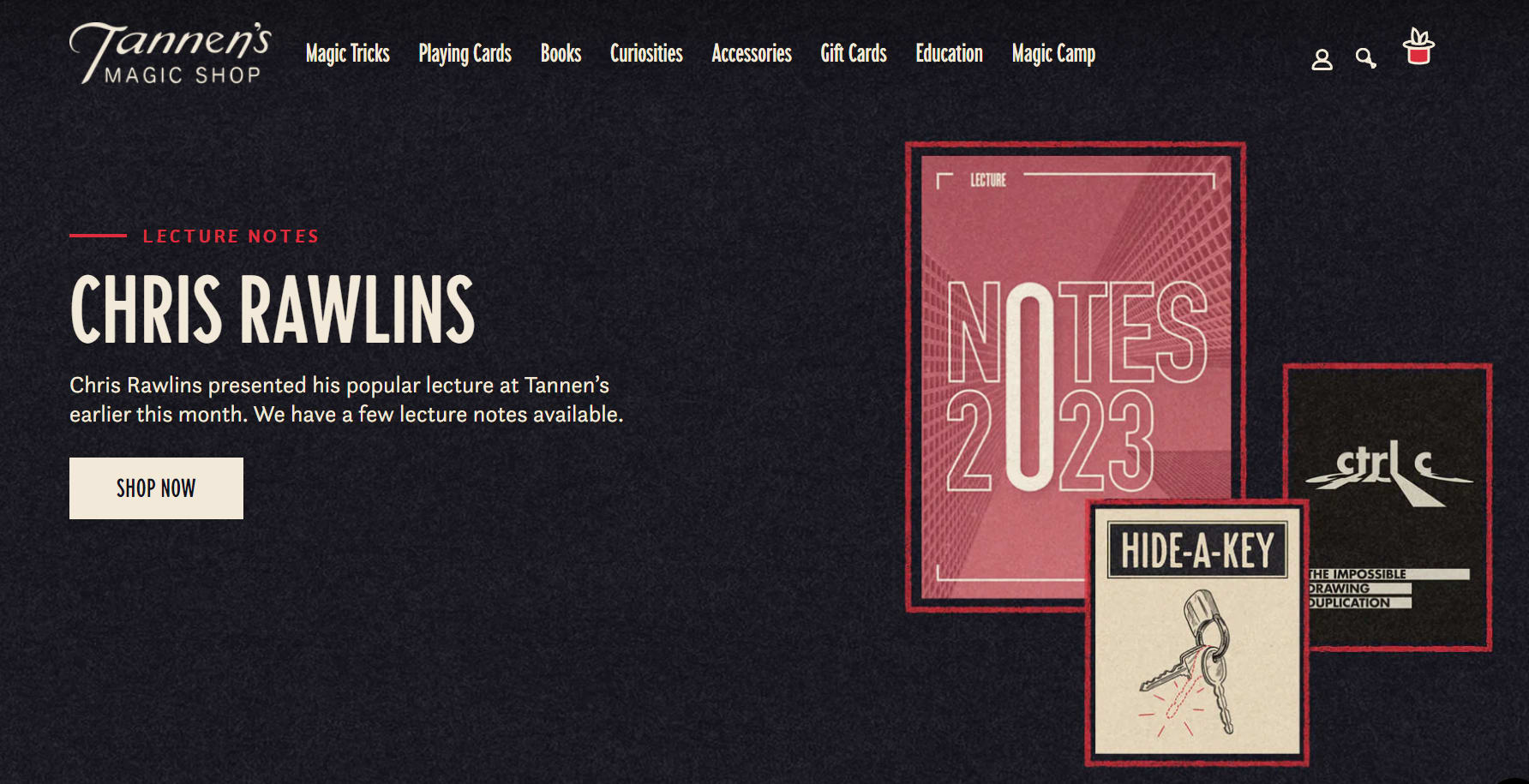
Tannen’s Magic Shop
Tannen’s Magic Shop sells magic supplies. The web developers did an exceptional job in branding the website to give it a magic “feel” throughout.
Excellently branded website.
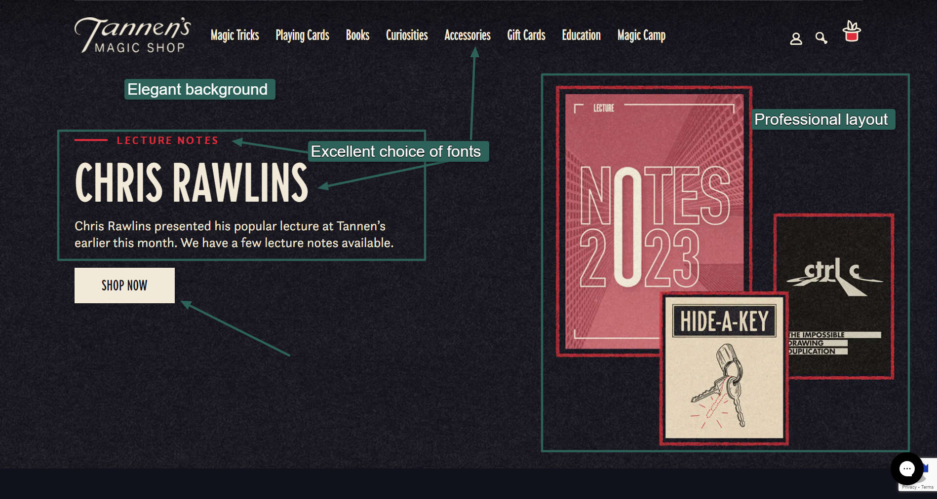
One thing all these ecommerce website examples have in common is the little touches that, together, make the sites stand out. In the case of Tannen Magic Shop, those little touches include the textured background and red border around its homepage images.
The site also uses a lesser-known font for its menu, Carnaby Street, which comes across as a little magical. In some areas, it uses the Questa Sans font, another beautiful, lesser-known font.
Unique product layout
Too often, ecommerce sites just slap a ton of products up on a white background and hope for the best. These bland designs aren’t particularly pleasant to browse and can lead to information overload.
Tannen does an excellent job categorizing its products.
It also uses custom graphics as design elements, such as the left and right arrows shown below. This attention to detail results in an engaging website, keeping the user clicking rather than running off to shop elsewhere.
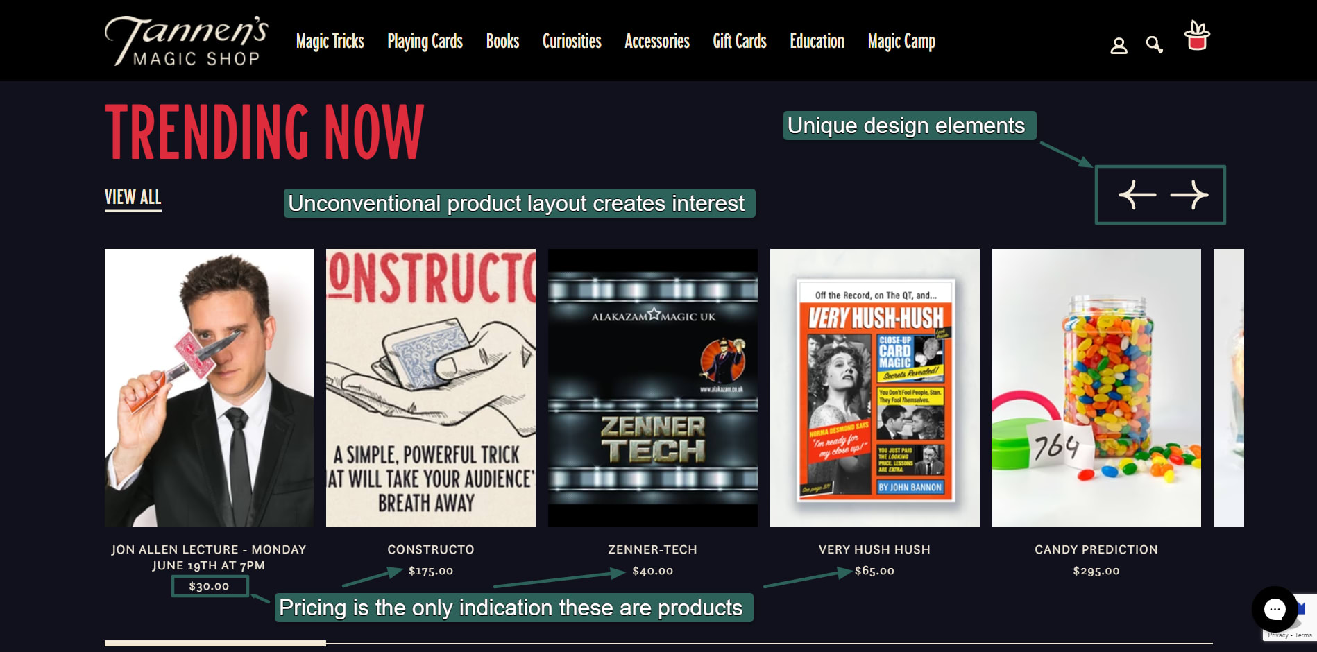
Unique layout for product listings.
Platform: Shopify, possibly with a custom template
How to do the same:
Although Tannen runs on Shopify, its unique template indicates that whoever worked on it has extensive knowledge of graphic design and company branding.
To create the same for your site, hire a branding specialist to incorporate all those little brand details into the site. Tannen also uses exceptional photographs and several custom graphics. You can buy graphics design services and photography services on Fiverr.
3. King Arthur Baking Company
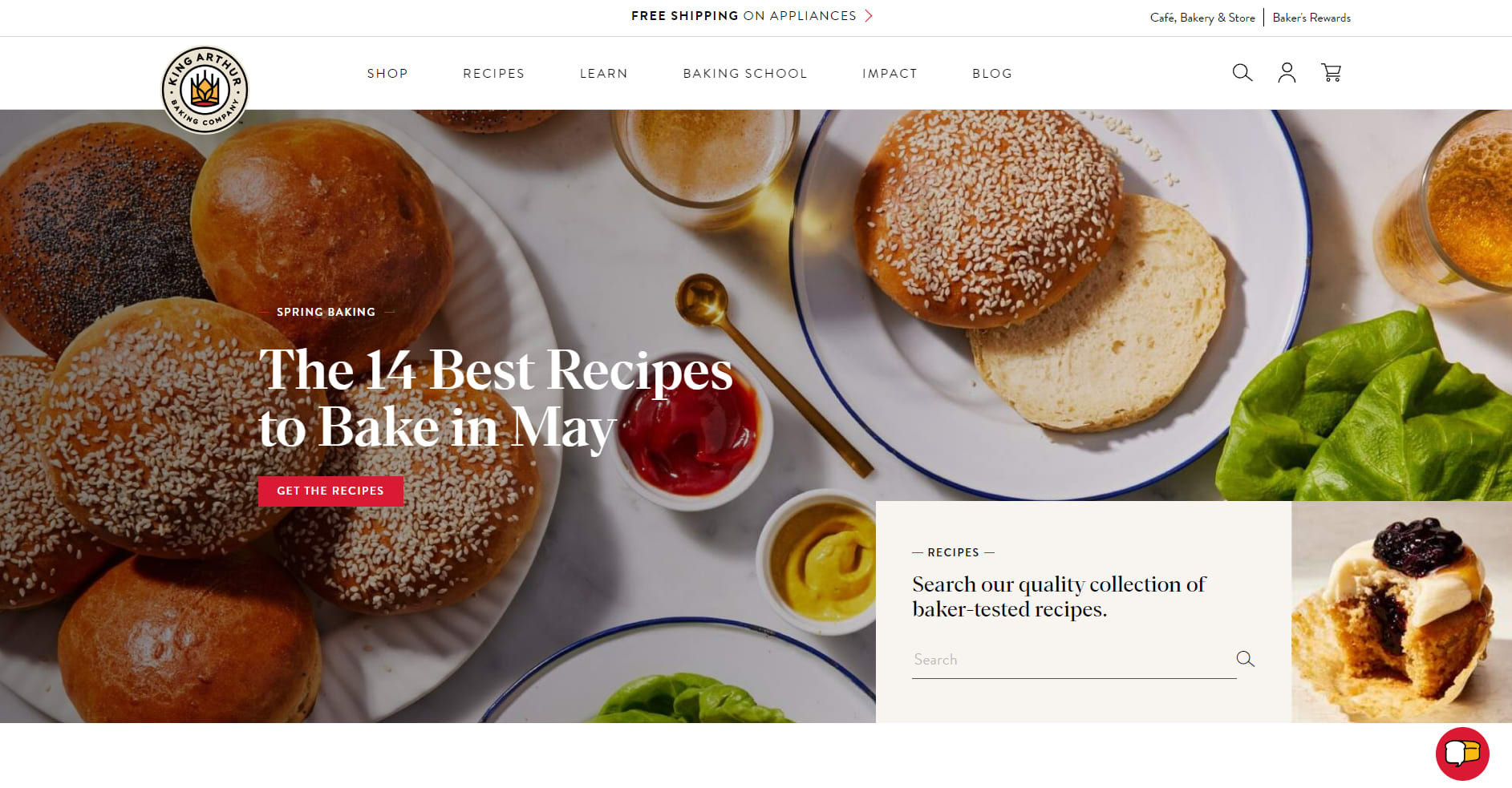
King Arthur Baking Company.
The King Arthur Baking Company does three simple things to make its ecommerce website stand out:
It uses exceptional photos and custom graphics.
It lays out the site cleanly.
It provides plenty of helpful content to the user.
The longer a user spends on your site, the more likely they will discover something they want to buy. (To learn more about improving ecommerce conversion rates, check out our ecommerce conversion rates guide.)
When you scroll down the King Arthur Baking Company homepage, the first section is a tutorial on how to bake something, as shown in the screenshot below. The products come after that. The rest of the site is likewise a mix of useful information and products you can buy.
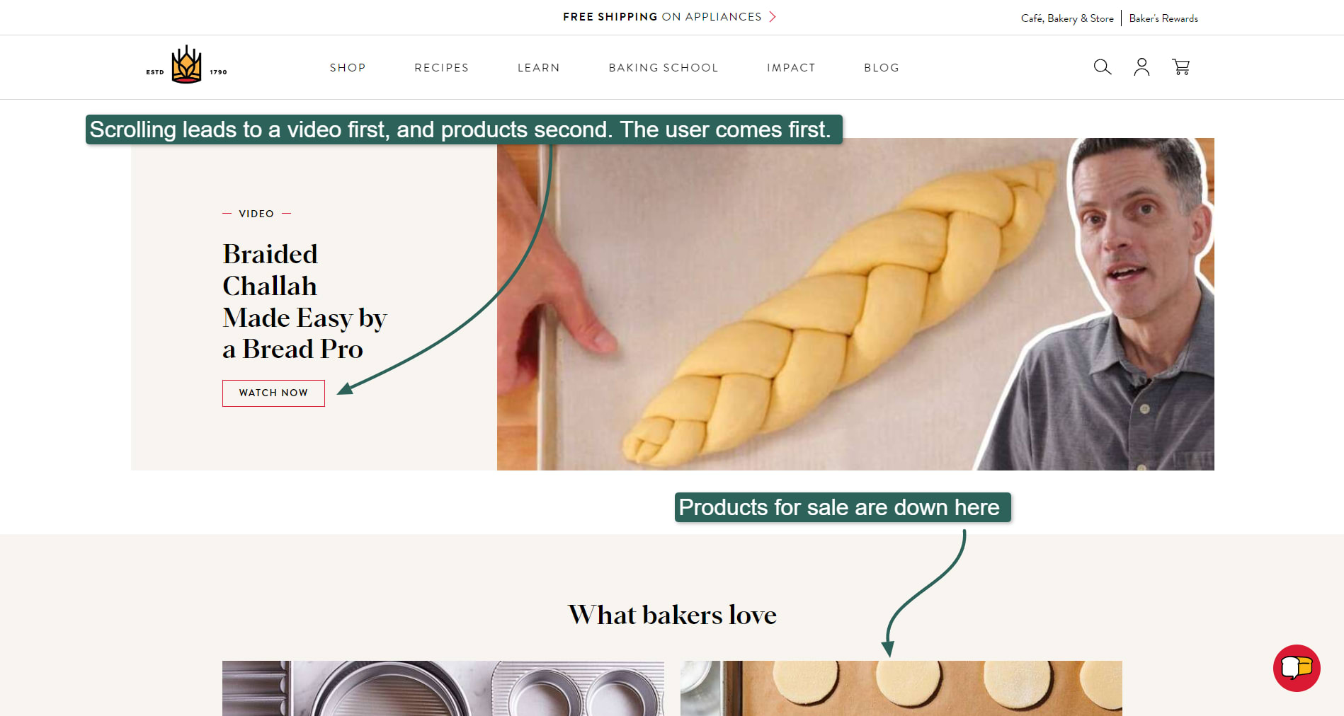
King Arthur Baking Company provides helpful content to users.
The website’s layout is clean, and the typography is unique and well-balanced. It uses an uncommon, highly contrasted serif font called Para Supreme for the headings, and a crisp, rounded font for the body text, called Brandon Grotesque.
In typography, a contrasted font is one where the lines of each letter have differing widths. These fonts can be striking when used in the right places.
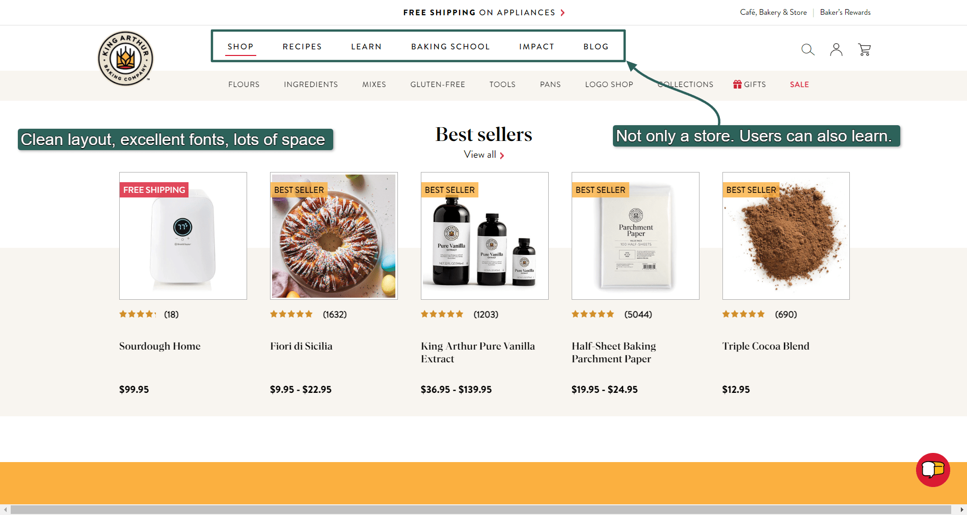
Users can find a lot of helpful content on King Arthur Baking Company’s website.
Platform: Drupal and BigCommerce
How to do the same:
The website uses Drupal for the non-shop sections and BigCommerce for the shop sections, which are accessed through the URL https://shop.kingarthurbaking.com/
What’s amazing is how both sites share the same design, despite running on different platforms.
Many websites use a different platform for their shop section than the content section, and the design looks slightly different when users navigate between both. This can be jolting and isn’t ideal from a branding perspective.
To achieve this consistent look between BigCommerce and Drupal, the King Arthur Baking Company would have had to hire BigCommerce design experts and Drupal design experts to make the two different platforms look like one.
Suppose you don’t want to use Drupal or BigCommerce. In that case, you can achieve similar results by providing helpful content for users, ensuring your design is crisp and neat, and hiring a typography expert to help you choose the right fonts for your ecommerce website.
4. Labyrinth Games & Puzzles
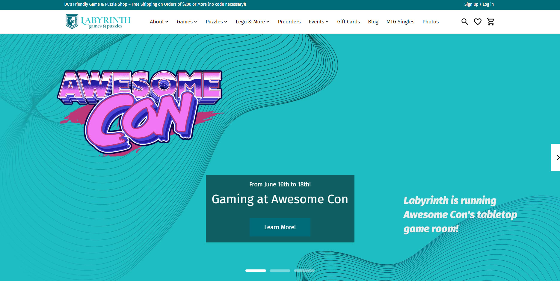
Labyrinth Games & Puzzles.
Labyrinth Games & Puzzles leverages excellent photos, human-centric content, and simple design tricks such as rounded corners to make the site feel friendly and fun.
Labyrinth’s website shows how even a “standard” ecommerce design can be spiced up with only a bit of work. It took many of its core photos in-house, and you feel a sense of warmth while exploring the site.
In contrast, some ecommerce sites feel cold, as if you’re walking into a store with no one to help you choose the right products. Labyrinth feels more like a community that also just happens to sell things.
The hero carousel uses excellent photos taken in-house.
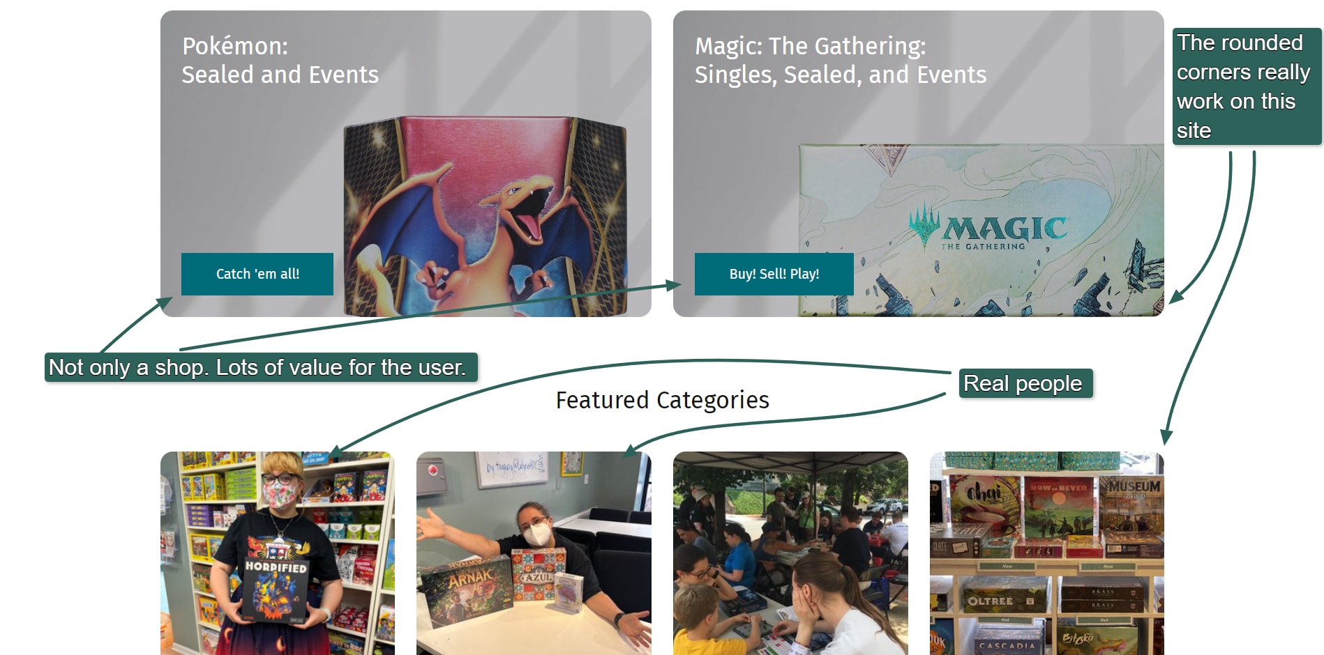
Human-centric photos.
Transparent backgrounds and blending images
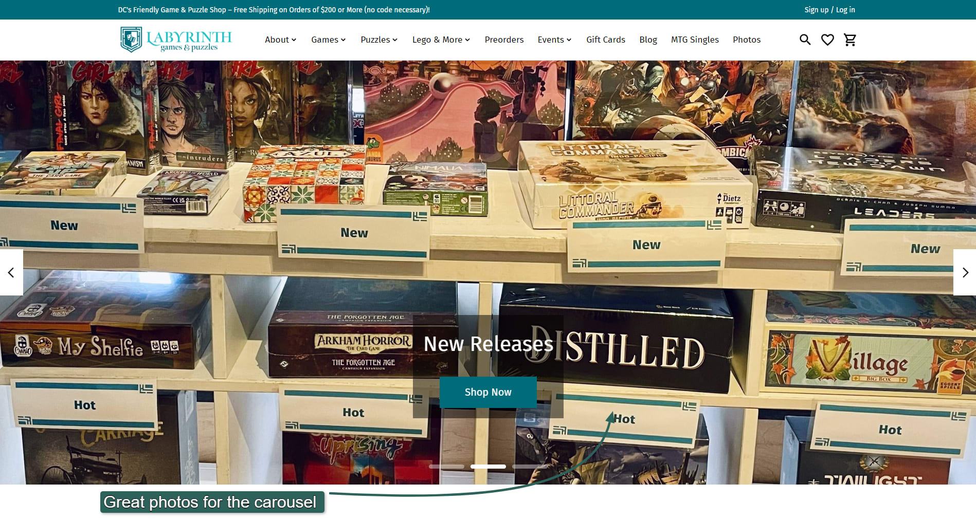
An important element in many of these ecommerce website examples is the use of transparent backgrounds in images or image backgrounds that blend with the website’s background. Using images with a transparent background or matching the image’s background to the site’s color can completely change the feel of an ecommerce website.
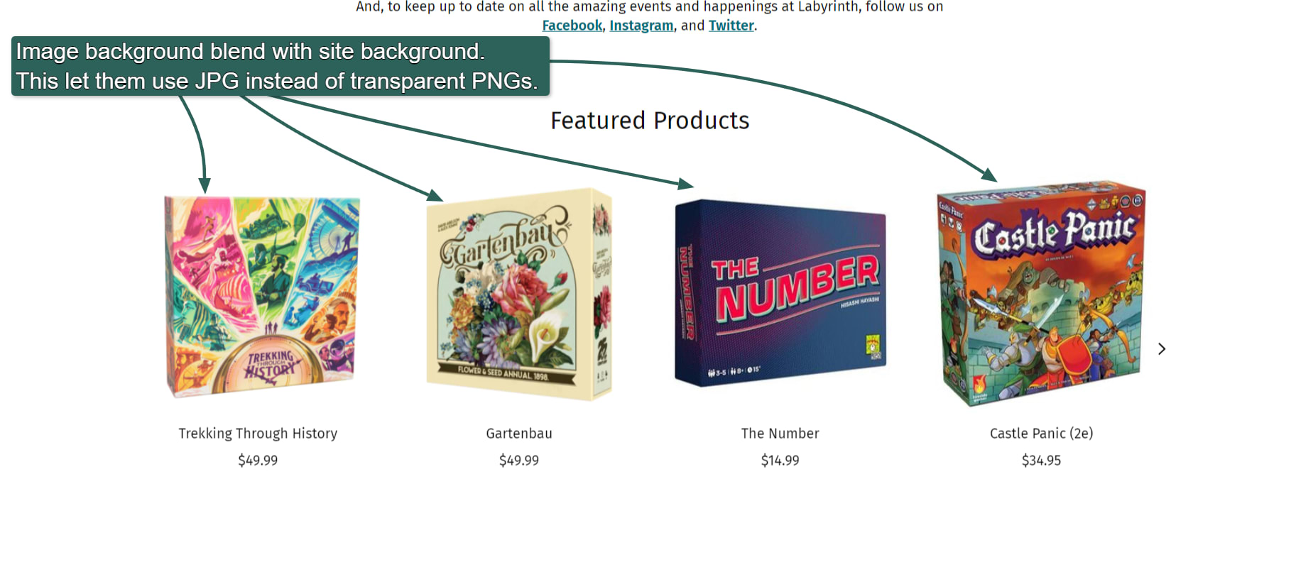
Images with the same background as the website.
In Labyrinth’s case, it used JPG images with the same color as the website’s background to create the illusion of transparency. As you can see, the products stand independently and seem almost 3D.
But JPGs don’t support transparent backgrounds, making it more challenging to change the site’s color in the future. A better choice might be a PNG, SVG, or WebP image format, all of which support transparency.
If you don’t know how to convert images from one format to another or how to make a background transparent, you can buy image editing services from Fiverr to help you.
Platform: Lightspeed
How to do the same:
To achieve the same, consider investing in high-quality photography services. Labyrinth’s photos are more than just product shots—they’re human and engaging.
You can also learn to make photos transparent or buy photo editing services from Fiverr to help.
5. Brobst Violin Shop
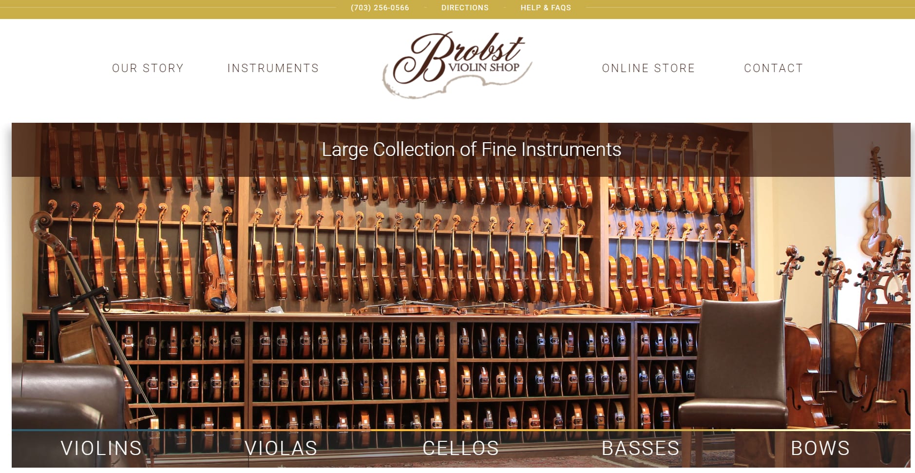
Brobst High-End String Instruments
Brobst Violin Shop sells high-end string instruments that cost hundreds of thousands of dollars. You can’t buy directly on the site—presumably because of the risks involved with such high-ticket items—but Brobst implements all the other basic ecommerce functionality, such as listing products and categorizing them.
When you’re interested in buying, you fill in a form on the product page.
It would be easy for Brobst to implement ecommerce functionality if it wanted to. Every product has a contact form associated with it, and you could easily add an Add to Cart button to those forms with the help of a web developer.
Brobst took a simple design layout and made it shine by:
Using vivid photos of exceptional quality that match the site’s color scheme
Leveraging transparency
Providing plenty of useful information for visitors
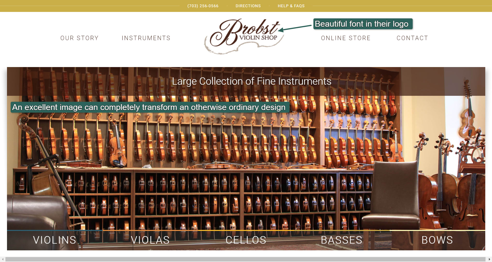
The Brobst logo uses a catching font that grabs attention.
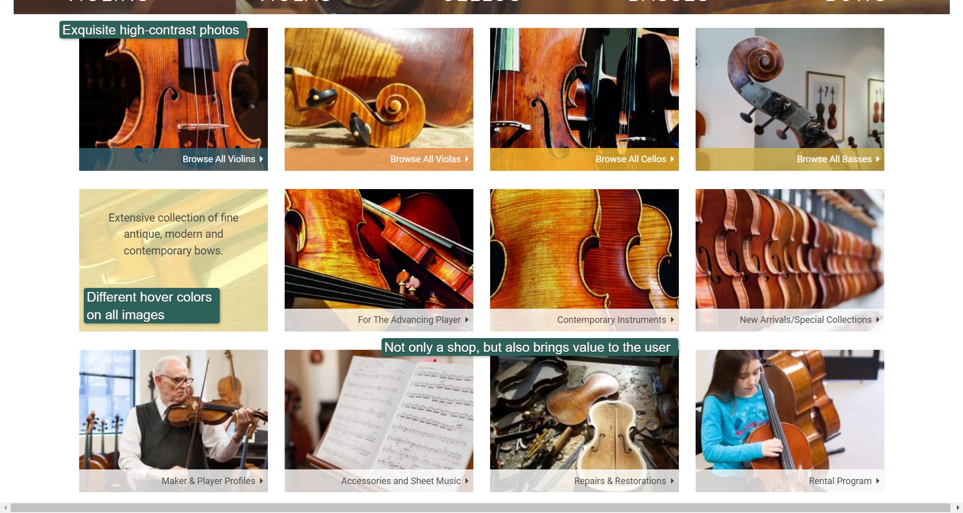
Every category has a different color when you hover over it.
Notice that the photos use extreme close-ups. This draws the viewer in and makes them want to know more. The photo coloring also matches the site’s color scheme.
A different-colored overlay shows you more info when you hover over each photo. These little touches go a long way to making this ecommerce store more than just another ecommerce website.
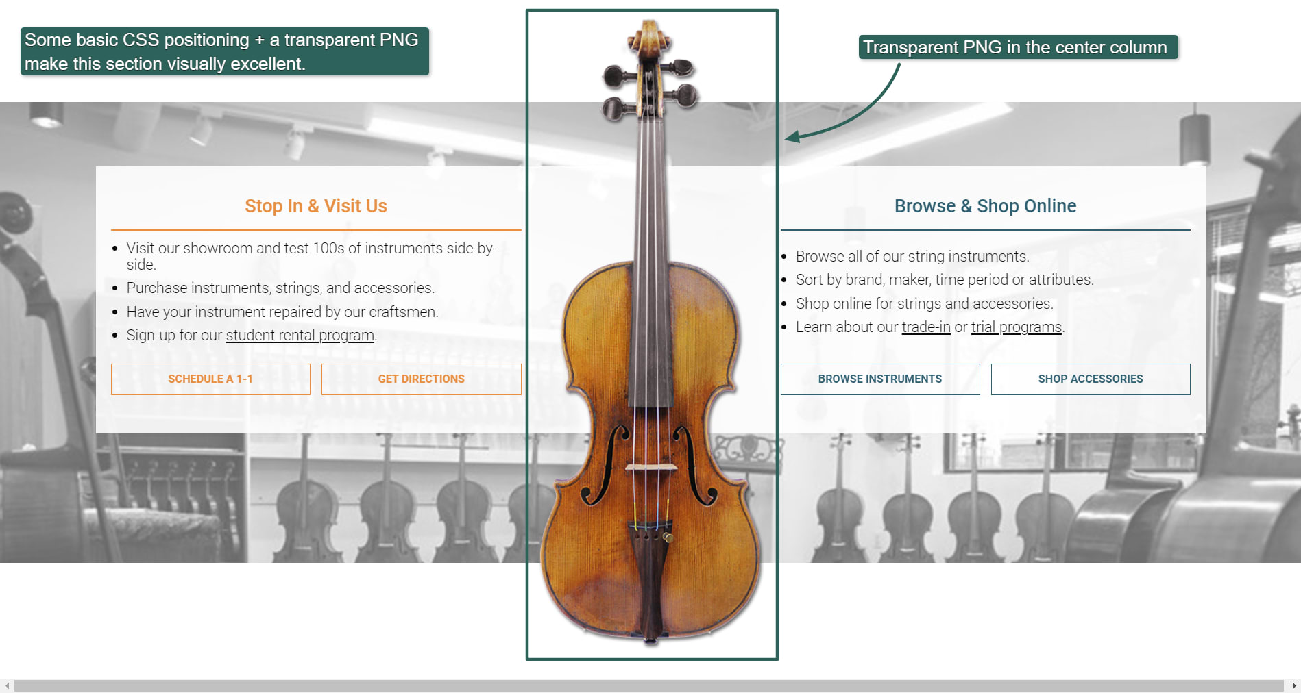
Transparency for a powerful visual effect.
Using a transparent photo, Brobst created the powerful visual effect shown above. Even though the instrument in the middle is a rectangular photo, it looks like a floating instrument that perfectly divides the left and right sections.
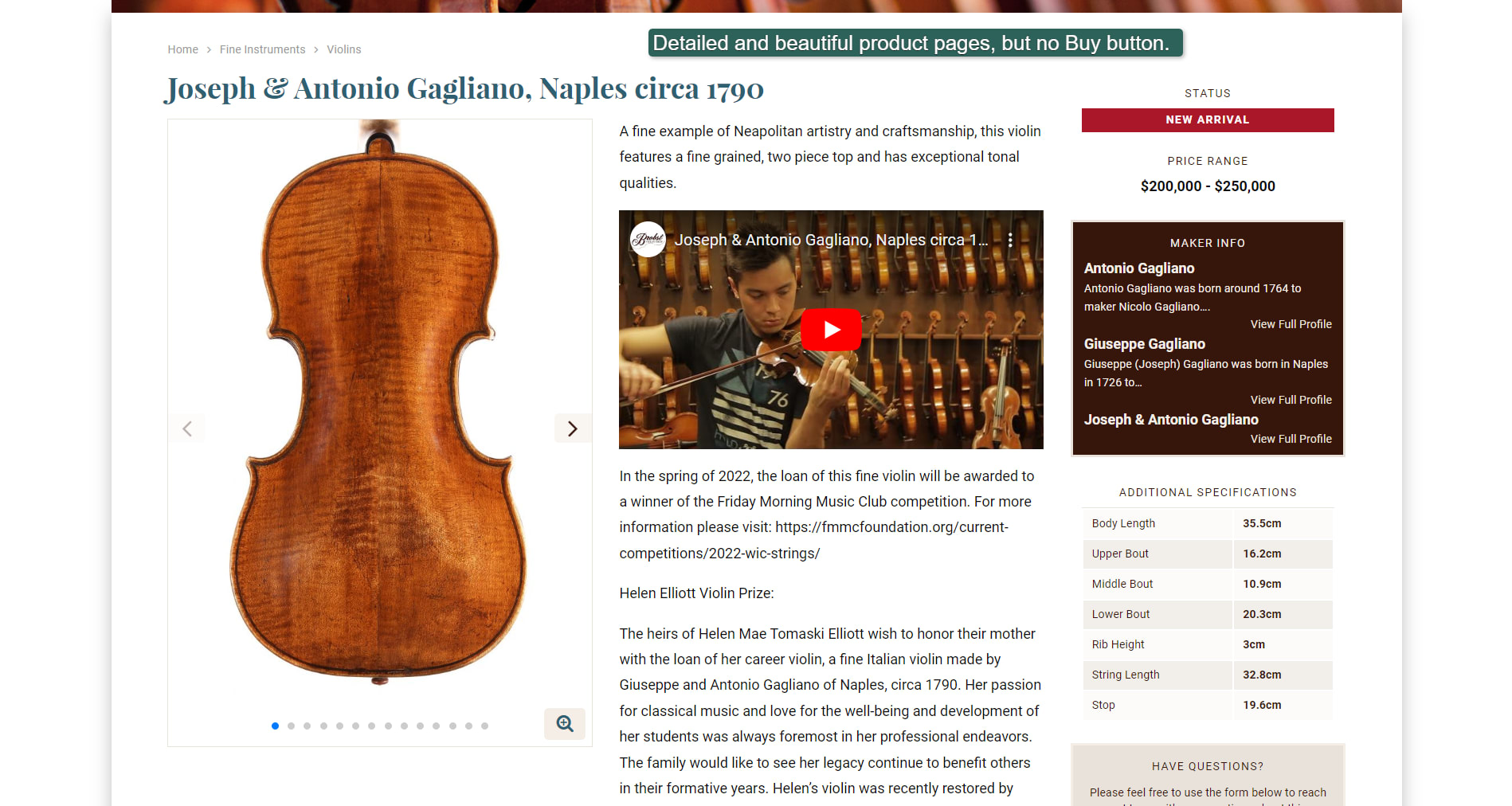
Lots of detail on the product page.
Every product has plenty of detail, some history, and sometimes even a video. Presumably, such high-priced items need plenty of info to get people interested, but the concept can be applied to any ecommerce store. The additional content keeps users interested and keeps them on your ecommerce site longer.
Brobst also has a beautifully custom-designed ecommerce logo that complements the site.
Platform: WordPress with a custom theme
How to do the same:
Brobst uses the powerful content system WordPress for its website.
It used a custom theme for its WordPress site, but many beautiful ecommerce WordPress themes exist that you can use for free or for a small fee.
To make this website fully ecommerce-enabled, it would simply need to install the WooCommerce plug-in. Many other WordPress ecommerce plugins exist to add functionality to a WordPress ecommerce site.
Fiverr has many WordPress and WooCommerce experts who could help you tweak your WordPress ecommerce website.
6. Scholastic
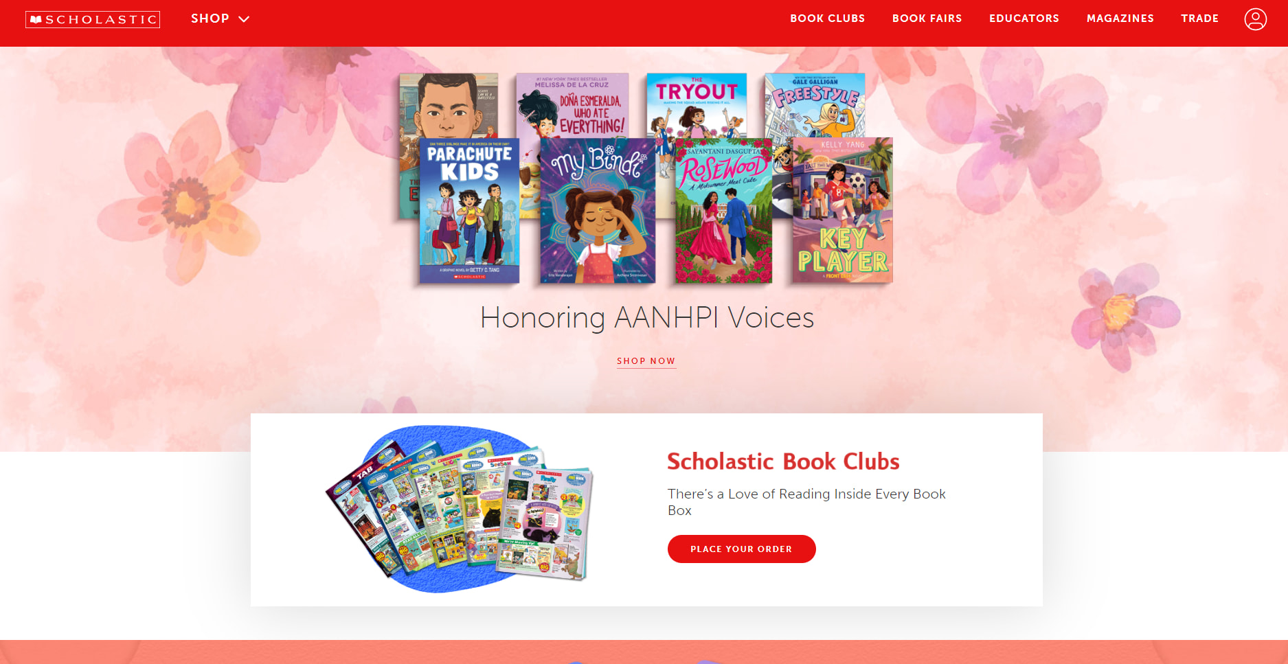
Scholastic
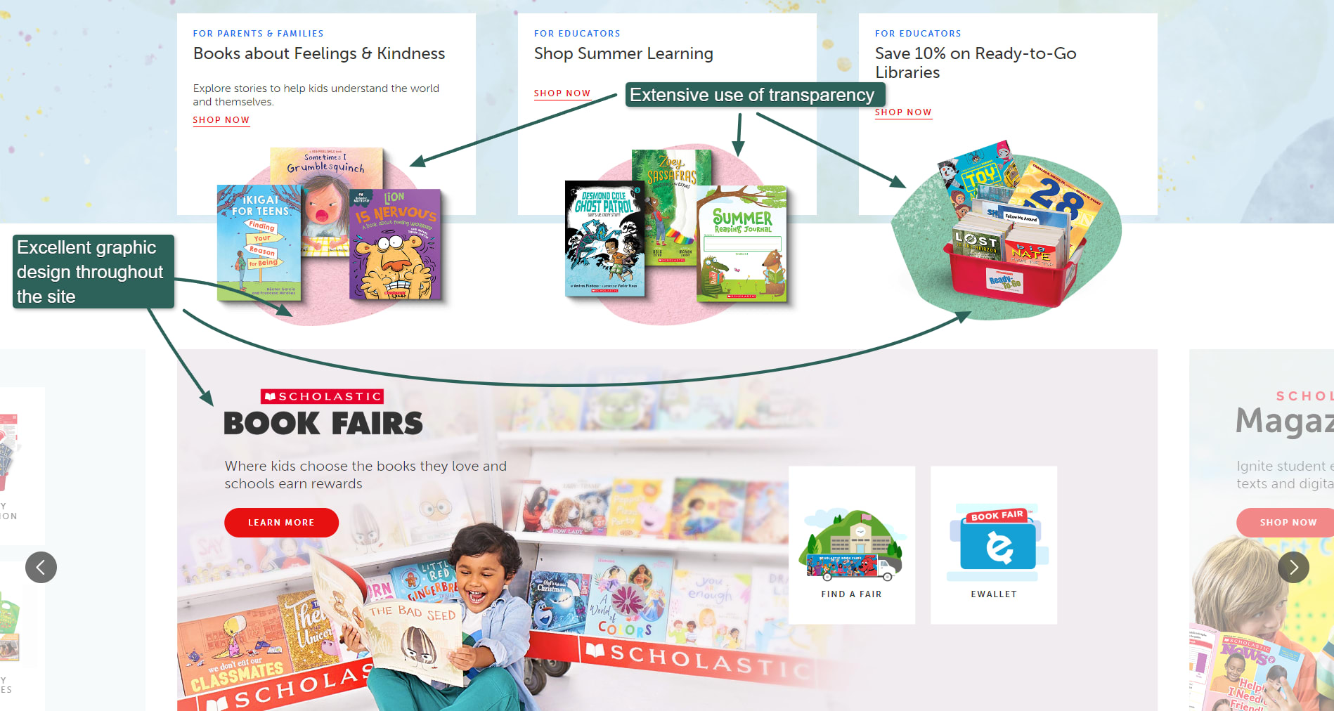
Scholastic leverages custom graphics in soft tones to create a friendly and approachable ecommerce store. Each section is visually distinct as you scroll down the page, solving the age-old ecommerce store problem of information overload. Every section has a clear CTA.
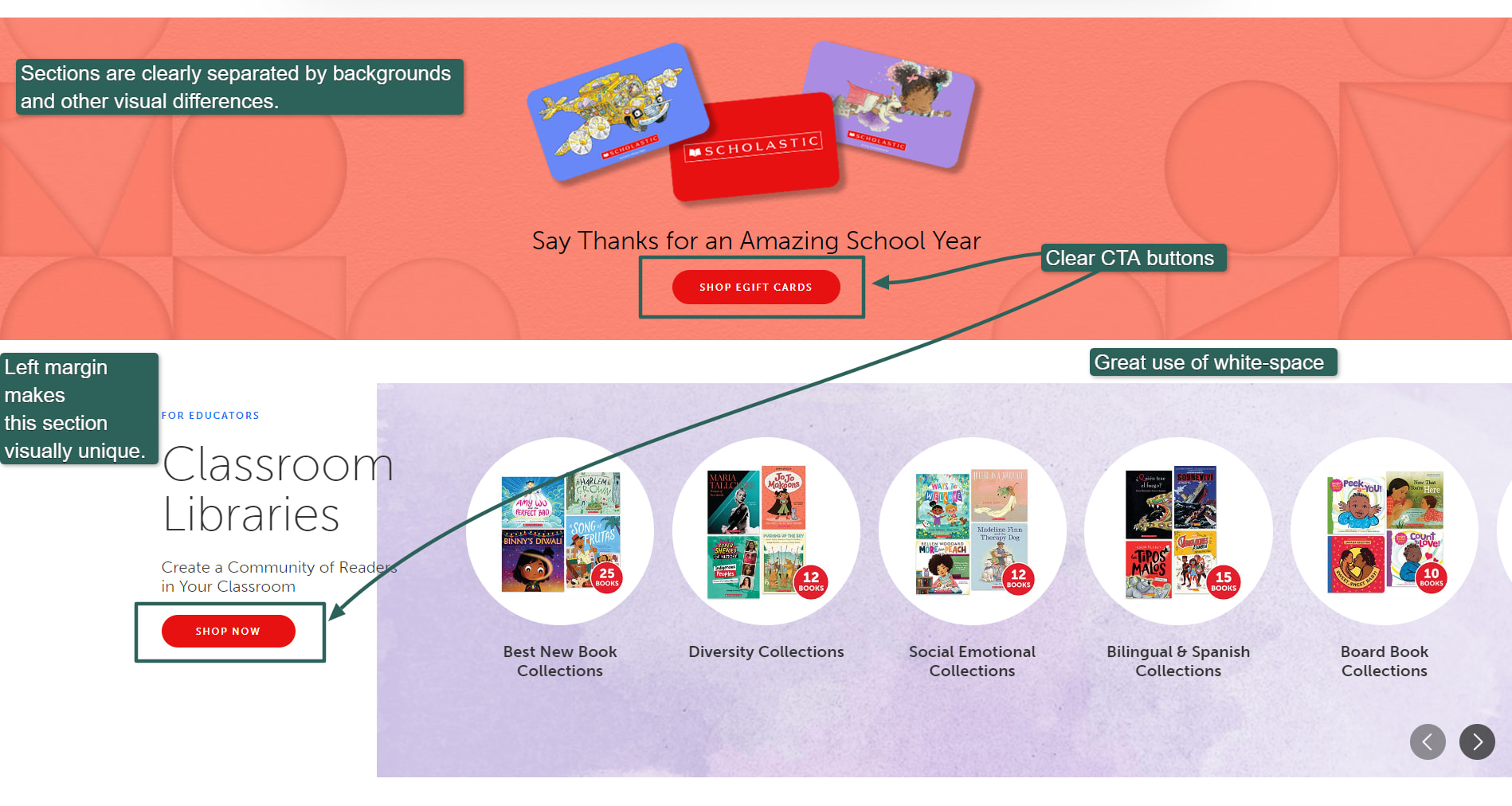
Visually distinct sections.
Excellent custom graphics.
Scholastic uses custom graphics and photos throughout the site. It uses basic photo editing techniques to make its graphics stand out.
For example, in the above shot, it faded the picture of the child to give it a softer feel. Above that, three transparent images seem to float on the page.
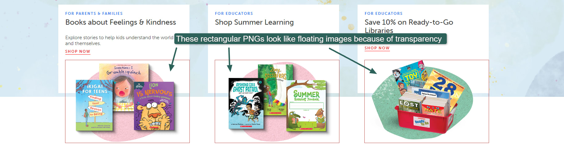
Leveraging transparency effects to make images appear to float.
Platform: Uncertain; possibly Demandware, Inc. for some sections
How to do the same:
Well-designed and well-placed graphics make this site work. You can do the same by hiring a professional graphic designer to help you create branded graphics that enhance your ecommerce website.
7. REI co-op
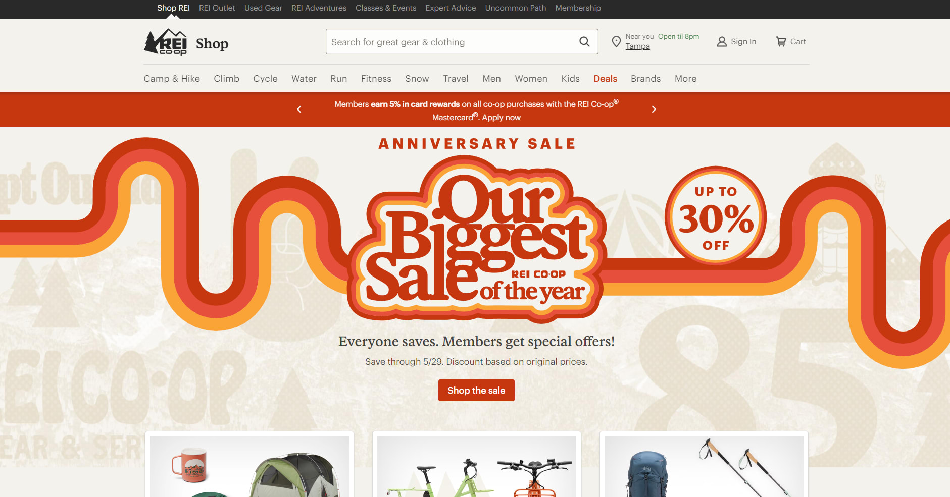
REI Co-op
REI Co-op uses the Bootstrap CSS framework to create a visually appealing design that differentiates it from other ecommerce websites. The use of curves on its homepage hero image also gives the site a friendlier feel than the angular, hard lines typical of older stores.
REI uses built-in Bootstrap classes to link sections and bring cohesion to the entire design. For example, in the screenshot below, you can see that the hero background image appears behind the images that follow it. Those images are displayed using Bootstrap’s “card” element and positioned using standard Bootstrap classes.
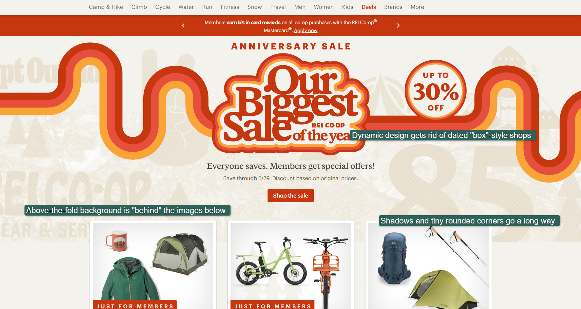
REI uses Bootstrap to position elements.
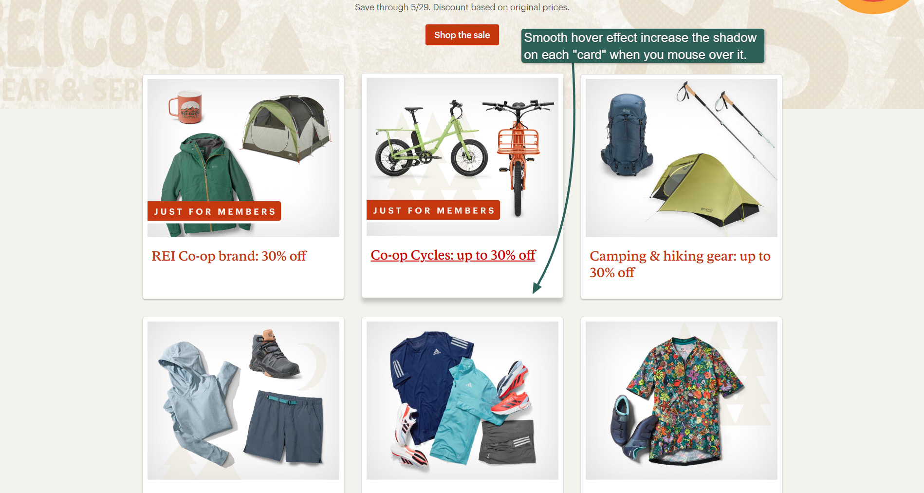
Shadows behind Bootstrap "cards" add a nice touch.
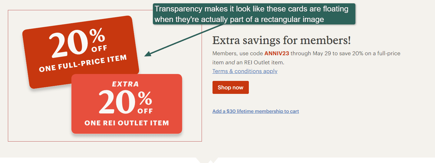
Transparency makes images seem like they’re floating.
We added the red border around the image above, revealing that it’s actually a rectangular image with transparency applied to the background. The use of transparency means the discount cards seem to be floating. You can create an incredible number of visually appealing effects using transparency.
Platform: Likely custom-developed using Vue components and Bootstrap; back-end technology unknown
How to do the same:
Bootstrap is a powerful CSS framework that lets you create a responsive website using standard CSS classes. It offers different types of layouts, such as Grid and Flex. It’s a powerful CSS technology that can take a while to learn. If you’d like to start using Bootstrap immediately in your ecommerce website, you can hire a Bootstrap expert on Fiverr to help you.
REI also uses Vue components for their site, part of the Vue JavaScript framework that helps you design responsive websites easily. You might want to hire a Vue expert to help you if you have no previous programming experience.
8. Goldbelly
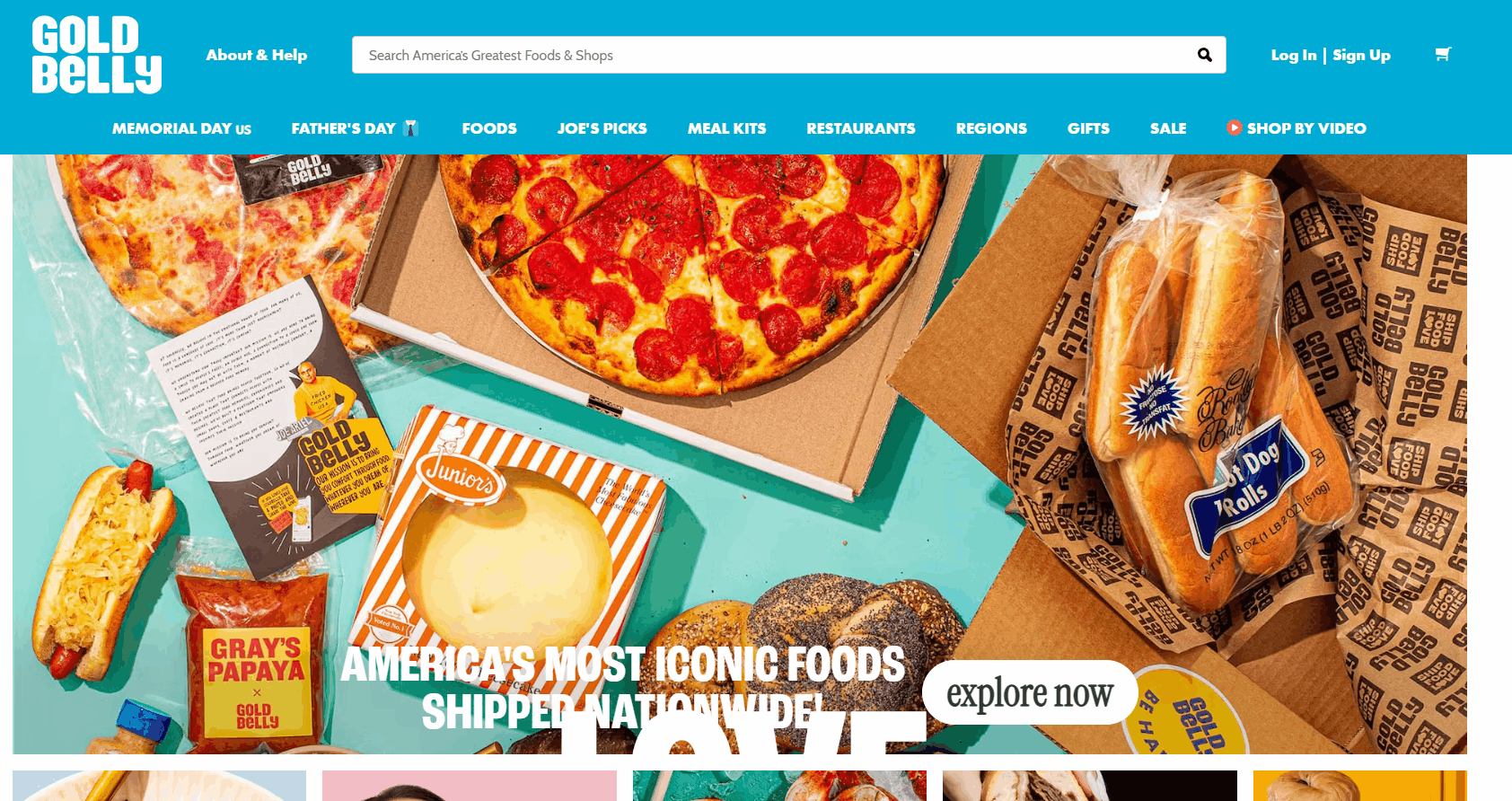
Goldbelly
It’s hard not to love Goldbelly’s animated home page. The website screams "fun!"
Goldbelly shines in several areas:
Spectacular in-house food photography: Some of those cookies look so good you can almost taste them
Using videos as product images
Overall design expertise, such as the perfect blend of serif and sans serif fonts and custom icons that show they cut no corners in making this site stand out
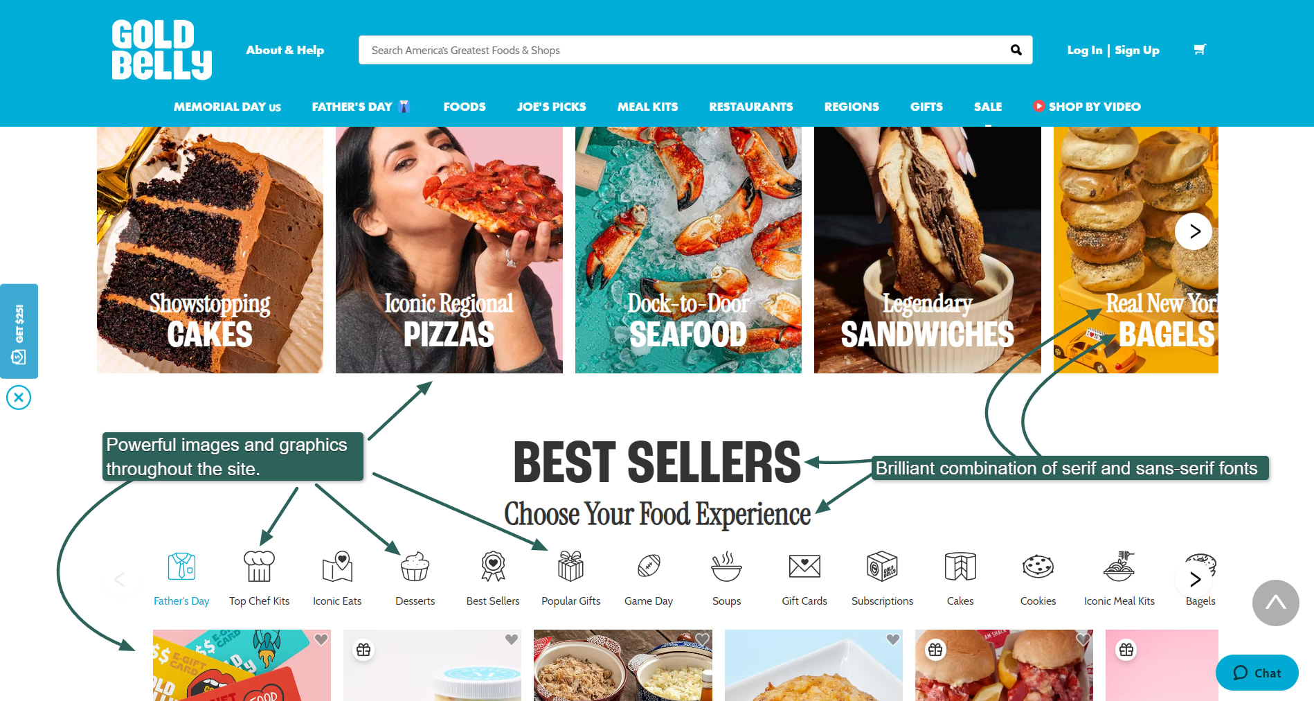
Excellent typography and design elements throughout the Goldbelly site.
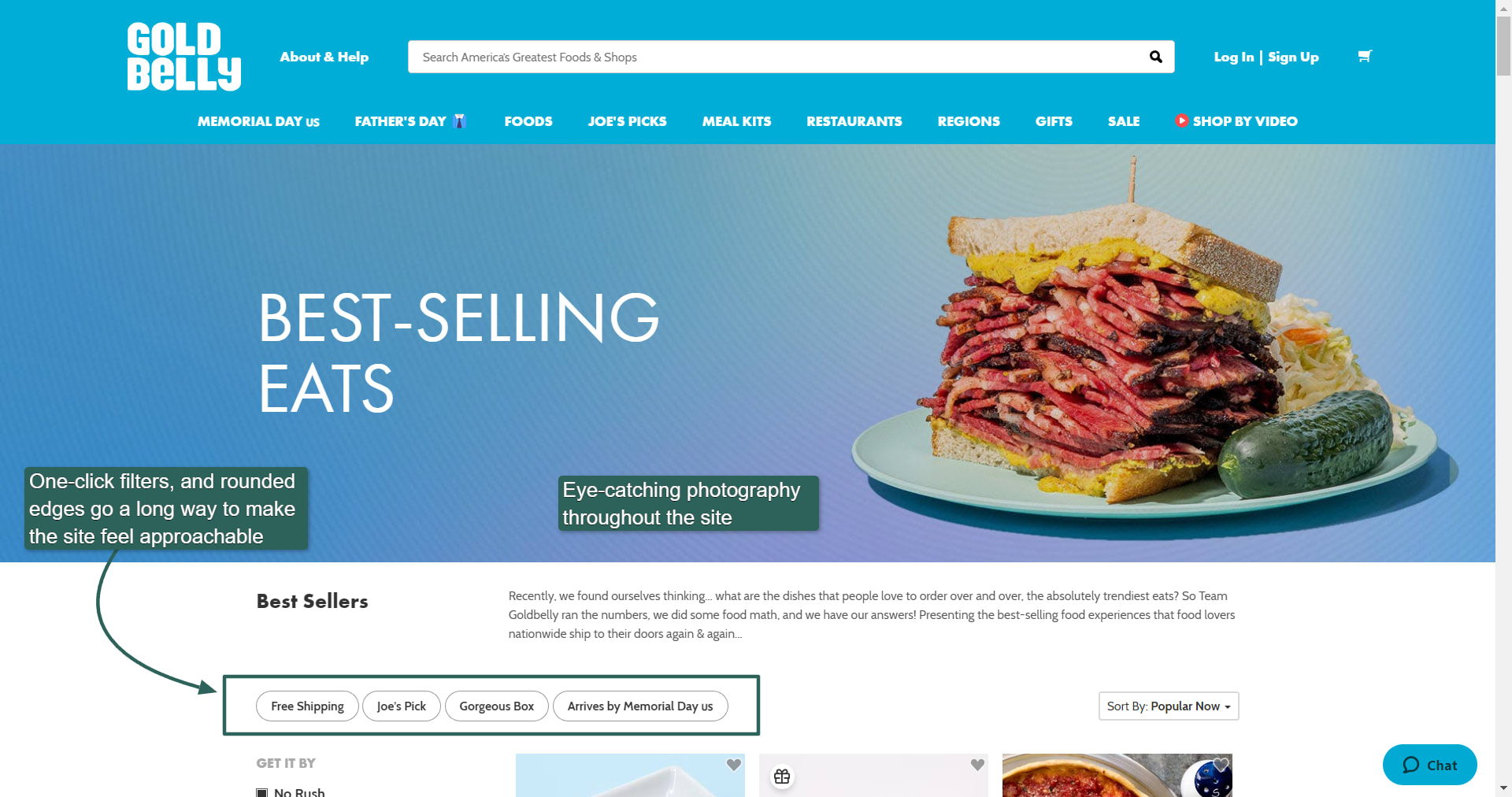
The photos on this ecommerce website are out of this world.
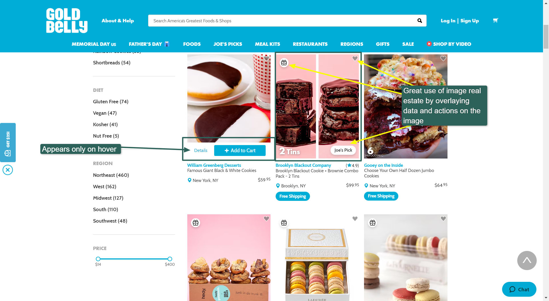
Excellent use of space.
One aspect that really caught our eye was how Goldbelly saved real estate by overlaying additional info neatly on top of the images. Trying to show too much info for a product contributes to the age-old problem of clutter on older ecommerce sites. But showing too little can prevent people from clicking on the product.
Goldbelly solved this by overlaying information on the images themselves by using Bootstrap, which provides several CSS classes to do this easily.
Another cool feature is when you hover over the image: Only then do the Add to Car" and Details buttons appear, saving more real estate on the product page.
Using Bootstrap, Goldbelly could display as much info as possible in the product listing without making the page feel crowded.
Platform: Likely custom developed. Bootstrap; back-end technology unknown
How to do the same:
Goldbelly used Bootstrap’s position-absolute CSS class to display the icons on the images with the additional information. We couldn’t figure out exactly how they achieved the hover effect when mousing over an image, but you could achieve something similar using the :hover psuedo-class or a bit of JavaScript.
And then there are the exquisite photos. Goldbelly went all out on these, and you might want to invest in professional food photography to do the same.
9. OwlCrate
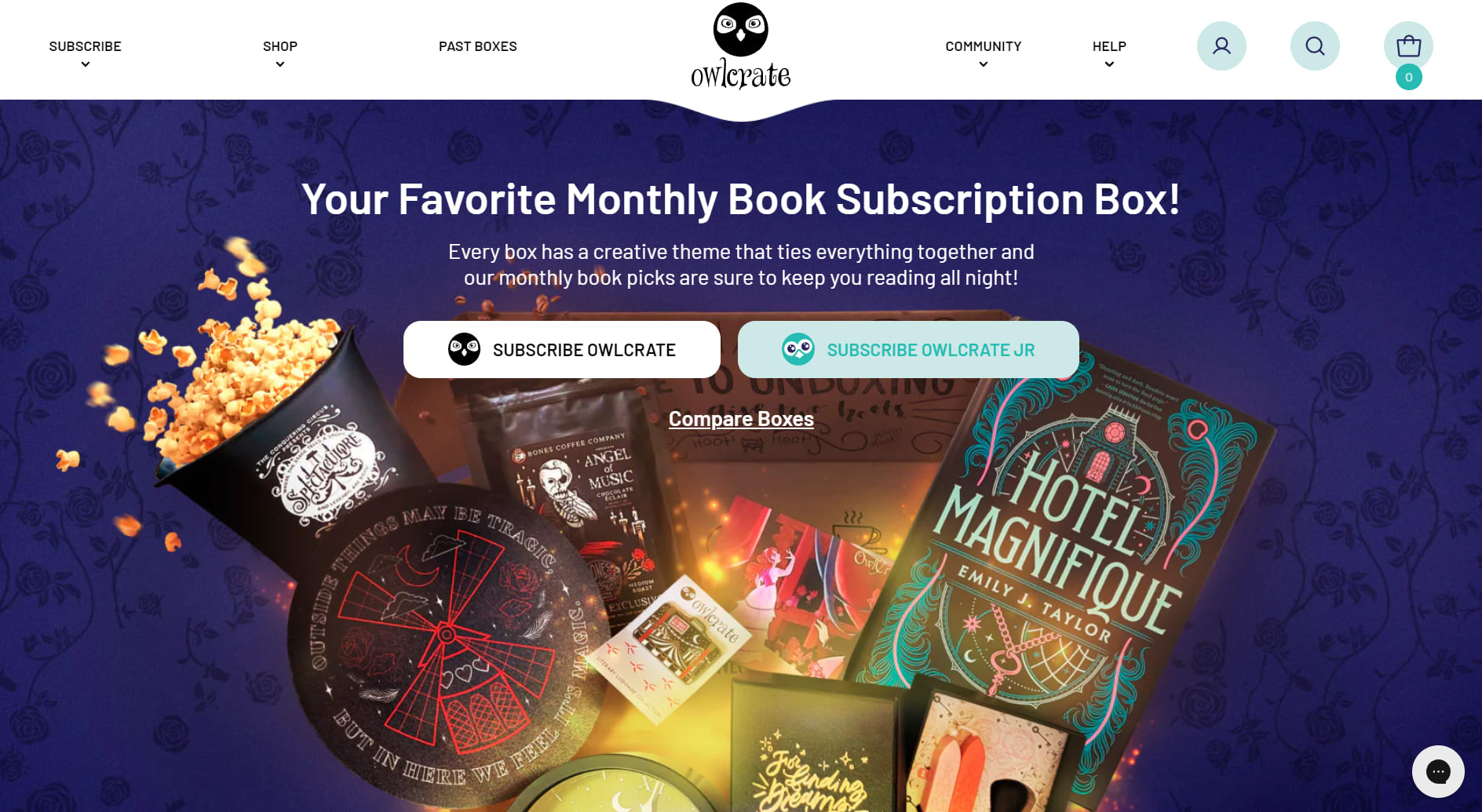
Owlcrate
OwlCrate is a fun site that uses custom graphics and images extensively to make its site feel as magical as possible. From owl icons to images of magical paraphernalia, this site feels immersive and joyful.
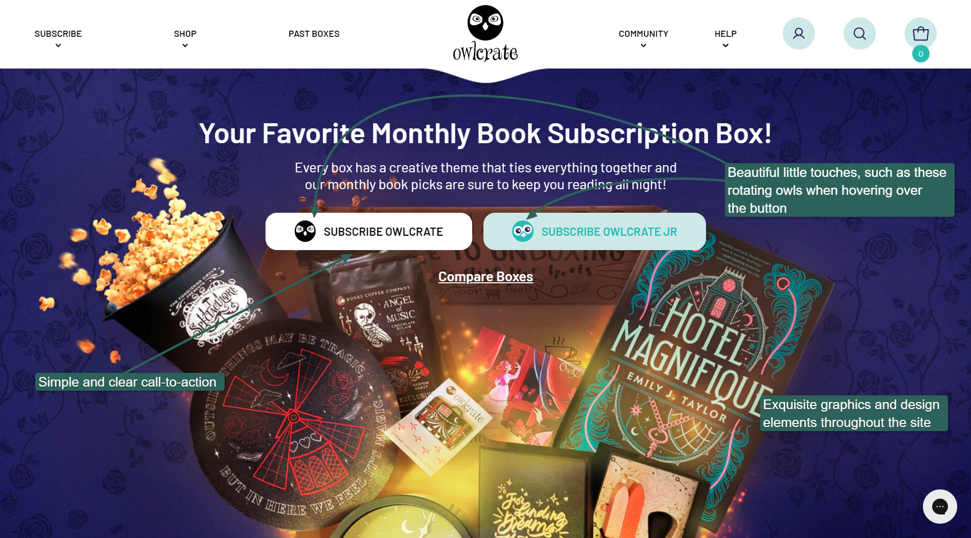
The owl icons rotate when hovering.
The site offers more than just a monthly subscription. It’s a full-scale webshop; you can buy past crates, exclusive books, and merchandise.
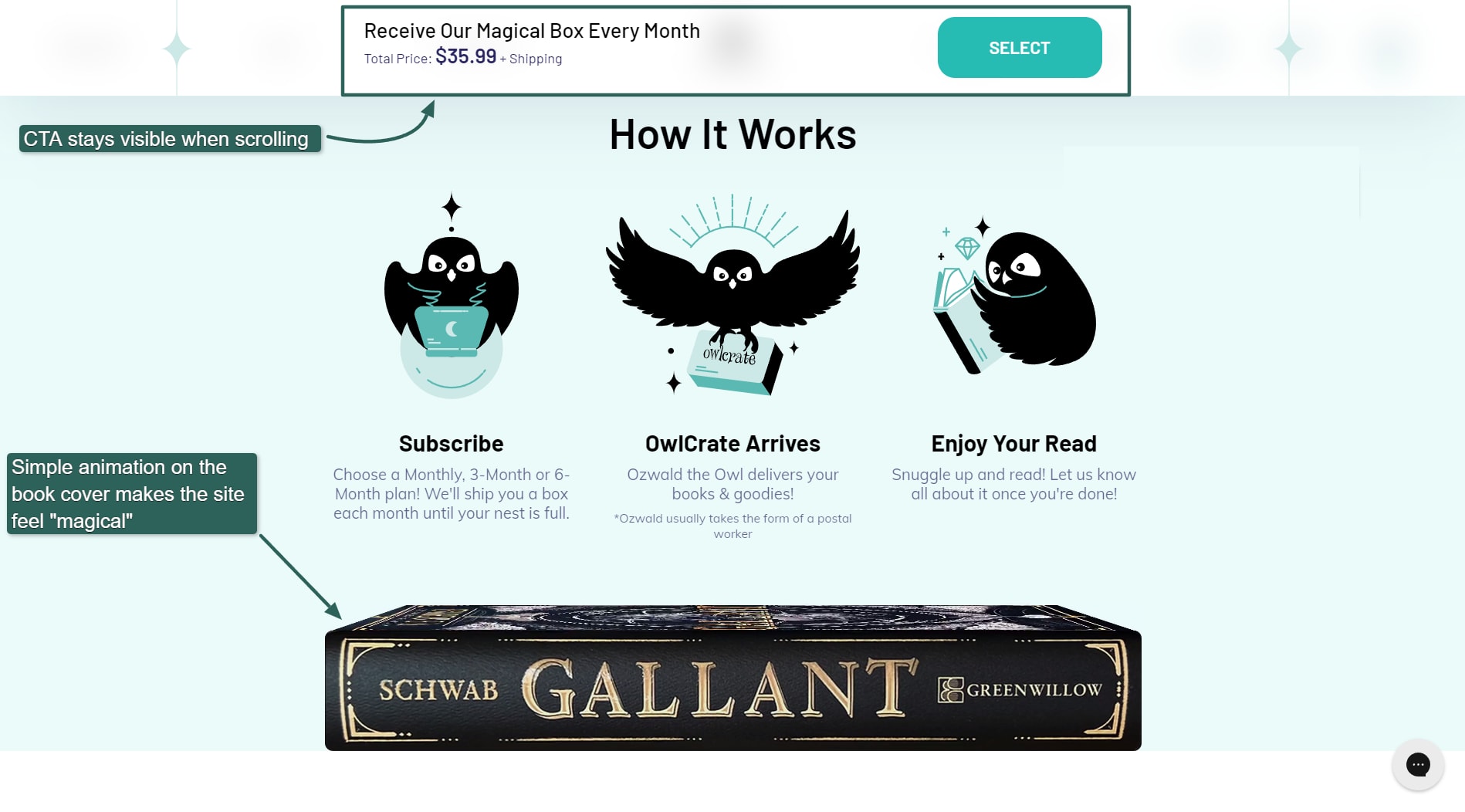
OwlCrate makes extensive use of custom graphics.
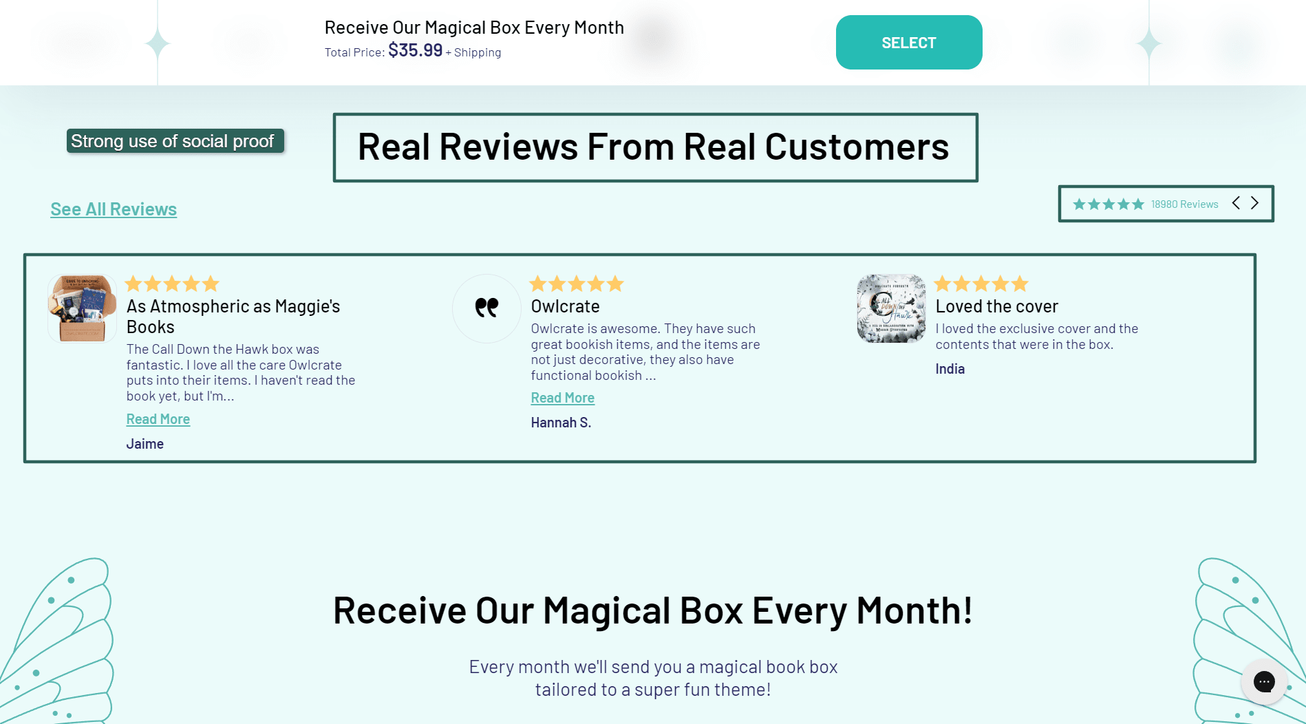
Over 18,000 reviews.
OwlCrate uses social proof on its site, displaying its thousands of real reviews to convince potential new customers that it’s legit.
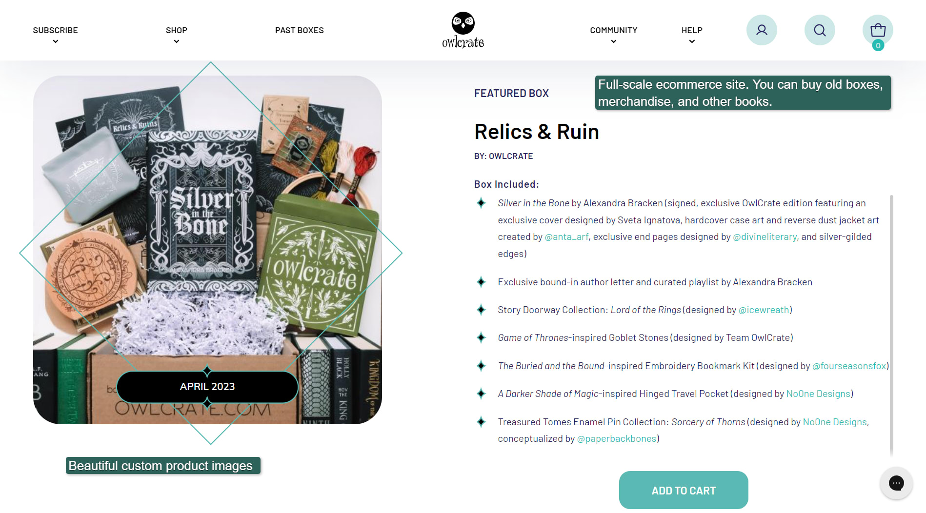
Product pages are detailed, with beautiful custom graphics.
OwlCrate also has a community page, blog, and reading guides section, providing plenty of helpful content so users spend more time on the site.
Platform: Shopify
How to do the same:
Custom graphics are the secret to making this shop stand out. The best way to do something similar is to buy image editing services and upgrade your ecommerce site with awesome graphics.
10. Once Upon a Book Club
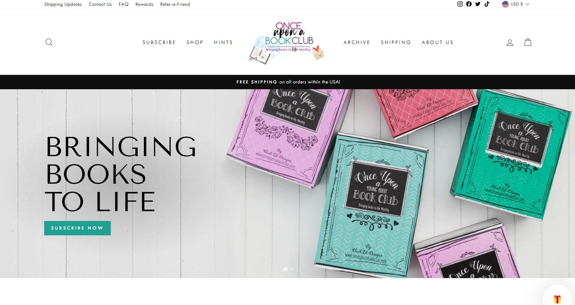
Once Upon a Book Club
Once Upon a Book Club uses beautiful typography and custom branded graphics to create a stunning ecommerce website. For its headings, it uses a high-contrast font called Tenor Sans. The body text uses the clean and highly legible sans serif font Twentieth Century.
As with many of the ecommerce sites on our list, high-quality photography really makes this one stand out.
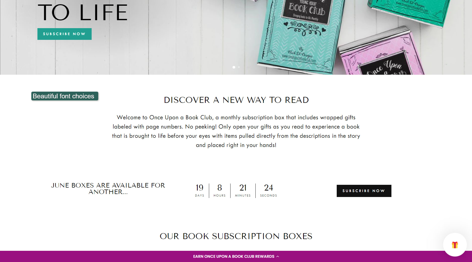
Beautiful fonts.
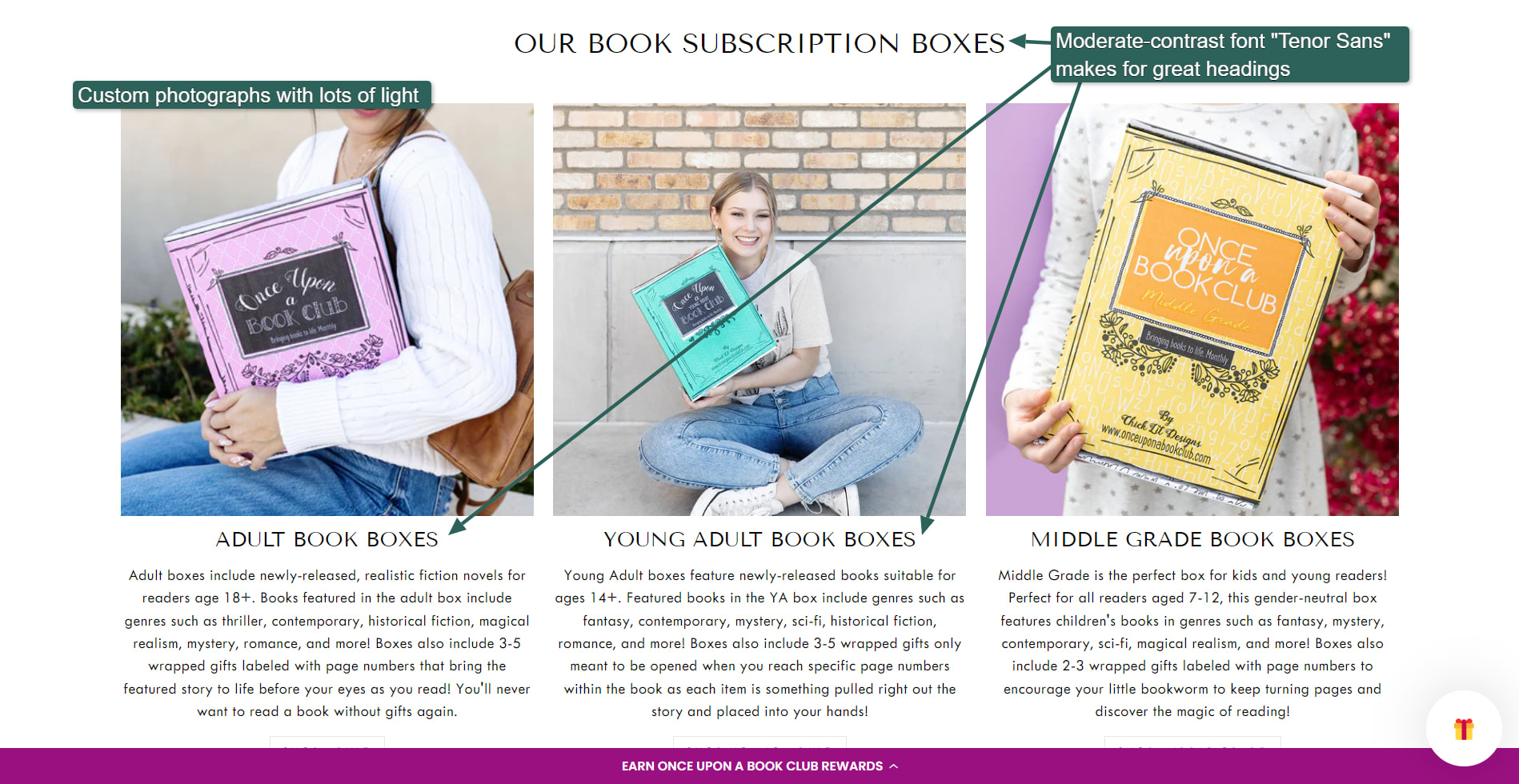
Custom, high-quality photographs.
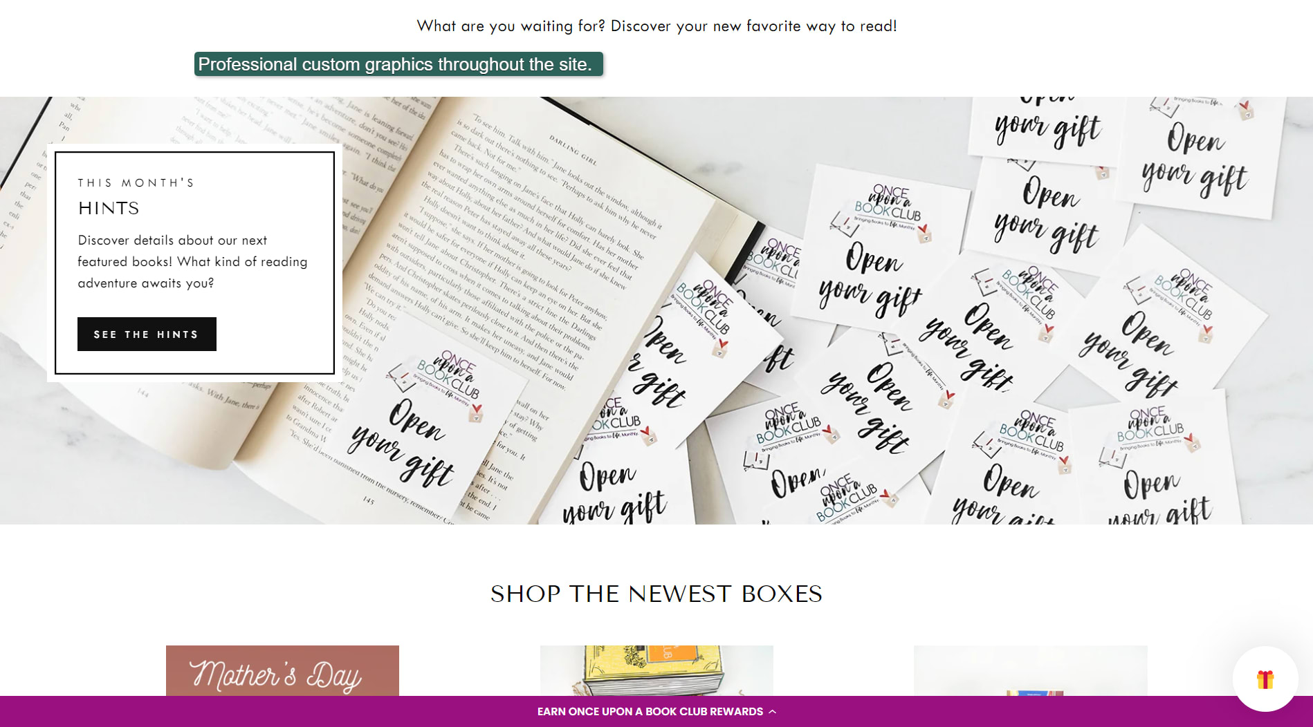
Custom graphics throughout the site.
Platform: Shopify
How to do the same:
The best way to achieve similar results is to invest in professional photography and custom graphics. You can also enlist the help of a Shopify expert from Fiverr to help you build a custom Shopify template.
What do the best ecommerce website examples have in common?
You probably noticed several common elements that made the above websites a cut above the rest. These include:
Professional photography
Professional custom graphics
Unique designs
Clean, crisp designs
Enough space between products
Moving away from older “grocery store shelf” designs
Beautiful typography choices
Helpful content
Friendly feel
Leveraging transparency in images
Clean, clear CTA buttons
Custom icons
Many simple touches, such as shadows and rounded corners
Soft animations
Hover effects
Consistent branding throughout the site
The best ecommerce website examples all had elements likely designed by professionals. You can do a lot of it yourself, but it’ll be a lot easier if you hire graphics design professionals, photographers, or designers to help you.
Get help from Fiverr freelancers for your ecommerce website
Anyone can create a website from scratch these days. Several affordable ecommerce platforms and hosting plans exist for people without any development experience.
Hiring professionals to help you in core areas such as photography and basic design gives your site the best possible chance to compete successfully.
After creating the website, you also need to market it as part of launching your ecommerce brand.
Fiverr is a marketplace of professional freelancers with skills across all facets of ecommerce, web design, web development, and web hosting. To find a freelancer to help you on Fiverr, open an account and search for the professional you need.
Open an account on Fiverr today!
Related Guides


About Author
R. Paulo Delgado Tech & Business Writer
R. Paulo Delgado is a tech and business freelance writer with nearly 17 years of software development experience under his belt, including WordPress programming. He is also a crypto journalist for Moneyweb, and proudly a member of Fiverr's Pro Seller program — hand-vetted professionals, verified by Fiverr for quality and service.
