Ecommerce Design Trends To Future-Proof Your Website in 2023
Mobile-first design. Personalization. Interactive content. What are the next biggest trends in ecommerce? Find out here so you can future-proof your ecommerce website.
 August 14, 2023
 11 minute reading
The ecommerce industry enjoyed a revenue of $5.7 trillion in 2022, from more than five billion internet users. That’s 66% of the world’s entire population.
With this comes the need for businesses to stay on top of the latest ecommerce design trends in order to remain competitive and maximize profits. This year and the years to come will be no different, with many new design trends emerging. Online shoppers are looking for an easier, more seamless shopping experience, and the best designs are evolving to accommodate this desire.
We’ve compiled a list of the top ecommerce design trends you should be aware of, in the areas of web design elements such as color schemes, typography, layout, and user experience. Familiarizing yourself with these can help you stay ahead of the curve in 2023.
Better yet, we’ve included five real-life examples of ecommerce websites that have successfully incorporated such web design trends, so you can see for yourself how it’s done.
Let’s dive in!
Choose top color schemes that dominate ecommerce design
One of the most important principles of design is the use of color schemes that are able to boost online performance. Color—a design principle connected to memory and attention—plays an enormous role in the success of any website design.
While you can certainly piece together a color scheme of your own, it’s always a good idea to hire expert talent (like freelancers) to help you implement the best color scheme for your web design.
Experienced UI/UX designers can help you achieve a sense of unity, balance, and harmony in your web design, which ultimately will impact user behavior and boost conversion rates.
Here are some of the top color schemes that will dominate ecommerce design in 2023:
Monochromatic

Source: Freepik
Monochrome is a popular trend for ecommerce designs, in which one primary color dominates the entire page. Common for minimalist ecommerce designs, the monochromatic color scheme creates a sense of cleanliness and helps focus website visitors’ attention on the page content.
Pastel

Source: Freepik
Graphic design experts have been using pastels, from hero on landing pages to vector images and icons, to create a sense of freshness and vibrancy in their designs—and this year, it’s no different for ecommerce brands. Soft pinks, blues, greens, and purples are all popular choices web designers use to create an inviting web design.
Neutrals
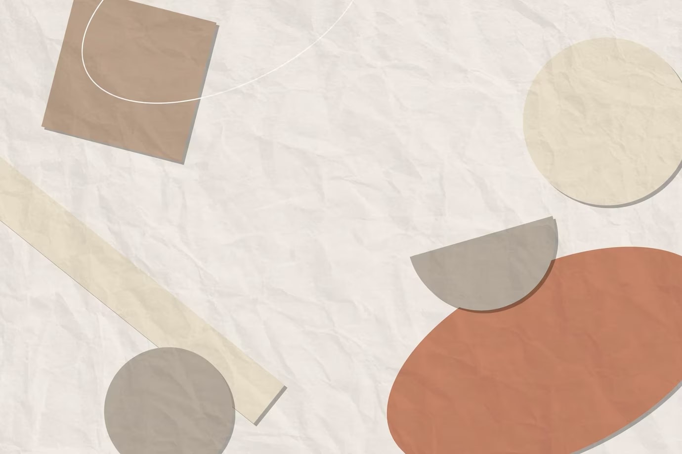
Source: Freepik
Neutral colors are also making a comeback, as they can help you easily transition from one page to another without jarring the viewer’s senses. Plus, they tend to blend better with other elements on the webpage (such as typography or images), for a smoother overall experience.
Bright and bold

Source: Unsplash
If you want to make a bold statement with your ecommerce design, you can use bright colors such as reds, oranges, and yellows in moderation to draw attention to specific elements.
The colors and themes you choose to incorporate will directly affect user behavior and conversion rates. We’re visual creatures, and we eat with our eyes, so make sure to find the best talent to help you implement the web design you need.
This is easily done with platforms like Fiverr, where you can find experienced designers who understand current ecommerce design and web design trends.
Incorporating typography: enhance UX with the right fonts

Source: Unsplash
If you’ve ever visited a website and felt a good connection to the words on it, that’s because typography plays a huge role in user experience (UX). When used correctly, fonts can help set the tone of your website and draw attention to important elements.
When selecting fonts for your logo or ecommerce store, remember that legibility is key. You want visitors to be able to easily read the text without straining their eyes or feeling overwhelmed by too much information.
Choose two or three complementary font families that you will use throughout the site, and make sure they’re consistent with each other so they don’t create confusion for users.
For example, if you have a bold headline font paired with a thin, lightweight font for body text, the two should work together without clashing.
Here are the top web design trends for typography:
Larger font sizes:
Make sure your text is easy to read on any device by using a large font size. This will help customers quickly skim through content and find what they’re looking for without having to zoom in or out.
Keeping the line length short:
Keeping lines of text short makes them easier to read and navigate, ensuring customers are able to get the information they need quickly.
Visuals incorporated into the typography:
Adding images or icons alongside text can make it more appealing and user-friendly. This gives customers an idea of what you’re trying to convey without having to read too much.
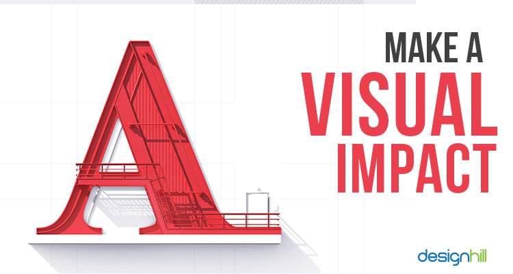
Source: DesignHill
The use of interesting fonts:
Using unique and visually appealing fonts can help make your store stand out from the competition.
To find fonts and optimal sizes that best fit your brand and create an eye-catching design for your website, you can hire professional web design freelancers on Fiverr.
Doing so eliminates all the hassle of finding and testing them out, as you can find the right experts with years of experience in the industry.
Brand recognition and consistency
Typography is a great tool for creating brand recognition and consistency. Keeping the look of your website consistent across all webpages helps visitors become familiar with the overall design and recognize it as uniquely yours.
Creating an ecommerce store can be overwhelming, but taking time to incorporate typography can go a long way in creating a successful user experience. Typography designers make use of color, size, and even spacing to create impactful designs that will help visitors navigate your website with ease.
Innovate optimal ways for layout and spacing
Source: Freepik
White spaces have become a trend among web designers due to their ability to create a sense of order and balance. By leaving well-defined margins between elements, you can make sure your page looks tidy and organized, rather than cluttered and overwhelming.
Using white space in the right way also helps draw attention to the content that really matters. For example, placing a headline within an empty block will help it stand out more than if it were surrounded by other design elements or images.
Spacing can also be used strategically when creating different sections on your website. For users to process information quickly, it’s important to separate different sections and topics with enough white space.
This helps visitors distinguish between related items without having to put extra effort into finding the right information.
Well-defined margins and spaces can help users better understand the structure of a page; it’s suddenly much easier for them to find what they’re looking for and navigate around quickly.
Here’s a quick step-by-step guide to help you use white space effectively:
Analyze your content and decide what elements need the most attention.
Create a well-defined grid system on which all design elements will be placed.
Use margins and padding to separate different sections of the page, as well as individual elements within each section.
Make sure that spaces between lines are big enough for users to read comfortably without straining their eyes.
Getting the job done can be faster and more resource-efficient if you use the right tools. For example, Adobe XD is a great design tool for creating white-space layouts in websites and applications.
The app gives you the ability to generate grids quickly, as well as adjust the padding and margins between elements with ease.
Website layout experts on Fiverr can even streamline the process for you with their experience and skills. You can find sellers who know exactly how to modify website designs into different sizes for different devices.
As 60% of internet users access websites through mobile devices, it’s crucial to make sure that your website is responsive on any device. Web designers can create the proper spacing between elements so they look good on all screens.
Improve UX by streamlining website navigation and more

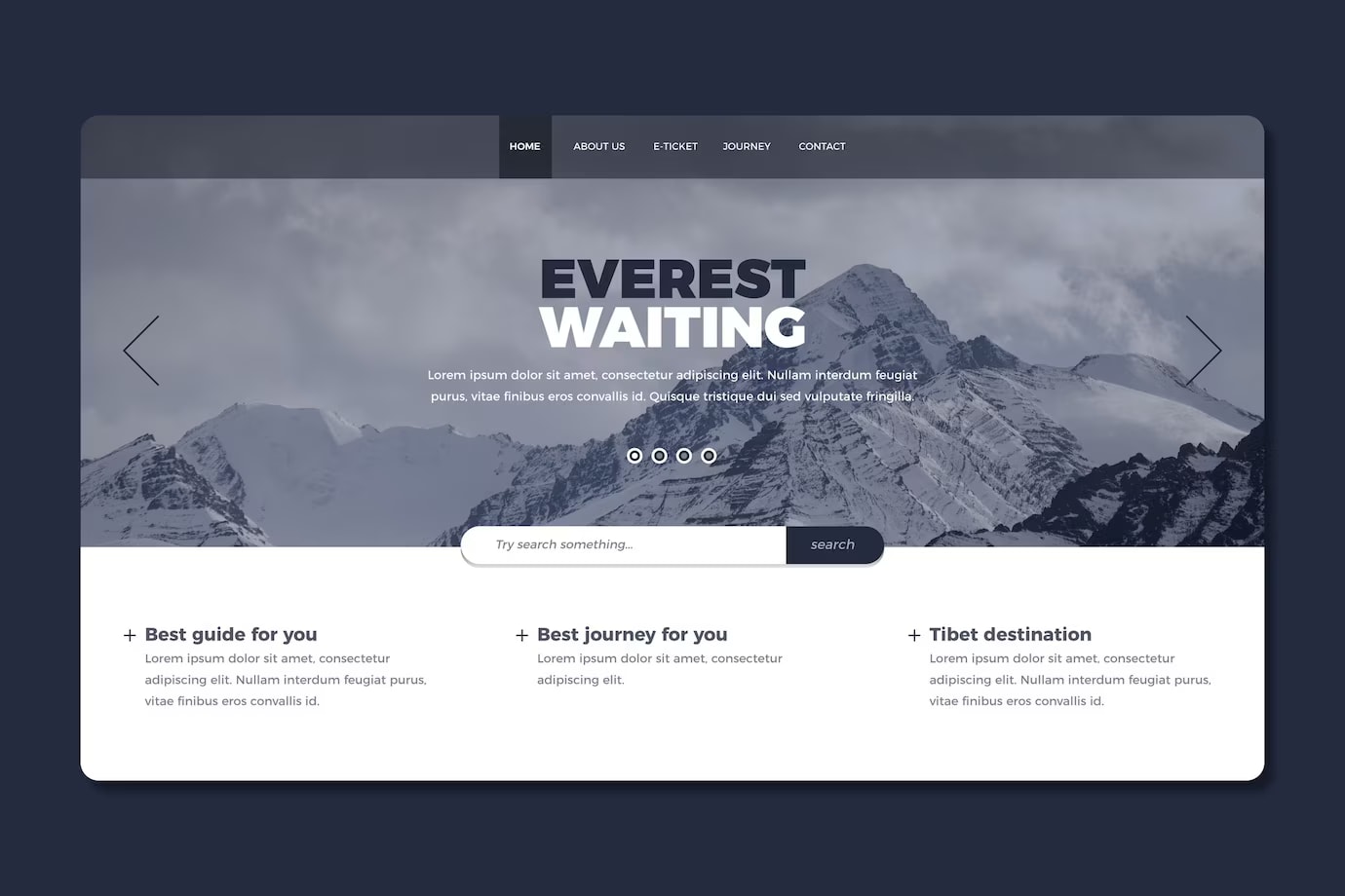
Source: Pexels
Website navigation is a key component of your UX design. It defines how visitors find your content and decide where to go next—so if it’s poorly designed, users won’t be able to find what they need and may end up leaving your site without taking any action.
To make sure this doesn’t happen, consider creating a use case diagram to illustrate how users will interact with your ecommerce so you can design your website with a good navigational structure in mind. That includes making sure all the links are clear and easy to understand, as well as grouping related content together for better organization. Some of the top web design trends for navigational structures include:
Mega menus:
These menus can contain multiple columns of content and links, making them great for quickly finding what users need.
Source: HTMLBurger
Breadcrumb navigation:
This type of navigation makes it easier to backtrack and see where users have been through the use of a “trail” of links.
Source: JustInMind
Sticky navigation:
This kind of navigation stays at the top or bottom of the page, making it easier for users to get back to key webpages without having to scroll.
Product page design trends
User experience doesn’t go unnoticed when it comes to product page design. In order to improve the user experience, consider incorporating some of the latest ecommerce design trends for product pages, such as:
Full-width images:
Large high-resolution images are great for showcasing products and giving users a better understanding of what they’re buying. You can further enhance the impact of your images by incorporating them in graphic design templates, adding a professional touch to product presentations and captivating users with beautifully crafted visuals.
Zooming, hover, and lightbox features:
Allow users to get a closer look at products by allowing them to zoom in on large images or open a lightbox with different angles of the same product. Hover features also let users have another view of products simply by moving the mouse over images or text. You can even add animated page transitions to make it more engaging for your site visitors.
Social media integration:
Letting customers share their purchases with friends on social networks can help engage customers and increase sales.
Product descriptions:
Provide detailed product descriptions to give customers more information about the product they’re looking at. Expert copywriters on Fiverr can help you craft engaging descriptions for your products to rank on search engines.
By implementing these website navigation and web design trends for product pages, business owners like you can improve the overall user experience of ecommerce sites. This will make it easier for users to find what they need while also helping them get a better understanding of what you’re selling.
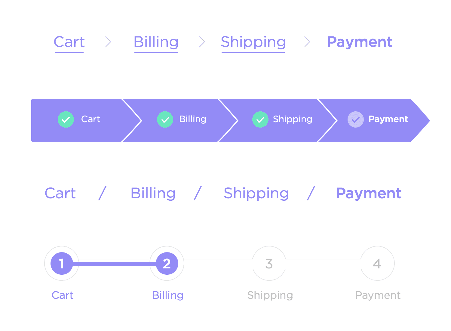
The checkout process

Source: Pexels
A 2022 Statista report found that, on a global scale, approximately 70% of online shopping carts are abandoned before customers complete their purchase. The checkout process is one of the most important and often overlooked aspects of ecommerce website design.
To reduce shopping cart abandonment, your checkout page must be optimized for usability. Here are a few tips to improve the user experience:
Offer multiple payment options
Include customer reviews
Let customers know where they are in the purchasing process
Allow customers to easily edit their online shopping cart by using a Bag or Cart button
Offer free shipping on orders over a certain amount
Provide detailed information about refunds and returns policy
You can save costs and time by hiring professional web designers on Fiverr who can help you optimize and streamline the checkout process using the above-mentioned tips.
Real-life examples of ecommerce websites with successful design integrations
As promised, we’ve prepared five websites that use the web design trends we’ve discussed above to deliver an excellent user experience. Ranked in no particular order, these websites have had implementations of good typography, color schemes, layout and spacing, and website elements to make their ecommerce stores stand out.
1. Andre do Amaral
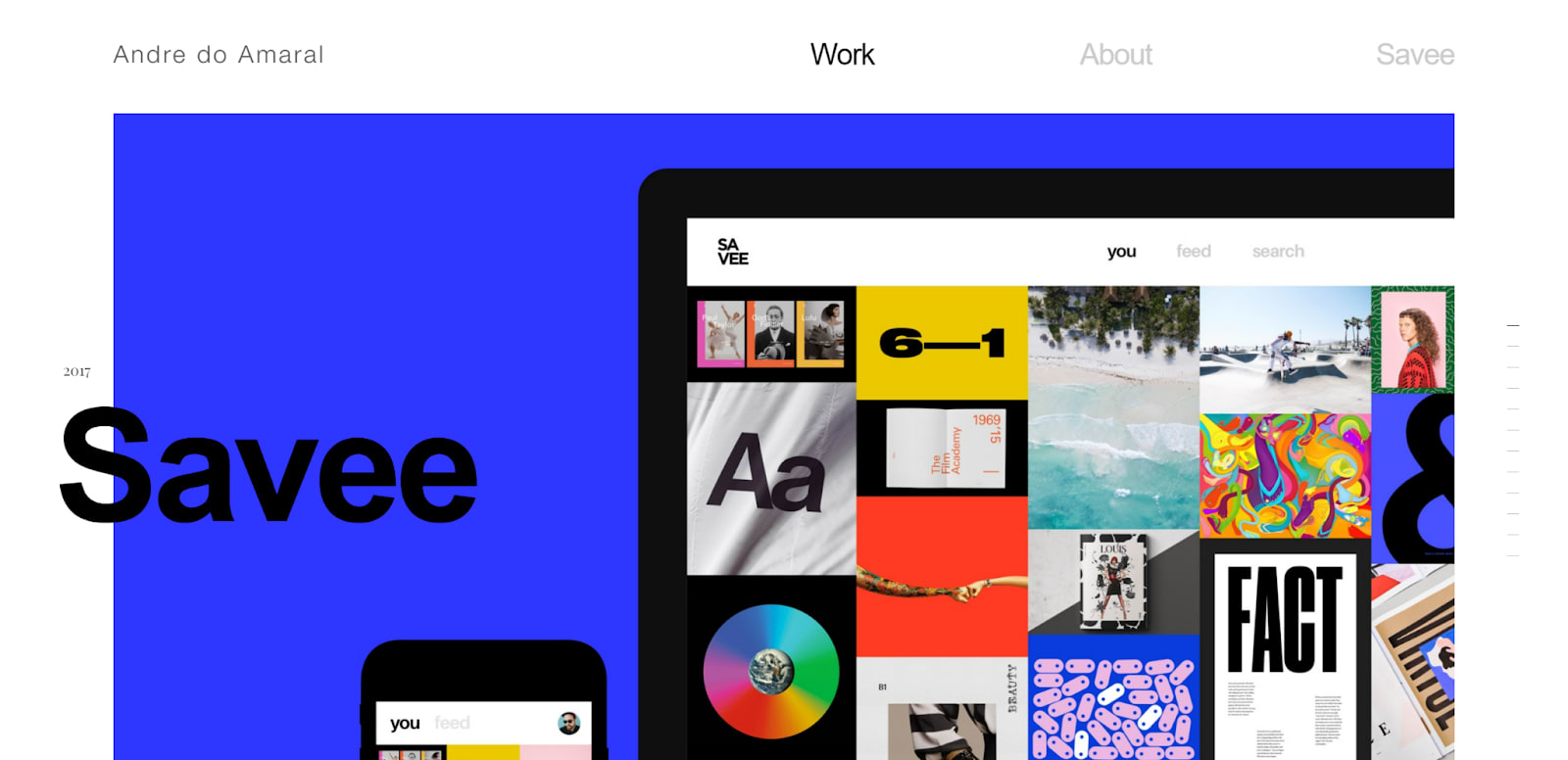
While implementing kinetic typography (also called moving text) and navigation movements to their website, Andre do Amaral also created a modern and sleek design that adds value to the user experience. Using central fonts and simple yet bold colors to contrast the white background, Andre do Amaral’s website stands out with its contemporary design.
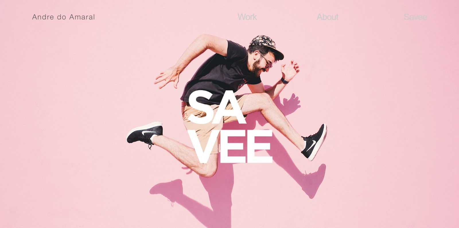
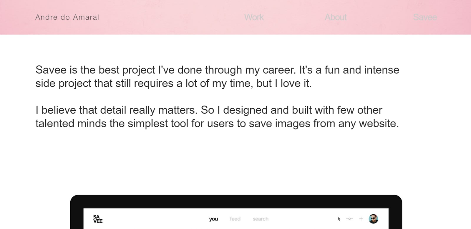
On its homepage, users can click anywhere and be redirected to this page explaining its main product, Savee, where people can download curated images for inspiration. You’ll also see that the navigation bar sticks, helping users move to other pages more easily.
2. Glossier
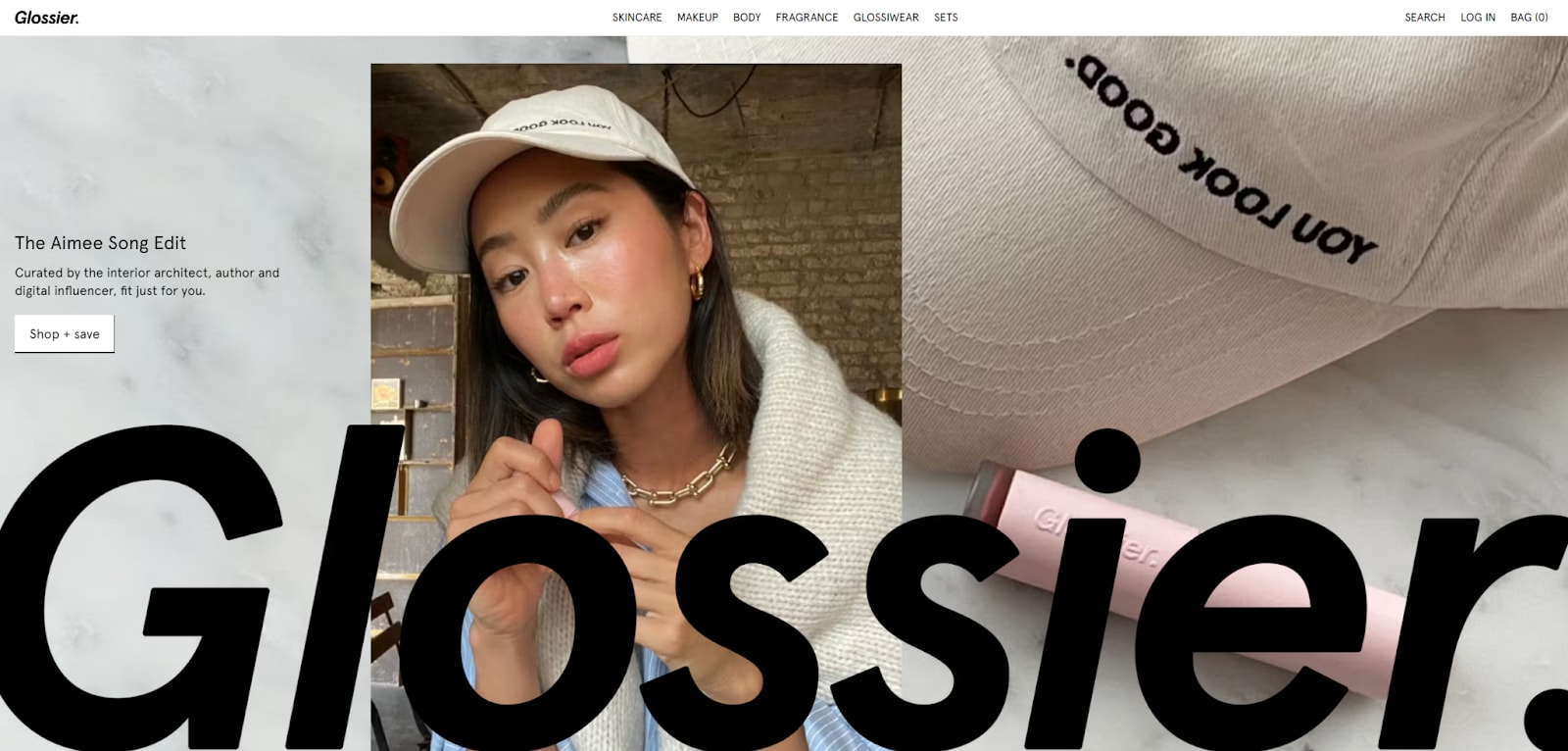
Glossier is a beauty and skin care ecommerce site that incorporates the use of interactive elements such as hover effects, which makes its products stand out from the rest. Its homepage also features full-width images to capture users’ attention and emphasize its product offerings.
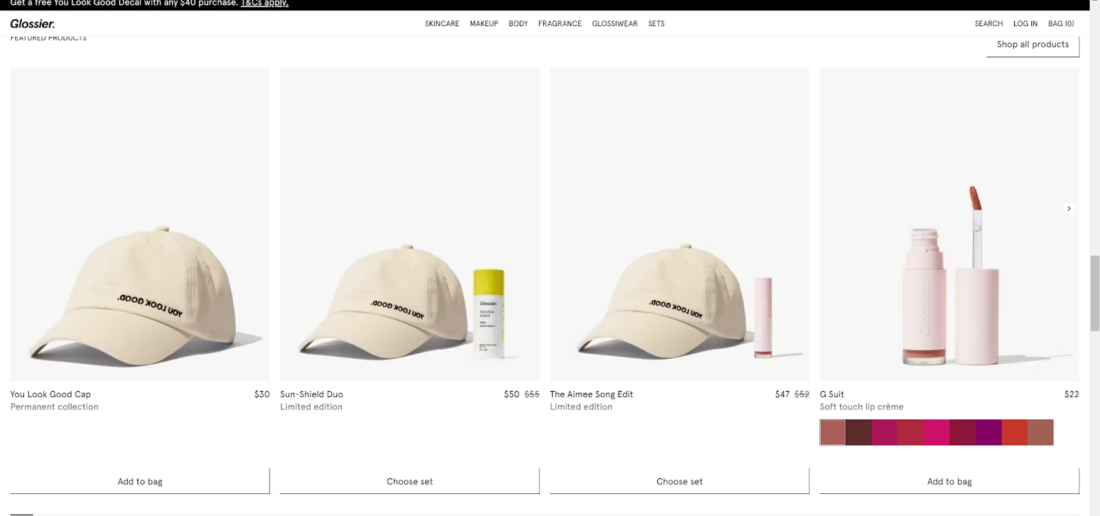
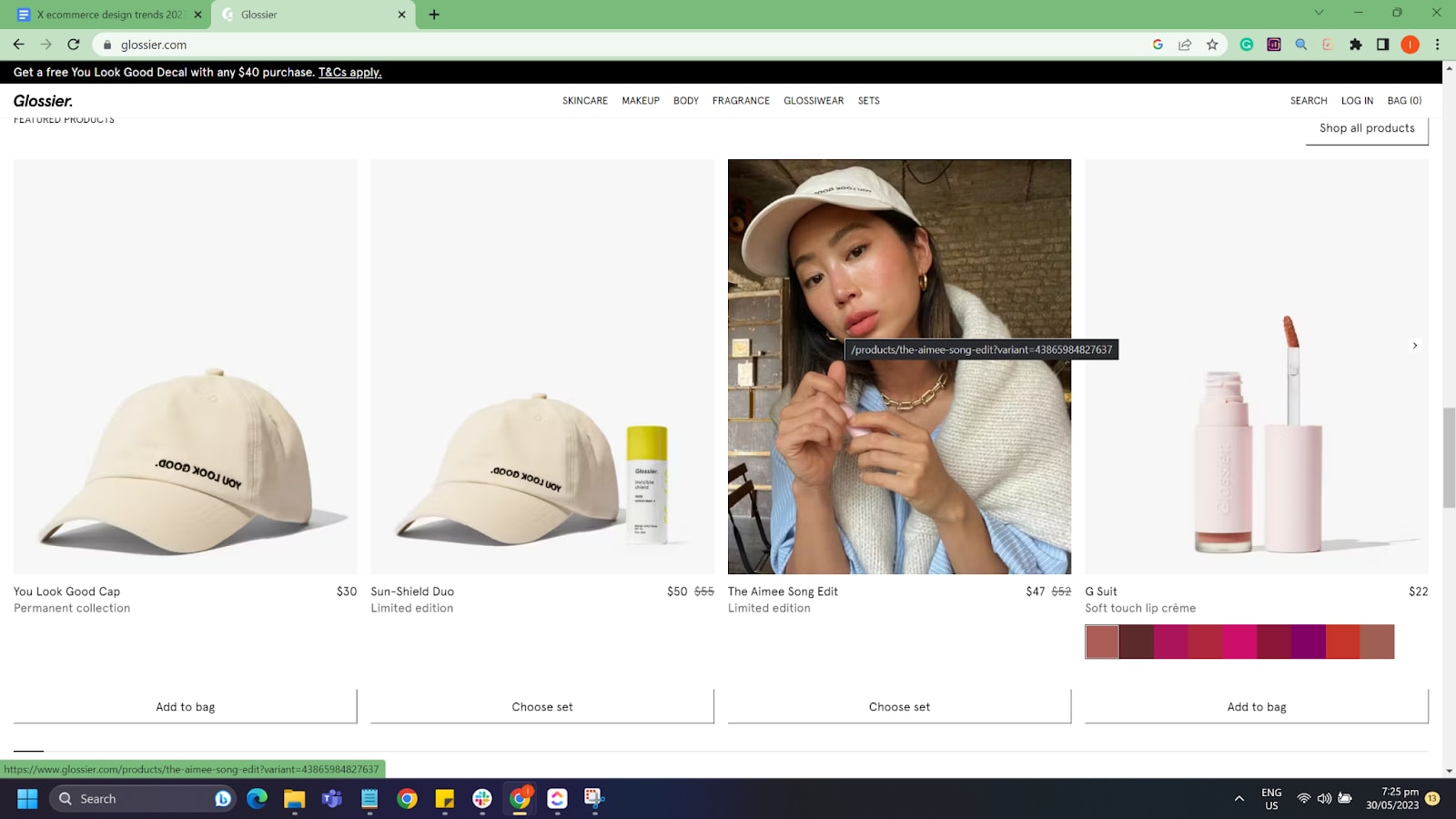
Sticky navigation bars, a Bag button, and a minimalistic color scheme are just some of the elements used to create Glossier’s aesthetically pleasing design.
3. Allbirds
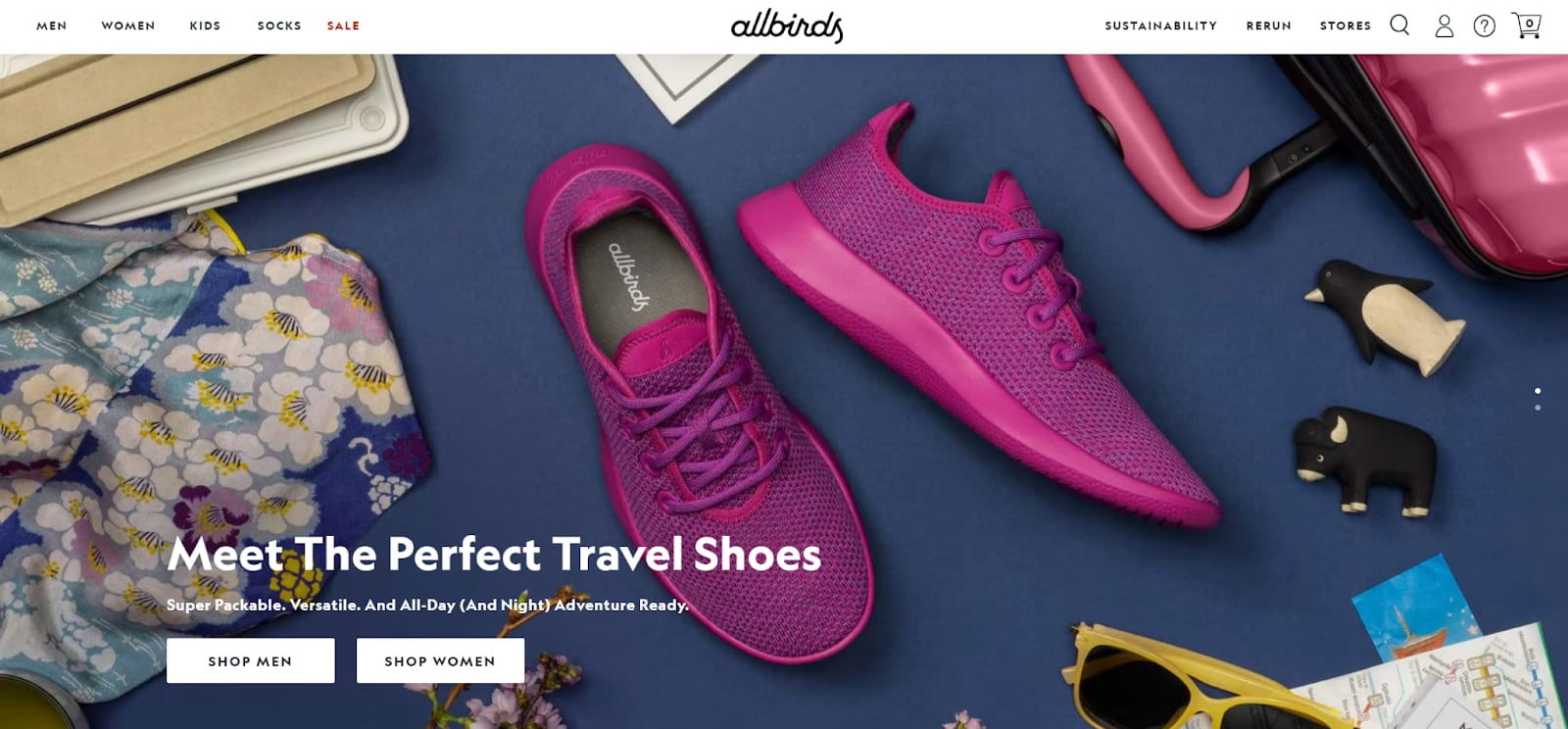
Allbirds successfully uses its ecommerce website for both branding and sales. It has been able to capture users’ attention with its unique design, which features typography made from bold colors, big images, and interactive elements such as animated GIFs and hover effects on buttons.
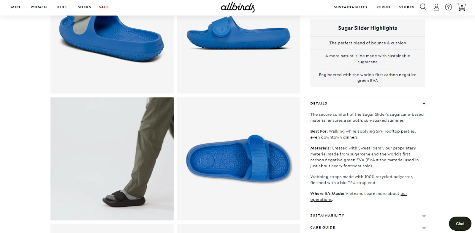
With a product description and checkout process that’s easy to understand, Allbirds’ website also incorporates the use of video, which gives an immersive experience for users.
4. Alto
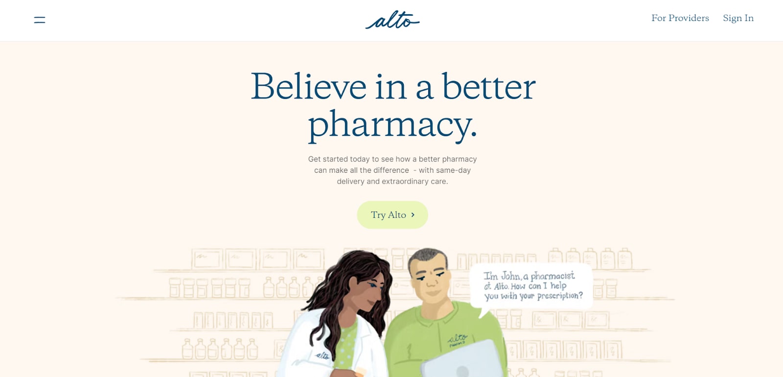
Pastel colors, a minimalist design, and an easy-to-navigate website are some of the elements that make Alto stand out. Its homepage features a large image with interactive elements that create motion as users scroll down the page.
The combination of illustrated graphics and pastel hues is unique for a pharmacy website and allows it to successfully convey its message while standing out from the competition.
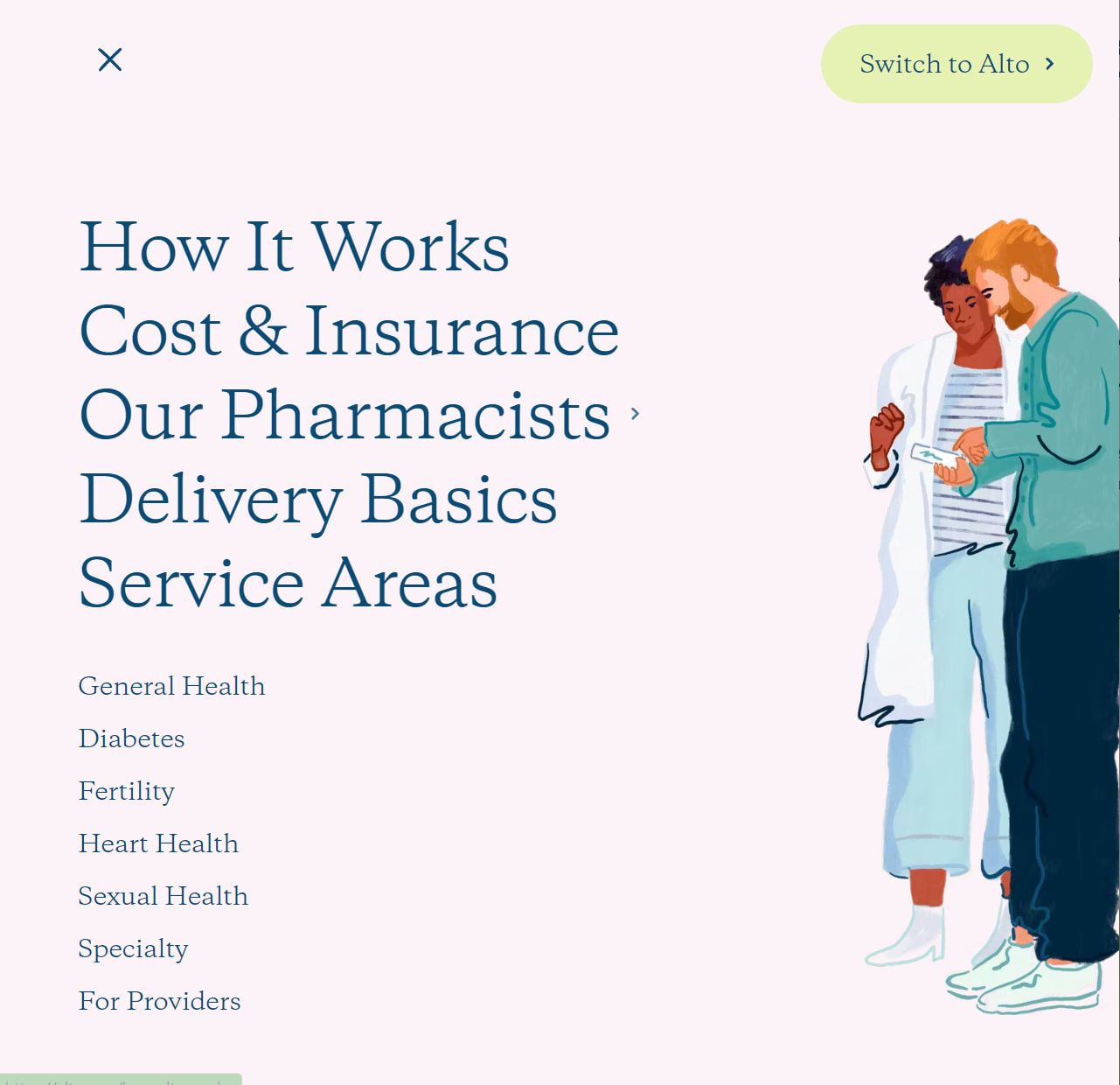
Its website design creates a warm and inviting atmosphere, using vibrant colors of beige, green, pink, blue, red, and orange. Illustrated content helps customers envision pleasant interactions with Alto employees.
5. Kiramoon
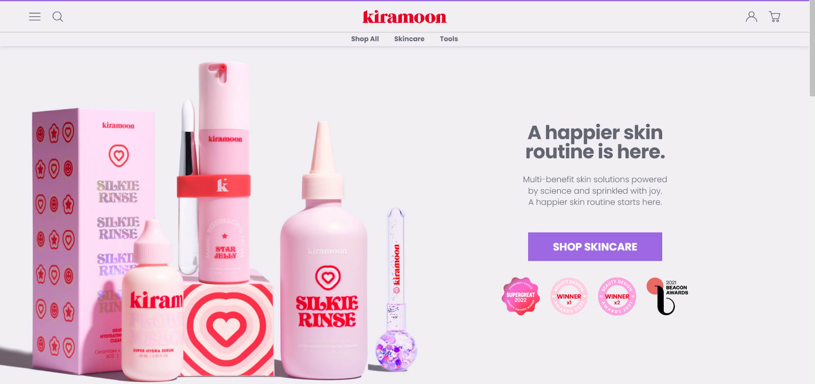
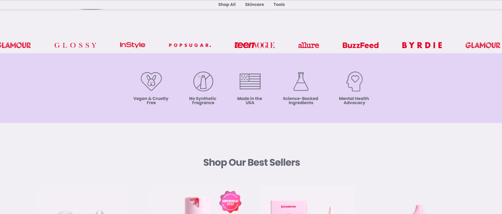
Kiramoon is a cosmetics ecommerce site that stands out with its use of a modern and minimalist design. Its homepage features large images, a layout that is clean for user-friendliness, and moving text showcasing other companies that have featured the brand.
It also uses a monochromatic color scheme with red, pink, and violet to contrast the background. This design is effective in capturing attention and providing an aesthetically pleasing experience.
Final thoughts
Using the right design elements is essential for all ecommerce sites, helping to create an engaging user experience and ultimately increase sales. The five websites mentioned above are all great examples of how effective design can be used to make a website or blog stand out.
Why not use some of the same design elements to create your own unique ecommerce space? With the right approach, you can make sure your website is able to capture the attention of its users and provide them with an enjoyable experience.
As an added bonus, you can also use your website to build brand awareness, helping you get more customers in the long run.
Do you want these ecommerce design trends implemented on your website? Hire freelancers on Fiverr to help you out! With over three million professionals, Fiverr has a wide range of services—from web design and development to marketing and SEO—to help you get the job done.
Even with a normal account, you can save time and money through Fiverr. Sign up today to get started!
And of course, look no further than Printful for your marketing collateral needs. We offer custom printing and fulfillment services for businesses. Need design ideas for your t-shirts or other merch? Take advantage of our products, which include t-shirts, hoodies, bags, mugs, stickers, and more.
Related Guides

About author
Marta Birzkopa Content Marketing specialist at Printful
Marta is a Content Marketing specialist at Printful. She has a degree in International Communication Management. Her interests lie in human psychology and digital marketing.
